Leveraging Data
Database Development
Data Discovery & Strategy
Data Explorers / Pre-visualizations
Data-Driven Applications
Data Search & Discovery Interfaces
Collections Management Interfaces
Federated Database Search Systems
Mapping Systems
APIs & Collections Feed Consumption
API Programming & Security
Data Dashboards & Visualizations
Collection Pre-interfaces
ContentDM Interfaces
ILS Interfaces
Data Privacy Audits & Controls
Data is at the base of most organizations. Building human-driven databases and applications that collect, process or use data require usability, accessibility and user experience skills. Data-focused apps and visualizations are the center of what we do at Byte.
While most web designers work with displaying data, creating databases and applications that distill complex relationships into something people can understand and use requires a different skillset. We've had our feet firmly in both data and usability from our beginning, and have worked through building databases, shopping carts, quote builders, user systems, and content management systems from the ground up.
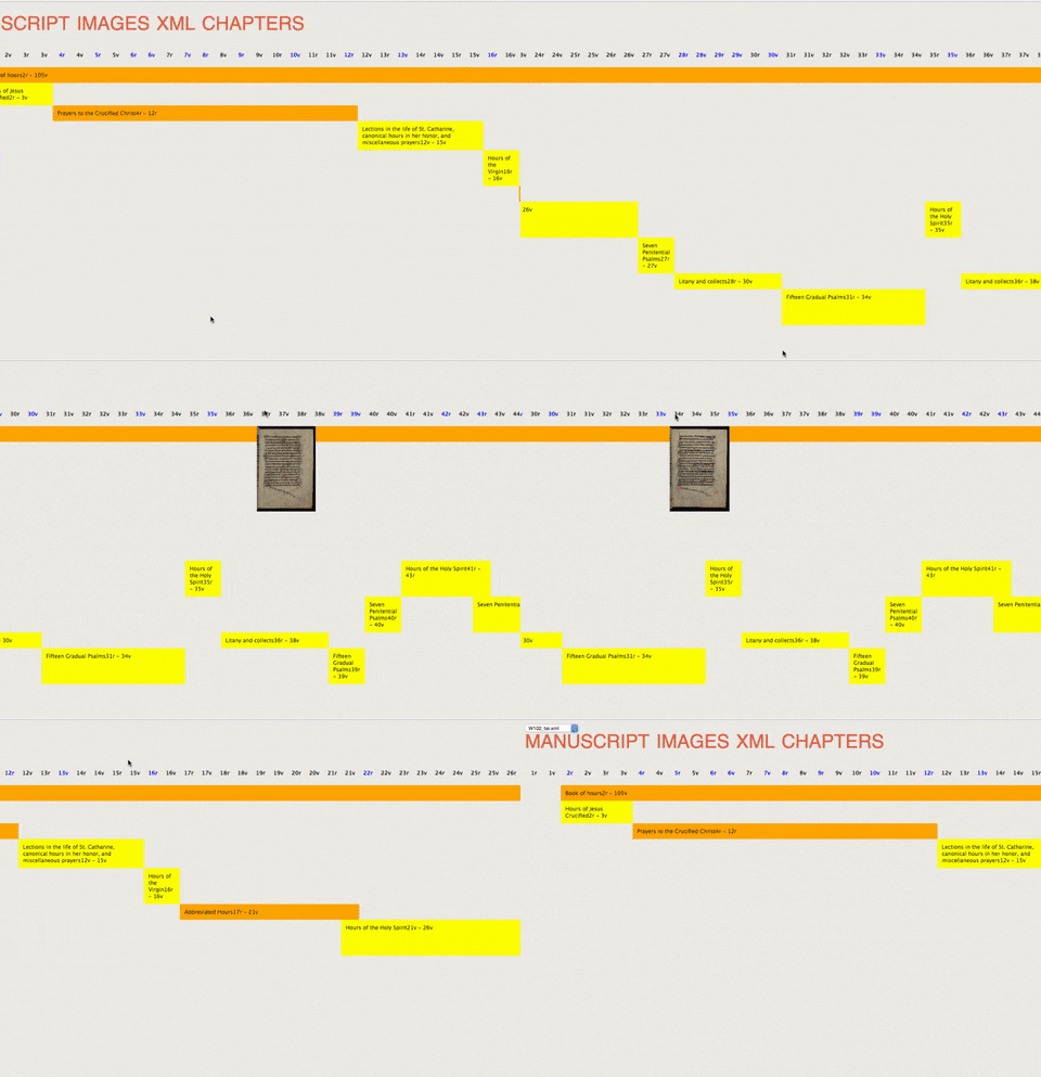
Data gets a lot deeper, like the 1.7m item collection of Milwaukee Public Library or the 400k folios and nearly infinite connections in manuscripts for UPENN's Bibliophilly project that we needed to find a smooth and easy way to let people browse, explore and search deep into the content.
How we understand data
When we have a large, relational and hierarchical data set that's as large as MPL or UPENN, we find our first disconnect: our brains. There's no way to understand the sheer amount of it, much less find what's relevant to people. Using tools like Google Data Studio, Apache Spark, Tableau and RStudio can be employed to understand data, but we usually find ourselves building tools instead, what we call a data explorer or a "previsualization prototype".
 We start each previsualization prototype project by just querying the data sets, and asking basic questions, how many X, how many children of X, how deep does the lineage go, etc. From there we start defining how we'd like to explore deeper, and make some basic prototyped interfaces and fill them with data -- which could be all items without parents, aka root items. Clicking on each one finds its children, which we put in a second column, and click on those to reveal a third column. Then we make basic hypotheticals, and let the data show us which are true. Then we affect the previsualization prototype and make more hypotheticals, rinse and repeat.
Turning data to interface
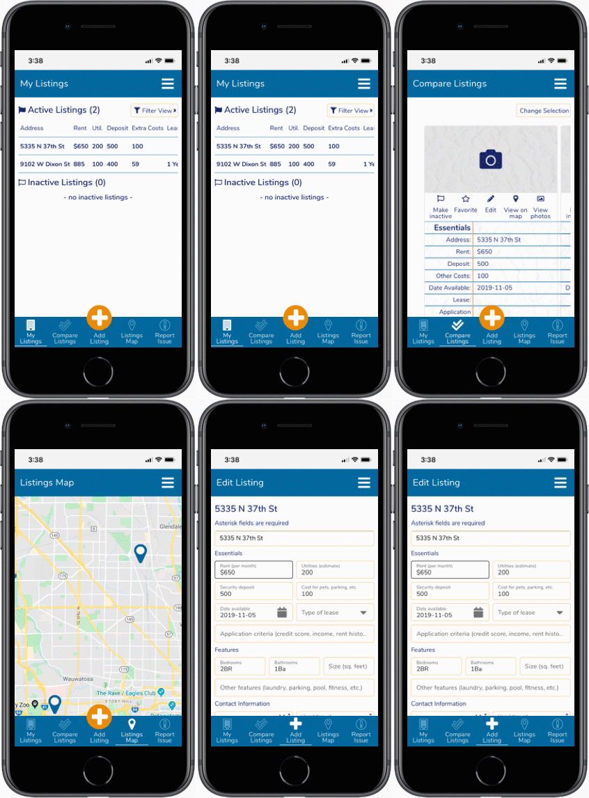
A previsualization project gives our UX designer and strategist to start finding ways to merge the original project's goals with the data we've found, and start sketching interfaces. We're looking to show the right level of abstraction to the visitor that makes understanding, exploring and managing the data easy for people, and to make the application's goals and use cases within easy reach.
 After sketching out layouts and interface ideas, we'll start honing in on useful patterns and start defining the a visitor's paths needed to make a system. Doing iterations of sketches will start showing systems that might work, and give us a chance to make prototypes that we can test against. As we dig deeper, we'll build even more previsualization tools based on our intermediate findings.
Testing in the real world
Our job is to distill meaning and find the appropriate abstraction to let people get the most from the data and its interfaces, and after years of experience, we're often right about people's interactions. But people understand and interface data unpredictably sometimes, and even our experience doesn't catch all the issues. We employ usability testing (often called "user testing") to close that gap.
Usability testing can be as simple as asking a few friends to do some site tasks while we look over their shoulder, or as deep as employing focus groups, task analysis and utilizing online tools that track mouse movement and user paths, or ask questions in ways to help us understand people better. The results will often have us fix some small issues that might get in the way, and sometimes it sends us back to solve some bigger problems. Either way, it improves the product by making things easier for everyone.
[Some sort of user testing image?]
Open data
 Byte is a believer of open data and has long been part of Milwaukee Data Initiative's efforts of opening government, and when possible asking our clients to have their open open data policy. Data is often just another form of website content, and often times an organization's own data can be useful to people in ways we can't predict.
As a studio, we've used public data and we've produce data for public consumption. Sometimes it's as simple as accessing a public API, and sometimes it's finding and creating public APIs and feeds from internal data sources.
To learn more about Milwaukee Data Initiative, check out their website and available databases.
Related Work
looking for a web team that will take the time to understand your organization's soul?
let's talk