Work
filter your experience

Services
Watch Mitchell Street in Milwaukee come alive online
A special street-based placemaking multimedia exhibit goes to permanent home online and in Mitchell Street Library.
Background
Listening to Mitchell (LtM) was a one-time exhibition that included photography and audio stories that spread a seven block radius of Historic Mitchell Street in Milwaukee, WI. Created and crafted by Adam Carr and Sonja Thompson, LtM explored the identity and cultures of a neighborhood "main street." Working with a wide range of residents, community organizations and businesses, the project created a visual campaign that mirrored the layers of advertising on the commercial corridor of Historic Mitchell street from 5th to 12th Street.
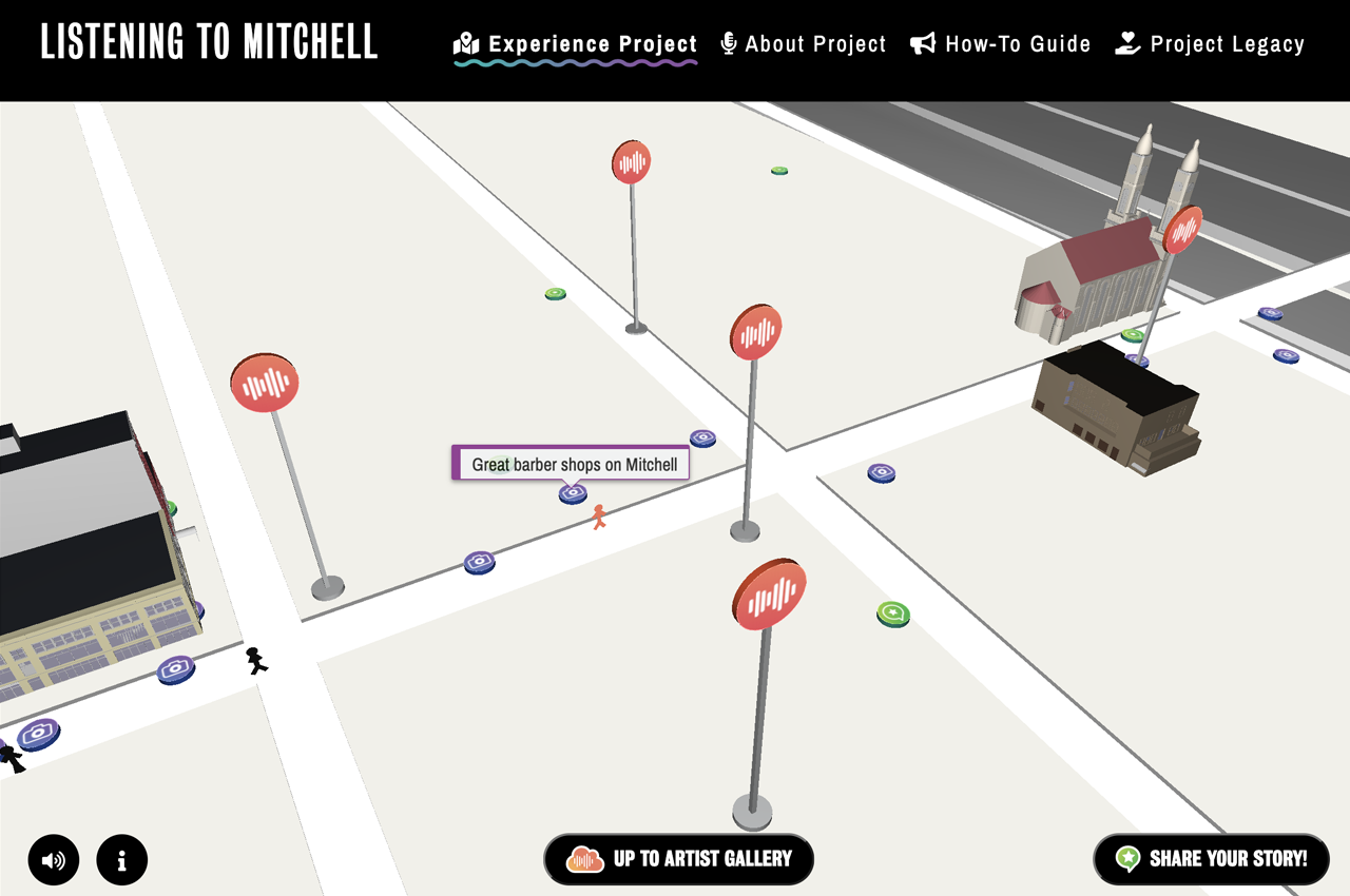
LtM had a variety of visual and audio output, including:
- Storefront gallery space with photos
- 18 channel audio installation with 3 hour loop with narrative stories
- 12 part radio story in collaboration with WUWM's Lake Effect
- 32 sites including storefront windows and billboard signs
- An "incomplete guide" and map that helped people explore Mitchell Street
- A "call now" telephone number that people can call into to add their own stories
Listening to Mitchell along with Milwaukee Public Library, Artists Working in Education and Ex Fabula, won an Our Town grant from the National Endowment for the Arts for a project named Gathering Art, Stories and Place. MPL asked Byte to assist MPL through the process of turning this into a digital archive and to build a front-end interface and kiosk where people could explore the project along side a new visualization piece from Sonja.
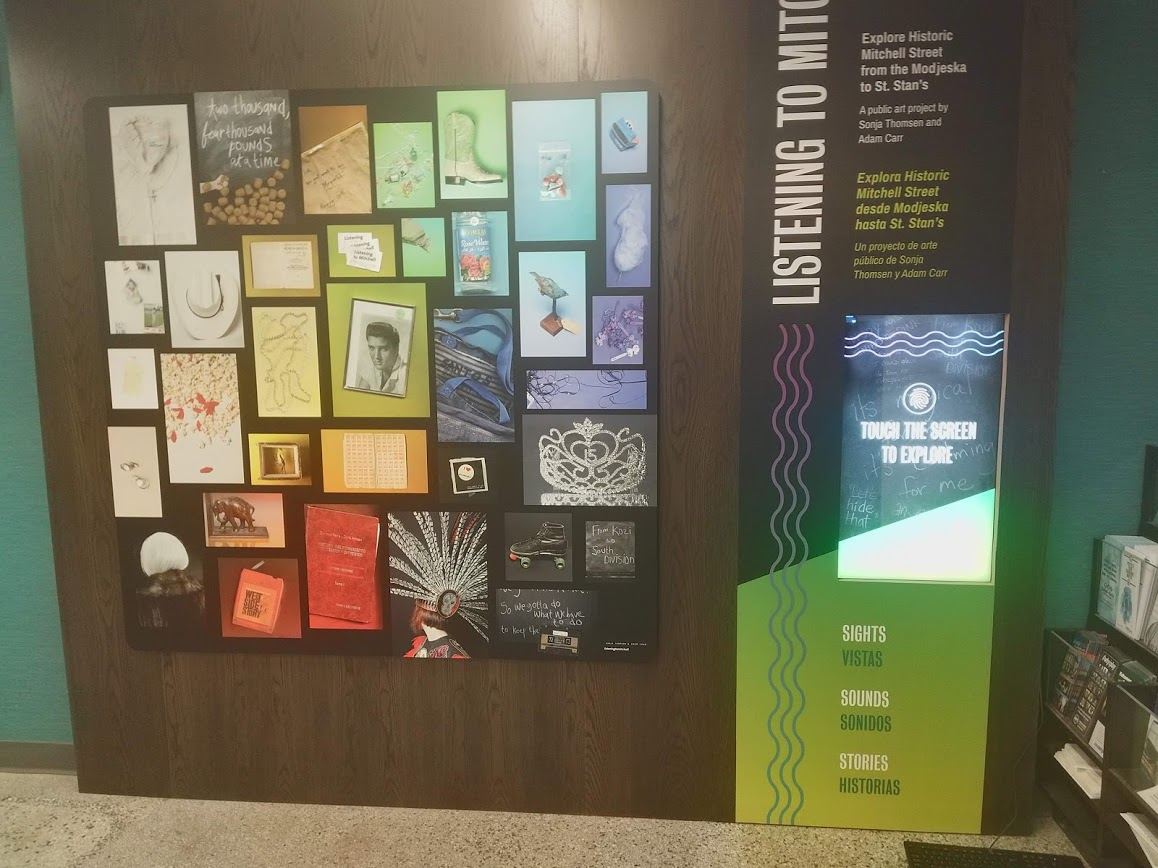
[1/2 size, image of kiosk and artwork in MPL Mitchell Street branch]
Artist and Archivist Collaboration
LtM's online phase was a collaboration between the artists Sonja Thompson and Adam Carr, the archivist (and business manager) Kirsten Thompson from Milwaukee Public Library, the facilities team for the kiosk, and Byte. Since this was Sonja and Adam's work, Byte's job was help understand the data sets, help MPL be able to put it into ContentDM, and to fully interpret that data into placemaking exhibition to communicate online.
The hardest part is to translate the vision of the project into a digital medium. To even get close, we had to ask lots of questions about how this piece works for people, how they artists intended the media to be seen and heard, and what they hoped the visitor would get out of it. It's one thing to create a website for a historic artist or museum, it's entirely another thing to work with living, brilliant, opinionated artists when the task at hand is to translate their work into a new format.
[1/2 size image of anyone with the listening to mitchell paper map]
Translating the Experience
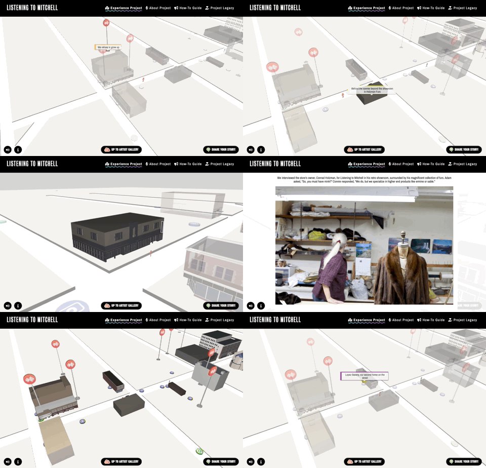
Working within more interesting issues and technologies, we've learned that we shouldn't try to know the form a website or kiosk might take until we really get to know the data and the experience that would connect best with users. The first meeting, we were asked if we could make a map that people could click on dots to explore photos and audio of the locations, so the artists were hoping to see this as spacial or geographic. We love 3D and we love mapping, so we went to work.
We love to sketch here, and we do it for every site we build, but it's almost impossible to build truly experiential interfaces based on data on paper. Instead we build "proofs of concepts" and early data explorers. We created proofs of concept of the data on 2D space, 3D space, geographic, abstracted geographic (think Massimo Vignelli’s 1972 design for the NYC subway), and many other ideas. The project principles, as heard from the artists, included getting people outside to explore the neighborhood, so we found the best congruent action -- exploring the neighborhood virtually.
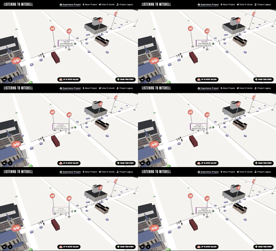
Another project principle was that we wanted the project to have it feel like a shared experience. We wanted other people to be around when a visitor explores the street. To do that we save an anonymized version of everyone who visits and the "places" they visit into a database and when a new visitor arrives, we play back the most recent visits.
To match the call-in telephone experience, we also ask people for their own stories to add to the archive. Archived telephone calls and stories are displayed right on the map.
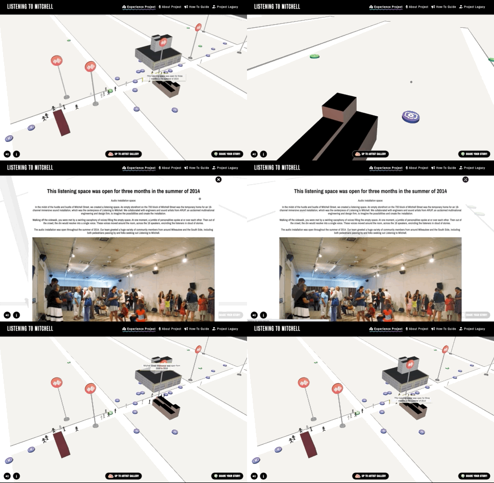
The one-time placemaking exhibit included a map, signs throughout the neighborhood and a storefront with an 18 channel audio installation mounted in a circle in the space along with an array of photos taken by the artist at the far end of the storefront space. We found the street installations very different than the storefront installation, and audio was attached to many of the videos, so putting that at street level never made sense.
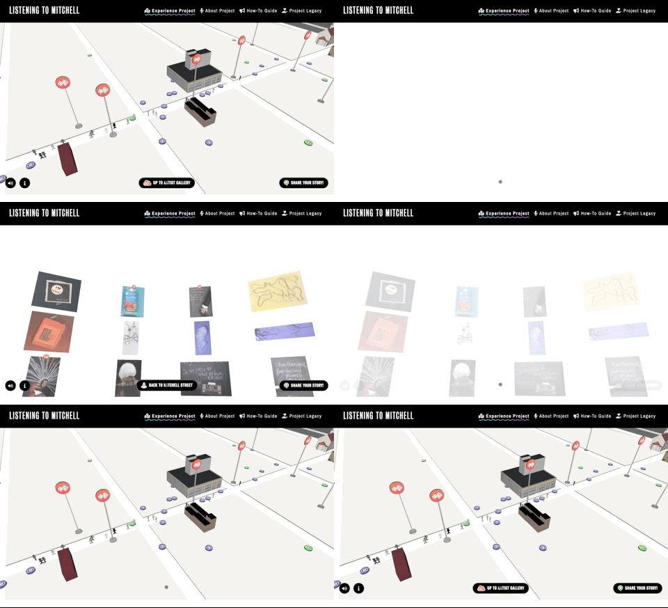
We also wanted a place that allowed visitors essentially to be by themselves. We created a space above the street and in the clouds where a visitor can explore Adam's audio stories and Sonja's photographs without the visual noise the street and people "walking" by. This created a spacial challenge -- visitors needed to understand there were different spaces "in the clouds" or "on the street" and both are worth their time.
Kiosk and Exhibition Design
This LtM project is an online site and in-person exhibition with a kiosk in Mitchell Library, a new community center and Milwaukee Public Library branch on Mitchell Street. Sonja was creating a piece for the exhibition, and designed the exhibition area to include the artwork, a large, beaconing description of LtM and an integrated, explorable kiosk.
The artists' felt that technology just seemed like a tack-on in most art experiences, so when we did the exhibition and kiosk design, we had the kiosk screen fit into the exhibition vertically, thus avoiding the appearance of a television. Furthering the merge of tech and exhibition, we created a screen saver that fit into the exhibition design itself by using the colors and shapes of the vinyl overlay.
Sonja, Adam, Byte's and the MPL facilities team, along with the woodworking and vinyl teams, came together with us to ensure everything went smoothly, worked flawlessly and looked amazing.
Accessibility
We had a few accessibility issues we wanted to cover. This is both a kiosk and website, so we had different accessibility issues for each.
The website needed to allow full keyboard navigation, should the user not want to or be able to use a mouse with fine controls. Users who use keyboard navigations often tab as their first action on a site, and for this site, tabbing puts you right into discovery mode on Mitchell Street, and each enter puts you into an area and escape pulls you back out.
The kiosk might have someone sitting or standing, and they would need the full range of the features of the kiosk, but since we're vertical screened, the range was too much based on the ADA standards. We solved this by having navigation in the center of the screen, and a flip screen button that allows the user to switch between the overview and videos or the Mitchell / cloud interface. Each user has the full range of features.
Lagniappe
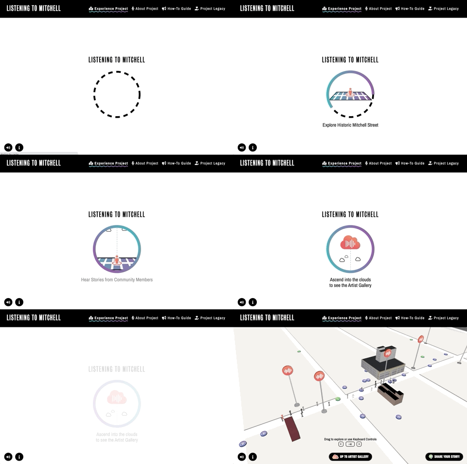
We love to add a little extra to every site we do. This one we wanted a loading sequence to be didactic, so we created an animation explaining the basic movement to the site between the two worlds.
Sonja and I poured a ton of work and our selves into a multi-year, multi-faceted public art project . We wanted the experience of our project — spread across multiple media and throughout seven blocks of a historic main street — to challenge our audience. When it came time to archive our intentionally sprawling project, just knowing where to start was difficult.
I appreciated working with Byte, as they helped us think through our overflowing piles of content, then find a semblance of order that would allow the public to meaningfully interface with it. Without the proper design, the archive of a project like ours could easily overwhelm a casual viewer, and Byte helped us translate our vision into something that feels both accessible and aesthetic.
Listening to Mitchell Online Experience