Work
filter your experience
Services
Bringing the American Revolution to Life with ARGO!
Bringing the American Revolution to life through historical maps meant developing an engaging, interactive platform that could serve researchers, educators, and the public alike. The challenge was to create a flexible digital home for over 900 rare maps—one that could scale over time, offer fast performance, and support rich contextual storytelling across diverse audiences.
To celebrate the United States' 250th anniversary and Mount Vernon’s growing map collection, George Washington’s Mount Vernon and Boston Public Library’s Leventhal Map Center envisioned a curated website that would tell the story of the American Revolution through maps. Byte was commissioned to develop the ARGO Maps website, an innovative platform for exploring historical maps and contextual data in new and meaningful ways.

Leveraging Our Expertise in Special Collections
The ARGO Maps project presented a unique challenge: creating an interactive, scalable, and sustainable platform for an ever-evolving collection of historical maps. Leveraging our deep expertise in managing and showcasing special collections, we designed a solution that empowers curators and scholars to continuously manage, enrich, and expand the collection.
The ARGO Maps project has some fascinating under-the-hood features based on the way collections are built and maintained over time. A key feature of the project was its dynamic and collaborative nature, with contributions from multiple institutional partners to allow the collection to grow over time.
As well, to fit within Levanthal's system of technology, the site was built using a modern static site generator that would house internal and external content, and be built in a way that would have both static and hydrated elements allowing pages to load quickly with core elements pre-rendered, while interactive features are "hydrated" dynamically upon visitor engagement.
Understanding People
A project like this requires we dig deep into audiences and find their needs so we can target the site's functions for them. We identified three primary categories for their goals:
- Visual discovery: People wanted to explore maps through compelling and intuitive interfaces.
- Interest-specific exploration: Topics such as map materials, creators, geographic areas, and historical themes were critical points of engagement.
- Practical use: People needed access to material for research, teaching and personal projects.
These insights shaped our design, ensuring multiple pathways to explore the collection—whether people wanted to dive deep or explore casually. The insights also helped shape our ideas on what explorable and digestible would mean in a visit, and started us on a trail for deeper answers.
Asking Questions & Exploring the Data
When we started this project, we had a lot of questions about the American Revolution itself:
- When was the last time any of us studied it outside of primary school?
- What were the key events that took place?
- Where exactly did it take place and who all were involved?
- When did it start and how long did it last?
These questions got us flipping through a stack of books at our local library to find answers and we were sure that we wouldn't be the only ones. We discovered in our own confusion that the interface and content needed to help people get a sense of what the Revolution was, and at the same time not get in the way of the researchers and academics who needed specific answers quickly and easily.
We also dove deep into the collection data itself to understand what we were working with, explore what the data can support and to see if we could find some interesting things in data. When working with large data projects, our understanding of the material is key.
Defining Pathways of Exploration
With a clearer understanding of who the people are, their needs, and the data, we began defining the pathways of exploration.
Lucky for us, we were working with a team of passionate historians and map experts who were willing to think out of the box with us to craft a meaningful digital experience. We did our explorations using data-accurate wireframes, iterating often and continuously returning to the drawing board to find new ideas and improve current ones until we found the many ways by which the collection could be explored.
Working together, we turned a static set of maps to something that could be explored in various ways.
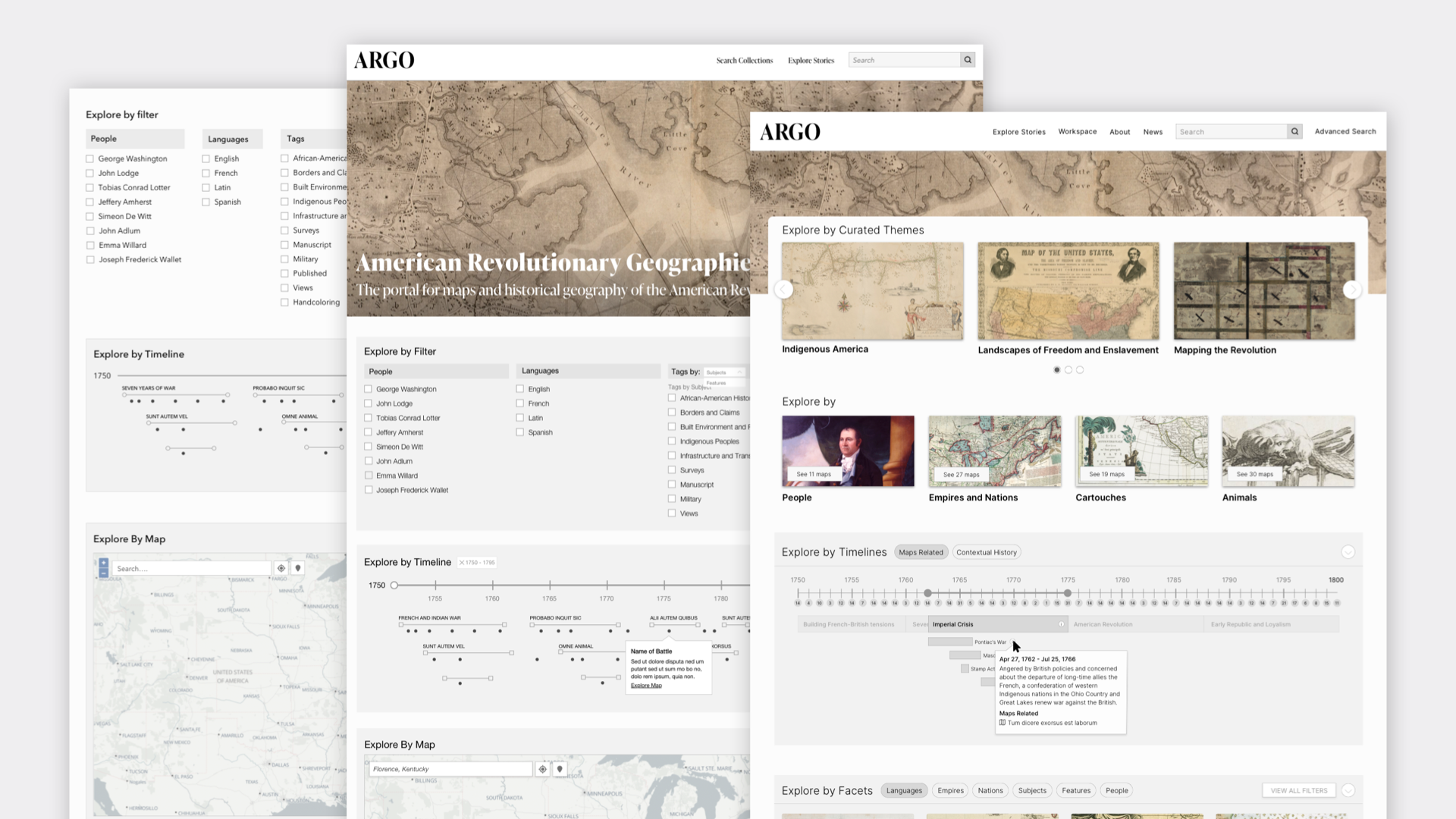
 Timeline Interface
For visitors who are just coming back to the American Revolution for the first time since primary school, we wanted to create a timeline-based interface to simplify the understanding of the Revolution's chronology. The questions became evident quickly: how much and how do we give any context?
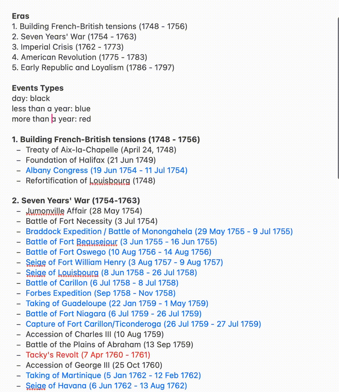
To create context, we proposed the inclusion of eras to group events, which would make the information a lot more digestible. We also wondered if it was important to denote the difference between a single day event and multi-day battle.
To explore these questions, we created proofs-of-concepts to explore the interactivity and features of the interfaces.
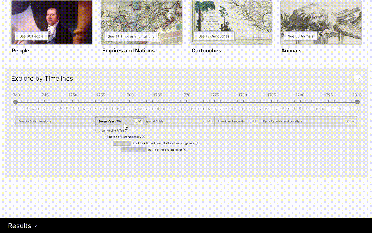 After many iterations and side quests, we found a final design idea that allowed people to explore to quickly to grasp the revolution's duration, its distinct eras and find events with maps tied to them.
Map Interface
When we work on a project, we spend a lot of time talking to people: our clients, other academics and institution, friends and family, all to help us get an understating of the subject matter along with people's perceptions of the subject. We circle back with some of the people with early ideas or proofs-of-concept and watch how they interact or search within a navigation.
One of our biggest questions was how people interacted with a map, and how people would search using a map. We found people used maps in a variety of ways, but one behavior was consistent: people wanted to see where they were in relation to the map, and wanted to see what maps covered their location. Being a Milwaukee-based studio, we found our local folks were fascinated with what Milwaukee was like 300 years ago, and everyone found something interesting and talked about it. Many people looked at their favorite travel locations or places they've been recently. Our interface wanted to make this easy—we added the ability to choose a location or let it find your location and see the maps that were available.
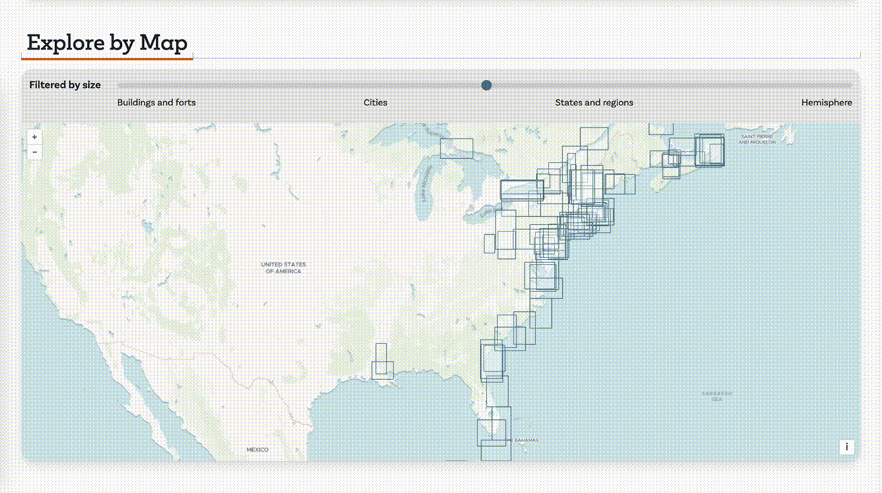
We ran into a big issue in the interface—some maps are very local down to buildings and forts, and some cover the hemisphere and most are in between. This meant we needed to help people understand the size the map area would constitute let them choose the map extents for their exploration.
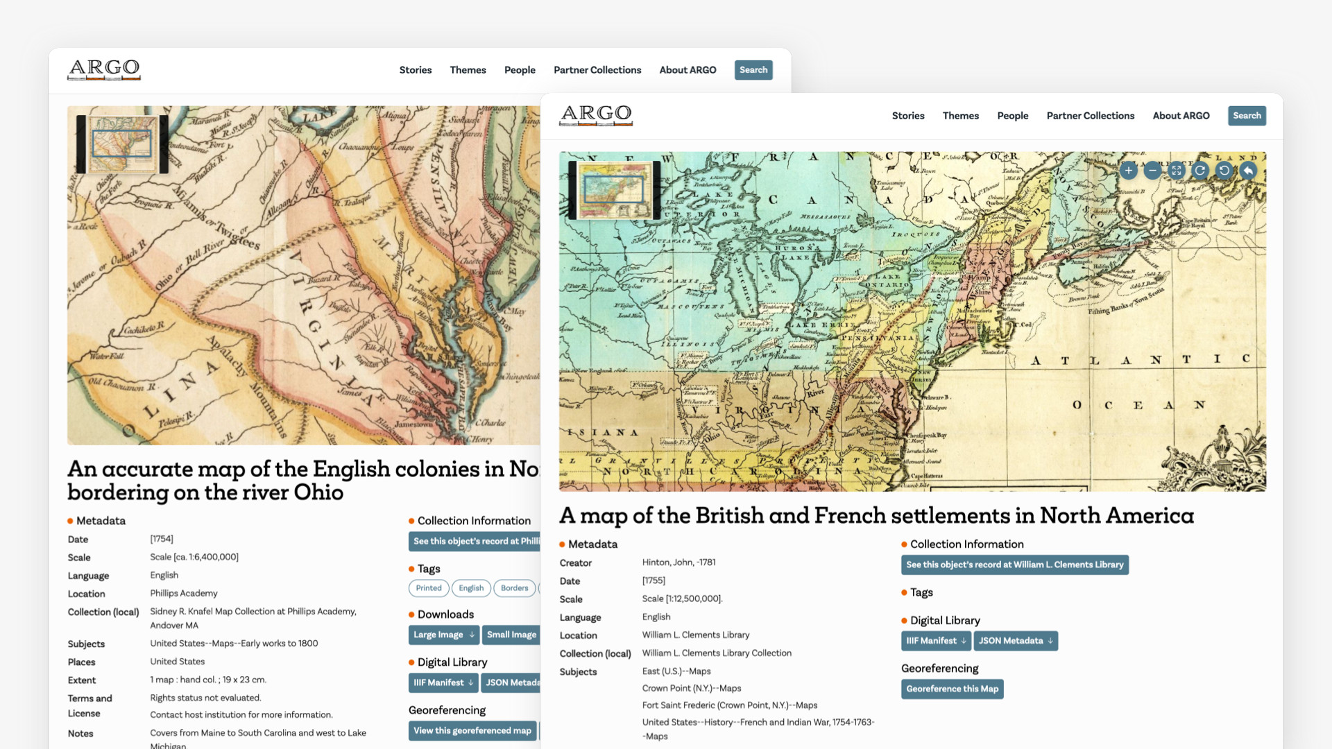
Map Page Details and Explorations
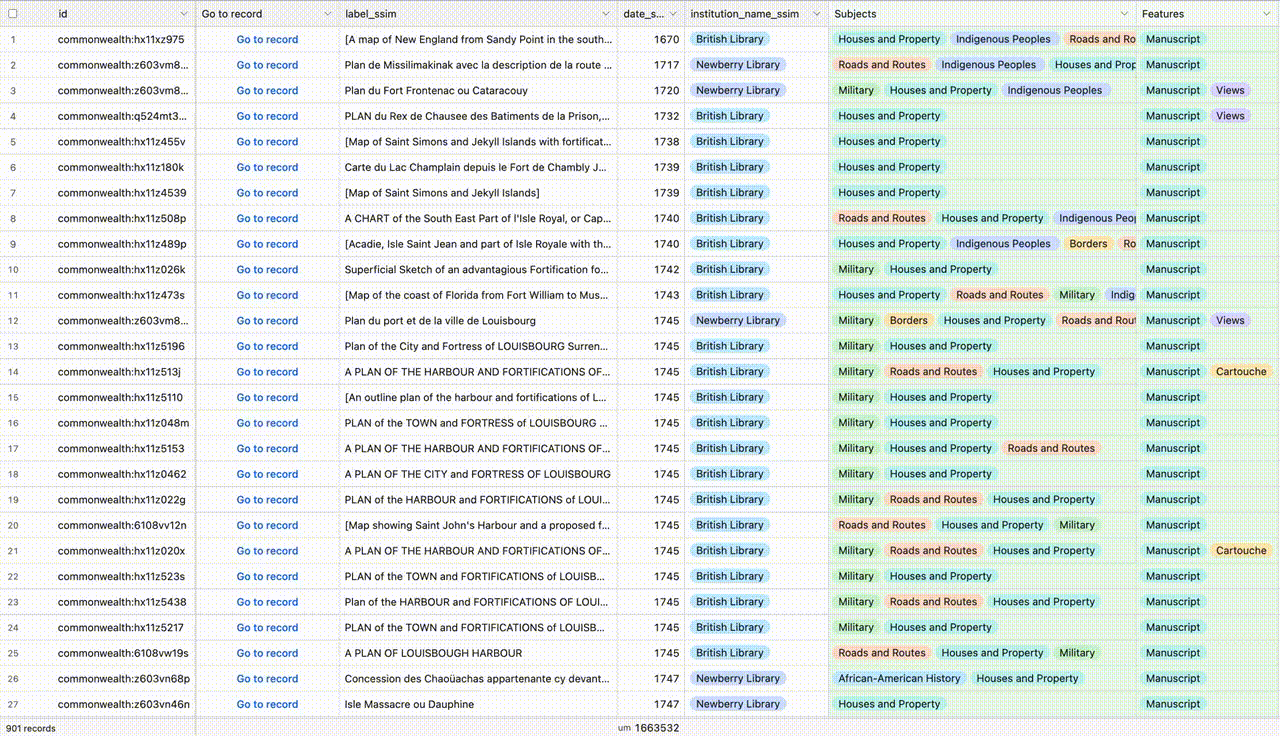
Users can explore within each map itself, encouraging a process of orientation and discovery through visual and thematic cues. The subject, writings and meta-data helped people understand the context of each map, and gave starting keywords or subjects to help them find more maps and connections throughout the site. Since we had great partners with deep domain knowledge, we wanted to bring out the best of their writings and curations.
The maps themselves are using a system called IIIF that's perfect for zooming and tiled maps. Our partners at the Levanthal Center had some specific technologies they wanted on the map for consistency, so we started using a Mirador or OpenSeaDragon viewer, but the technology for viewers is getting a lot better, so they're meant to be easily changed in the future. Hopefully georeferencing and other overlays or annotation system can help connect the map and modern contexts.
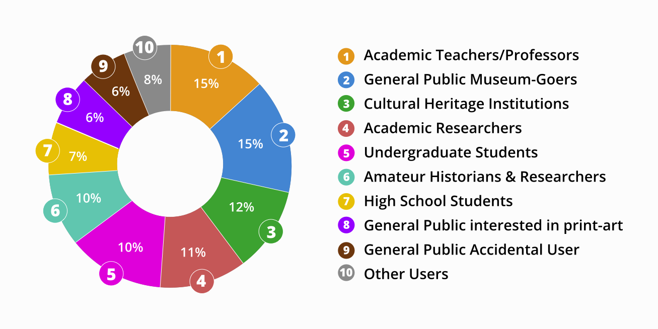
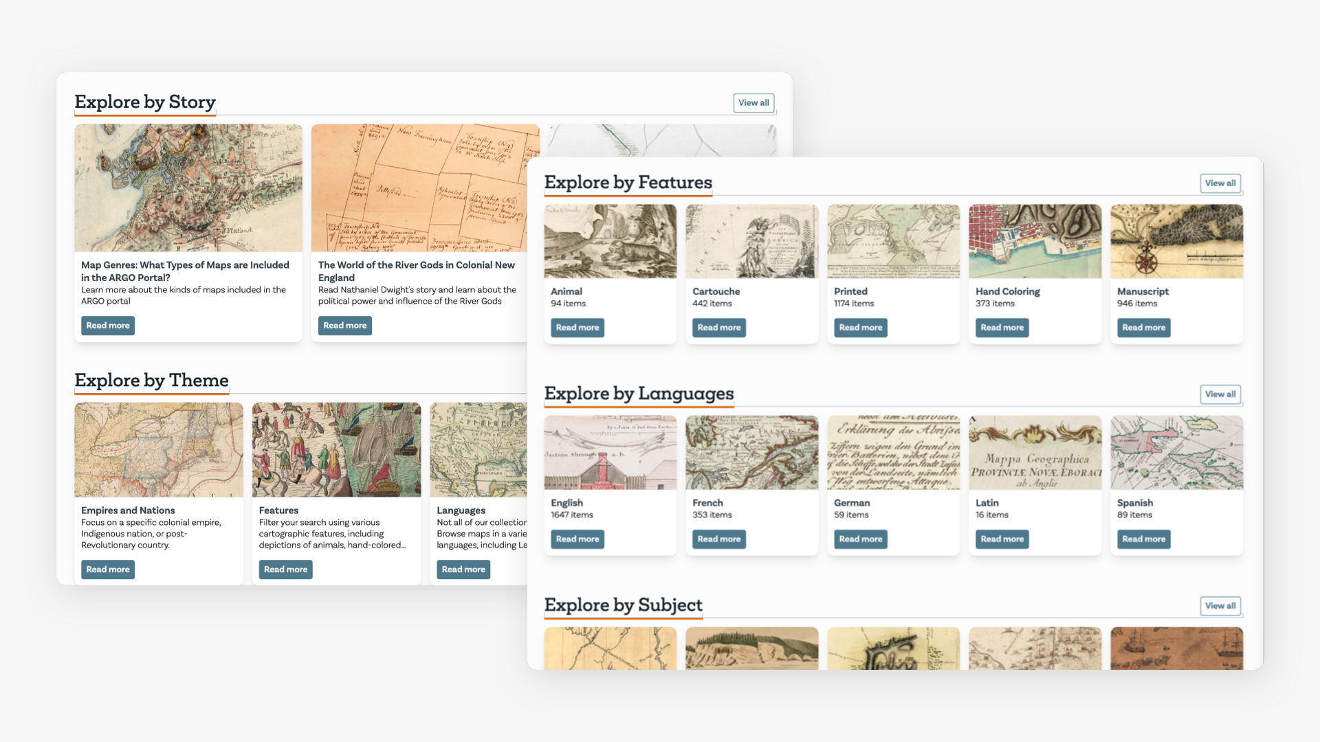
Subject / Feature Entry Points:
Beyond geographic details, users can engage with map elements, such as the intricate cartouches along the borders, and historical themes like the animals of the era, as well as people and languages. We identified a few key areas that people would love to explore and worked with the folks at Mount Vernon who could identify and add that content to the maps. The animals are endlessly fascinating—the map etchers at the time had never seen many the animals depicted, and had to use their best guesses on what the animal might have looked like.
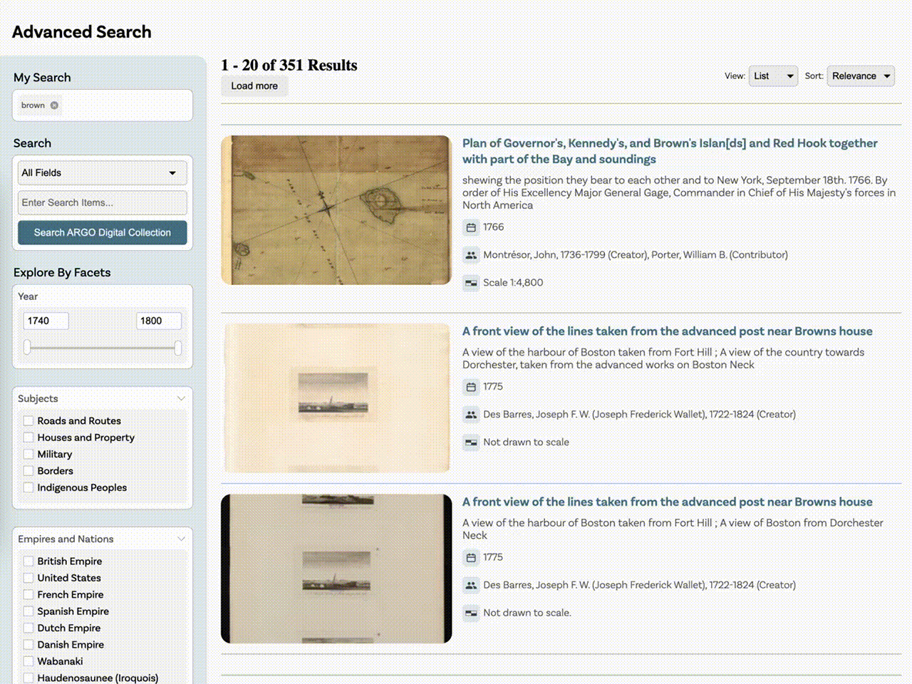
Search
One of the more challenging aspects of the site is its hybrid approach to content source. While the site has great local and curated stories and content, the map data and imagery aren't housed on the site, and the site has to expect the source maps collection to change over time. Search is vital to a site, but this system needed to search both local and source collection content without a user noticing the different background connections.
We built an advanced search system that lets you start with a search term or just start by viewing all the maps and paring down by subjects, years, empires and other facets, as well as features like hand-coloring or marginalia to find just the right maps. (Unfortunately the site doesn't support advanced searching at this time.)
Other Key features Included:
Local Curatorial vs Offsite Map Content
As introduced above, the site has multiple sources of truth, notably a local set of curated maps and stories written by Mount Vernon's historians, and the offsite map data that contained maps from many institutions.
We developed a middle data layer that enables staff to effortlessly manage and expand the collection. Curators can create tags, timeline events, and thematic categories, then tag individual maps accordingly. As the collection grows, this flexibility ensures that new discoveries by scholars can seamlessly integrate, enriching the collection's narrative over time.
Good Librarianship Through Best Practices
In collaboration with the Leventhal Center, we adhered to their archival best practices in what they considered “good librarianship.” Working with library experts underscored the value of these standards for sustainable, accessible data management.
In the end, the local data was stored in a Git repository that's a structured file system with markdown formatted files, and a data-storing system in each file called frontmatter. This allows for long term storage and easy editing of content. For Byte's own projects, we tend to prioritize data normalization and keeping the data in standardized databases, so this was an opportunity to try new ideas in archival content.
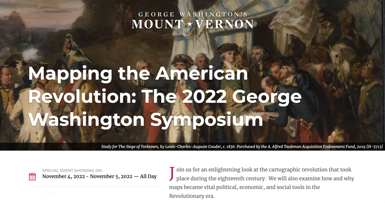
Site Launch at the George Washington Presidential Library
The site was launched at a special symposium called Mapping the American Revolution in November, 2022. Over the two day event, lectures included map historian luminaries including John E. Crowley, Nora Slonimsky and a great talk about mapping the origins of urban violence with a series of maps based in New York City in 1765-1768 with Ala L. Montgomery and Richard H.. Brown.
We had an opportunity to attend the symposium and talk to participants and presenters both about the subject matter and ways to improve map education, and ideas about the site. We also had the opportunity to have talk with Richard Brown, the map collector and namesake of the maps collection at Mount Vernon, along with other historians and map experts, all who have been instrumental to helping Americans understand the origin stories of America and historians make connections that were never before possible without well-crafted websites and better librarianship.