Work
filter your experience

Services
Creating a world-building library website for kids
Befitting of a cultural institution like Milwaukee Public Library and its many programs and opportunities for kids
Overview
Milwaukee Public Library (MPL) has extensive programming for kids including story times, classes, events, kits and a lot more. They also have a strong children's collection at every branch, and the Central Library branch has a children's wing with the floor designed by children's book writer and illustrator Lois Elhert.
MPL wanted to create a kids mini-site that can be a starting place for kids from age 0 to 12. MPL also has a mascot, Browser the Library Lion, who needed to be brought to life.

Process
Any time we start a project like this, we research to find comparable sites, in our case within libraries and outside of libraries. We also ask a lot of questions and hope to create some basic documentation about who would use a site like this and what they'd want to achieve.
It's common for us to creating "proofs of concept" sites, mini-sites that only show a prototyped version of an idea, with just enough technical detail to show if that idea is worth pursuing. We made many for the kids site that explored world building and Rogue-like gaming.
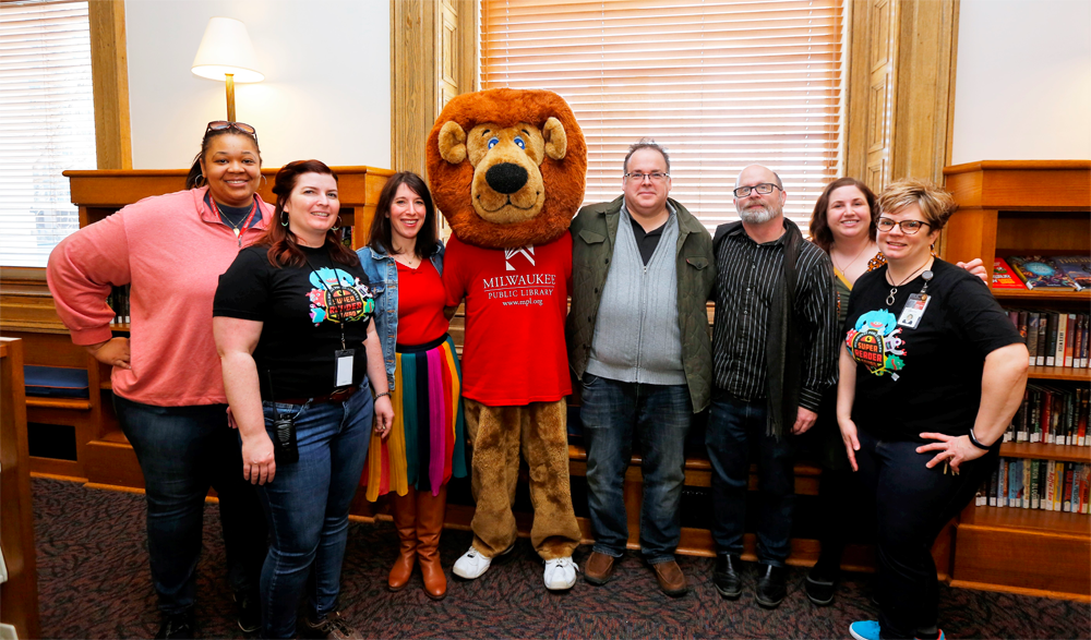
We knew we wanted to make a dream site that really connected with kids, so we need to find the dream team to help put it make it happen. In this case the team included an animator, designer, illustrator, programmer, creative director and a team of MPL children's librarians and the MPL webmaster. And, of course, a large, dancing lion.
Content Strategy
The more we talked about a website for kids of ages basically 0 to 12, the more we realized there's no way we could be as effective as we wanted talking to the entire range of kids as one. Kids that are less than 5 years old have very different skills and modalities than an 11-year-old.
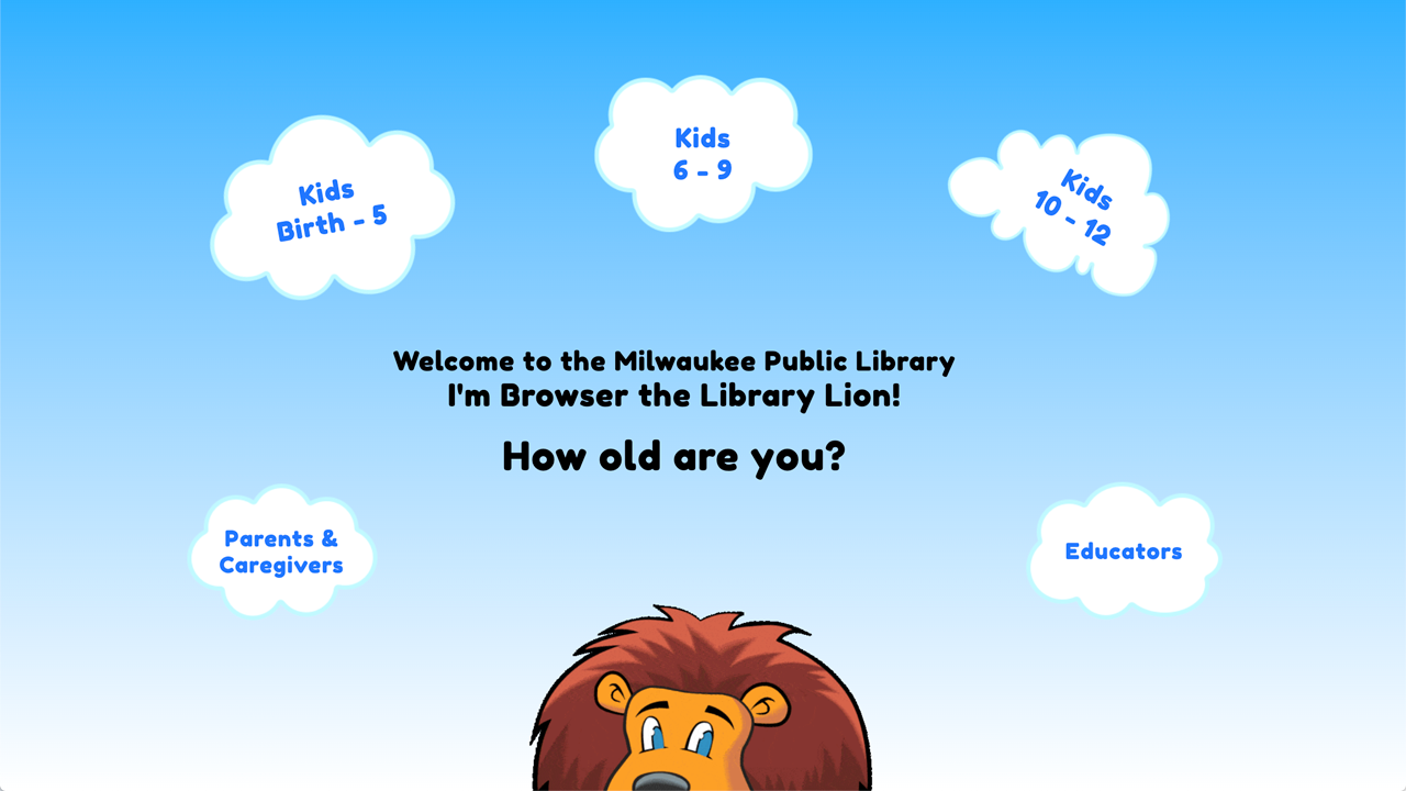
We asked the library to find help us find sub groups of kids, and we decided on 0-5, 6-9 and 10-12. Since the website was going to show upcoming events and book lists, we also asked the library to tag events and book lists with each of the appropriate ages, and we rebuilt our importing software to make those changes work on the new site.
Design challenges
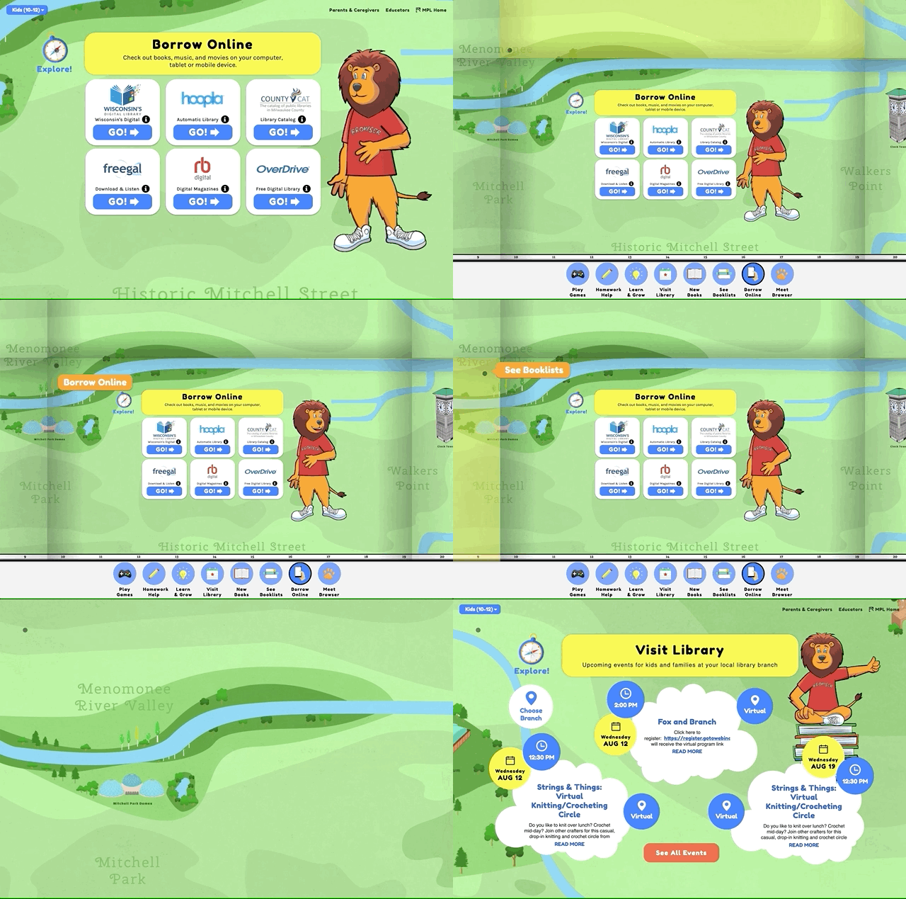
The big design issues were going to be about explorability and age-aware design. We've seen a lot of library kids websites, and few seemed to aim for explorability. We wanted to help kids explore and play on the site. Age-aware design on library sites was basically non-existent. So we knew we were in uncharted waters.
Even if age appropriate design isn't well represented, it isn't terribly complicated. There are lots of UX and design articles about designing for kids. Younger kids respond better with more primary colors, more basic shapes, less interface and certainly less complicated words.
We also needed to create an interface that first asked kids their age when going to the site, which we settled on clouds. We then needed to make changing ages easy, as there are plenty of parents and caregivers with kids in multiple age groups.
Explorability is a bit more interesting, and this is where our creative direction, creative coding and proofs-of-concept (POCs) helped. A designer and a developer worked together to produce a few very different POCs each exploring different ideas. We had one with maps, one with an island that kids could explore different scenes, and a few that were just out there, spacey fun ones.
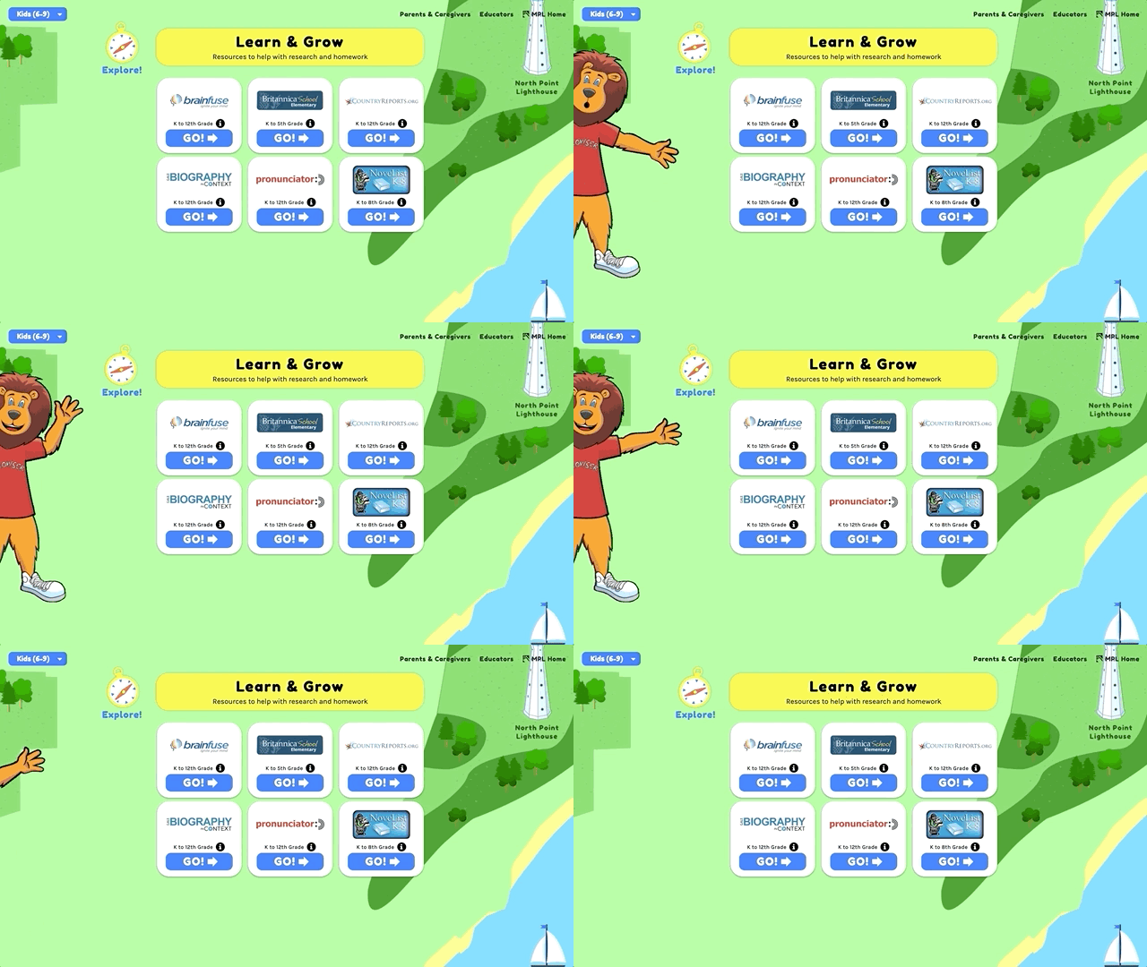
The POCs help us internally know if any of the ideas have merit, and then help us show the folks at MPL different options to see their reactions. The exploring by map and on island really started to work, so we invested more time fine tuning those ideas. In the end we merged the map and island theme, and in a total aha moment with the children's librarians, we realized that map should be Milwaukee, and the kids could explore the landmarks and things they know and discover other landmarks and things that were new.
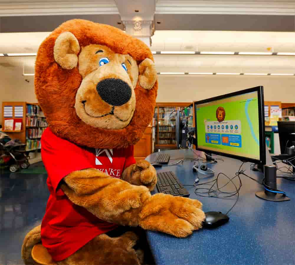
To make this really come alive for kids, we knew we wanted to have an animated version of Browser, the library lion, and we worked with illustrator and animator Chris Higgens. We worked through some important questions (teeth, no teeth) and made a sequence of places the animations would engage kids throughout the map.
Programming for People
It would be a lot easier to make a site and push it out the door, but we have standards that go beyond most design and development studios. We needed this "single page application" to have features that helped people at every step, from viewing alone as a kid to having a young kid sitting on a parent's or caregiver's lap, to sharing on social media.
Here's just a few things that take extra time but make people experiences better:
- URLs that update automatically so at any time someone can share a link and that link will go directly to the same page
- Cookies to remember someone if they'd been there to avoid asking them their age again
- A system that works on mobile and tablet, but has enough similarities that someone who's seen the site can easily find it again on the new screen size
- Screen size adaptations that allow for what would normally be considered "edge cases" like Chromebook laptop.
- Dynamic animations to make it feel like one cohesive system, so a designer managing paint and other animations.
Lagniappe
We do a little something extra for every site that's beyond budget, but so perfect it just has to be done. MPL Kids had a map and a system of exploring it, but the ability to move around was a little more difficult and required multiple steps. We found last minute a much easier way to move about could be done, and added it in.
We also found a way to dynamically create content that fits into overlays, and a bucket system to point to them, so certain age grouped kids can see better content along side parents and caregivers.
