Work
filter your experience

Services
A great American library embraces the internet as its most dynamic branch
Byte has been working as a long term partner with Milwaukee Public Library (MPL) and watched the library become a more modern, creative and dynamic library, with its website and digital outputs being considered its 14th branch.
The Beginning
MPL is a large, dynamic library with 13 branches, 1.2 million collection items, a drive up window and a neighborhood 24/7 materials kiosk, not to mention thousands of events, programs and classes that help raise the level of access and education in a large post industrial city. They include all of Milwaukee with events poetry slams, haunted libraries, rap battles, deaf storytelling, children's parties and so many more. MPL is one of the many examples of local government doing stellar, good-news-headline-making work.
But the library didn't always seem this dynamic, and MPL was just starting to find a new way to communicate and show the value of the library. MPL asked Byte to create a website back in 2013, and had a very specific set of features and design requirements. They'd created their own site up to that point, and then worked with an agency to build a site for them, and they were not aware that a small studio like Byte could be deeply consultative as well as creative.
MPL wanted a site that could show the width and depth of their services, events, materials and special collections. The site really needed to include blogs, a dynamic calendar, mapping tools, connections to the available databases and services, and various other content.
We saw a site like MPL needing to go a bit farther. We believed the site needed to work for people across a wide spectrum of technical skills and abilities. The site's data needed to work as open data -- to allow their collections and special collections as data sources others could use. The site needed to start a conversation, needed to feel current, and needed to show a dynamic, modern library that gives stakeholders and the city an opportunity to be proud of their government works.
Content Strategy
When we first started the project, we learned just how much a library works to help a city become smarter, more connected and have more opportunities. We also learned a lot more how real people use a library, how libraries across the country are helping people with so much more than finding a good book.
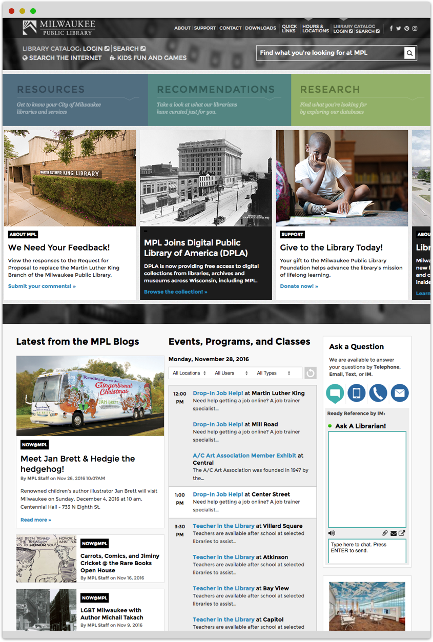
We started to see a large library like MPL having three major parts to it:
- The books and CDs and DVDs and materials across the special collections. This is the part that everyone knows about a library.
- How librarians and administrators offer services and expertise from everything from searching to finding a job, to everyone in the city representing every skill level. Few people think about this level as a value.
- The online databases and materials that people use to study, learn and research subjects, and the subject matter experts at the library that help facilitate research. Few people know this level even exists.
As we did site map explorations, we found that a standard navigation (i.e. About Us, Our Collections, Our Branches, etc.) missed an important point, that the library has more than materials, and that the people, events and programs are the real value of a library. We try different sitemap "themes" when doing the explorations, and for us it came down to the three major parts. So explored a sitemap that follows the three parts to a library and ended up with:
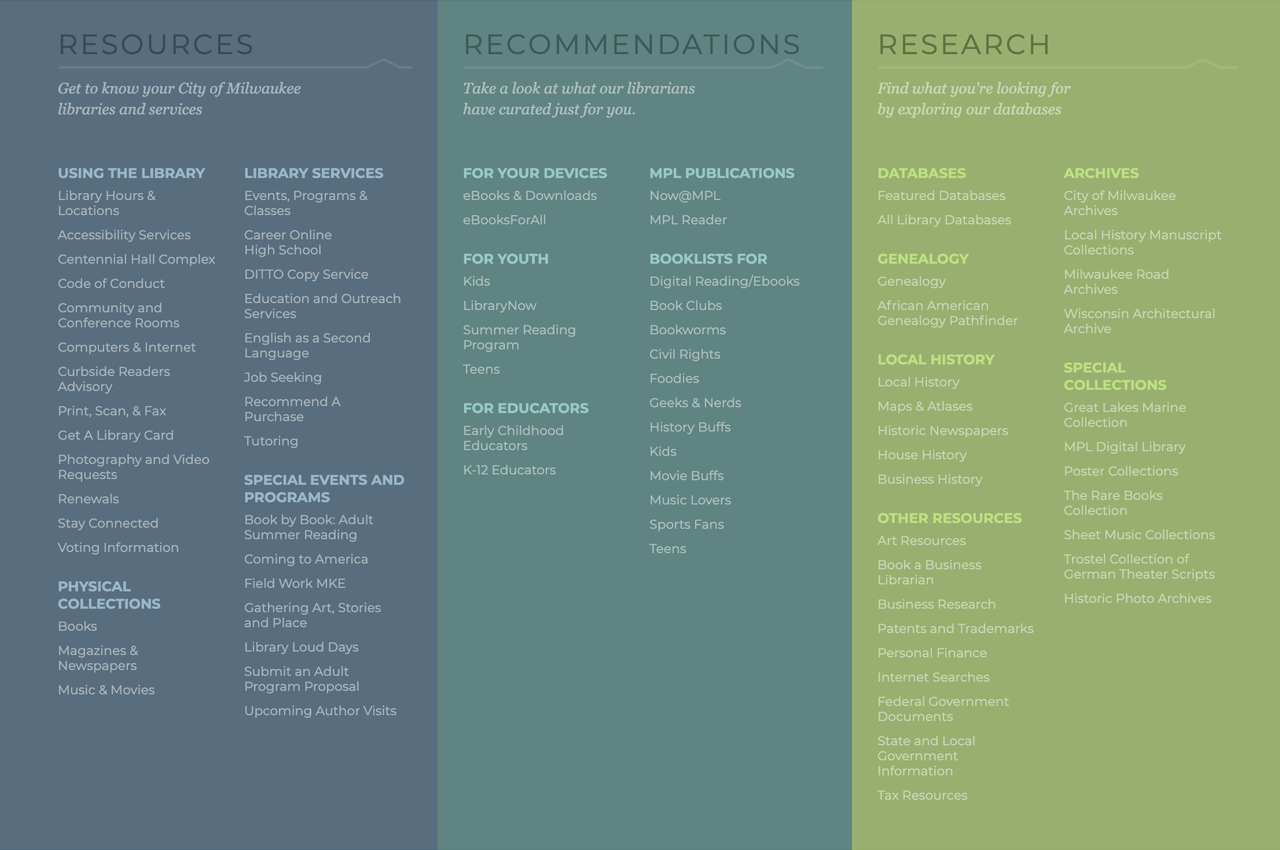
The question was, at that point, how do we help people understand what goes where, or how can the navigation itself be didactic and show the value of the library? We had the full menu open all three groups at the same time on the home page, and then have more logical, guessable groupings underneath, so people would read the sections as the primary menu and the Resources / Recommendations / Research as just a way to separate the groups. By the time they get to secondary pages, we can keep them separate but easy to explore with the least number of clicks.
Didactic menus usually have a shelf life, and we imagine the next rebuild to find a more modern grouping approach. When we started, MPL was just starting to excel at communicating their value, this was a bold approach to launch the new site.
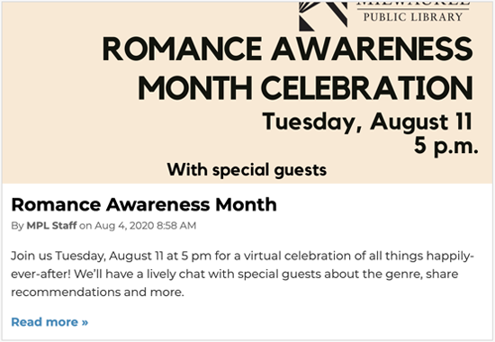
We also helped stakeholders get into blogs that would connect with a disparate group of patrons and find content and data sources that could shine more light into lesser-used parts of the library. In general show the library as more relevant to a wider audience, from kids and teens to parents, educators and other audiences.
On-Site and Beyond-Site Tools
Over the years we've added a myriad of tools and interfaces to the library's website, and tools beyond the website including screens and kiosks. On the website we've created
- Website databases, including blog, booklists, etc.
- Federated search merging MPL content with CountyCat (the county-wide LIS) content so that when someone searches for a book or an idea, they can find materials, programs, events and blog posts on the subject in one search.
- A COVID-19 resource explorer that helps people find trusted information about the coronavirus and how to get testing, find trusted sources, and find help from the economic and psychological effects of the pandemic.
- An intranet that includes workers information, forms, policies and portal links to important areas.
- ShipShape database of all the ships on the great lakes.
We also created multiple side or mini-sites for different audiences, including:
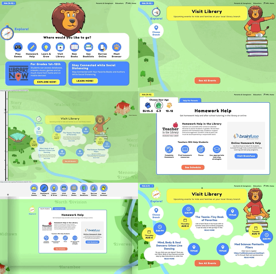
- MPL Kids, a separate interface for events, offerings, book lists and kids info divided into multiple age groups.
- LibraryNow, a program that gives digital access to kids across school districts, and the site covers the offerings, process and policies for students and educators.
- LibraryLoud event website including Haunted Halloween and MPL Rap Battle mini-site (with Milwaukee ad agency Cramer Krasselt).
Beyond that we've extended the library's content beyond the website, including:
- Digital slide management for 30 screens in 6 branches, a (currently) television-based information and help system across the library, with central management that integrates campaigns and blog posts right in the screens. This allows for useful walk-in screens that say "today in the branch"
- Listening to Mitchell kiosk, a digital format for a placemaking art exhibit that happened along Mitchel Street and is now archived at MPL and accessible through their website and a digital / artwork exhibition at Mitchell Branch.
- In-library search kiosks, lab computers and WIFI are easy ways to connect with people at the right place and time.
With the changes we've seen in our first seven years at MPL, We imagine MPL to keep branching into more media with stronger, more visionary ideas. We've loved the opportunity to build tools that communicate the value and give new opportunities to patrons and residents.
Digital That Stands the Test of Time
Library websites have to live by different standards, from accessibility to security to design aesthetic. And a library website like MPL is very heavily used, so needs to pass technical requirements that aren't usually needed for smaller websites.
We've been building websites for a long time, and we have a set of guiding principles that have helped us create sites that last longer, require less maintenance and are more secure. For long-term sites like MPL, we've also avoided the visual trends that date websites very quickly and instead work in a more classic design style of hierarchy and readability.
More important than that, though, is extensibility, the ability to build onto a project like this with new tools, frameworks and ideas, while still being able to keep the brand consistent. We have a simplicity standard for coding that allows us to build very large sites with very little technology, using a more content publishing than content management methodology, and using real, easy-to-visualize data for any data point on the site.
Learning From the Experts
Website can be one-way devices, digital brochures that are published and sent into the wild, or they can be two-way interfaces, points of knowledge that show what is known and ask what is unknown. We love feedback, we love learning from people who are stuck. When we take a large website live, we often have a banner that asks for feedback at any point someone gets stuck. We also build in reporting that can alert us when errors have stopped someone from finding what they need. And we ask our clients to forward us any issues the stakeholders or patrons have.
As a studio that thrives on long term partnerships, we also value the input over the years, and want to have open, honest discussions about what the site is missing and what can be improved. MPL has a web committee that meets regularly to discuss issues and feedback, and they regularly report to the webmaster who works with us to solve the issues. MPL is very issue driven, and they solve every issue every stakeholder and user might have, which is great. The longer term, though, is a bit more difficult to plan out and requires leadership that's from both teams. We've attended some of the committee meetings and helped build longer-term roadmaps to map out how the site and data interfaces might work in the future, and the processes to get to that point.
Having an open dialog and strong long term relationship can help us learn from the experts -- the librarians and patrons of MPL -- and help lead the long-term efforts of a library website that shows the relevancy of MPL.
Lasting Results
The way we see it, MPL has transformed into the digital and social age with vigor and creativity. The librarians and admin team have moved from the 'ssssshhh' library and the list-of-links website of the past to the vibrant library and site of today, and they've moved the needle of librarianship in this digital age. We couldn't be prouder to be a part of this transformation, with us learning so much in our time so far.
In terms of metrics, basically every metric has been transformed to required usage to inspired reading, sharing and communicating. The statistics have gone up so much that we don't even consider them before and after. (Numerically the site saw 130k sessions per month before we put our new version live, and this last year we were seeing 750 - 900k sessions per month, a 700% increase.) What we really care about, and what we find the most amazing, is how much MPL has invested into its digital branch, from populating it with rich content to staffing it with a team of webmasters and content managers and social media folks, and then seeing how that garners a substantial audience.
I can’t tell you how much we appreciate your expertise and enthusiasm for the library. In 33 years at MPL I can honestly say hiring Byte was one of the best decisions we ever made.
Milwaukee Public Library