Work
filter your experience
Services
A rural arts center with heart
How delight can help discovery and increase opportunities to tell a story
Overview
The Schauer Arts Center (SAC) is non-profit, regional center for the arts that opened in 2001 in an old canning factory in West Bend. SAC presents professional touring performances, regional artwork, and also serves as a home to the Hartford City Band, Hartford Community Chorus, The Hartford Players, and the Kettle Moraine Fine Arts Guild.
SAC wanted to create a wider audience base that included younger patrons, show the community the value and offerings of the School of the Arts, and, as much of the revenue of an arts center is in space rentals, show brides and meeting managers the center’s offerings for venues.
One of the things we noticed was SAC runs a vital, dynamic school of the arts that was getting left behind on their communication and on the website. From our work with the School of American Ballet and Milwaukee High school of the Arts, we understand just how important it is to help parents and the community know the value of an arts education, and we wanted to highlight the arts training to help elevate the school in the community.
Data Discovery
SAC's website needed to integrate a popular ticketing and class management software called Theatre Manager. Theatre Manager has an API, but like most APIs we interact with, this API was not helpful. To even understand the API was a challenge, and to find the necessary data -- events and classes -- required a data explorer and 101 tests working with SAC staff.
When working with data projects, we need to find a single source of truth for all data. If we don't find a single source, any events or classes added would have to be added in two places, and that will increase the chance of data error that could cost the SAC real money -- marking a show or class as sold out that isn't, for example.
We ended up carving out a system that uses Theatre Manager's API in a few unorthodox ways -- passing through data in fields that weren't intended for such usage. That allowed us to partition the data to put in the correct places throughout the website and include images in multiple sizes on the Theatre Manager side without having to intervene using the site's CMS.
Content Discovery
After figuring out what was possible for the events and classes data, we need to dig into audiences, use cases and SAC's goals and content. SAC is a multi-use space and organization, so we needed to work through the needs, content and goals for parents, renters, donors and people who enjoy shows and music in general.
We subdivided these groups to discover who might be renting the space, say, brides, brides families, organizations, business, etc. that might rent the space so we could find unique needs and content that would fulfill these needs. To help elevate the school and the need for arts education, we also asked deeper questions about the arts in general.
We then created competing versions of sitemaps to show different content approaches, from a genre-based event approach to an audience segment based approach, to the current approach we decided upon, a top-use-case driven approach. Exploring themes help SAC and Byte better understand how telling the story a different way changes how people perceive an organization.
Brand depth
SAC had a logo, but we found it was used inconsistently and was the only element of branding in an organization that needs a much stronger depth of brand. That being said, each season had a thematic difference, so whatever the branding, it had to be malleable to fit the seasons.
An issue we had with the logo was that It was comprised of three disparate thematic elements: a big, soft curved art-deco S dividing a box with a seeming line of stage footlights, with one side having what appears to be child-drawn people's heads, making up what seemed to be a theater scene.
Turning a weakness into a strength, we reverse-designed the meaning into disparate brand elements on the site. We found more meaningful places for the elements. We used the gentle S to divide areas of the website, including the footer, using the footlights in different places, and creating textures throughout the site that harkened to audiences. With this, we helped make the brand much more cohesive with visual feel that was as unique as the Center.
Site Design
Finding the look for performing arts center and a school of the arts isn't easy -- by itself whatever is chosen is an overstatement. We've seen some arts organizations that the opportunity to be bold while most others found a way to have the boldness only in the details.
A second challenge for the design was the duality of an arts center that has both public professional performances and a school of the arts. Mix in the need to talk about rentals and weddings, and that's a lot of visuals that need to be housed in one place.
To solve for these challenges, we created multiple competing design ideas, pared down to a few to show to SAC, and in the end we explored two design ideas until we decided one of them was a clear winner. Concurrent designing isn't usually affordable, but for a site like this, it really helps ensure the vision is tested and understood.
Results
We don't often rely on site analytics to tell the story, but here's a few anyway:
- 2.5x increase in pages explored by people
- Page views went from 2.5 to 4 per session, resulting in a 25% lower bounce rate
- 600% increase in season subscription interest
Hands-on experience is a much better way to understand results. From Roxanne Daly, "We had a strong increase in class enrollment which I believe is solely due to the website being easier to navigate. We had an uptick in wedding inquiries. We are also steadily building our email list from the API which has been awesome!"
In talking about the data integration, Daly said it "definitely made adding events easier and has almost totally eliminated user-error on performance data since we're pulling right from Theatre Manager." For an arts center, performances are the bulk of the revenue, so getting this right was imperative.
Lagniappe
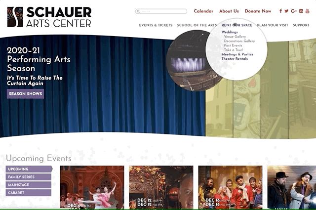
We usually find a little part to a site by the time we're done that's not in the budget but we do it anyway. Except this one was..ahem..in the budget -- we forgot the create the dropdown menus. But it's a good thing we forgot them, because by the time we remembered, we found smaller solutions on the site that needed a leader, a delight that started from the top, so we used animated circles with secondary pop-out circles for illustration in a way that we've never seen and really adds to the delight of the website.
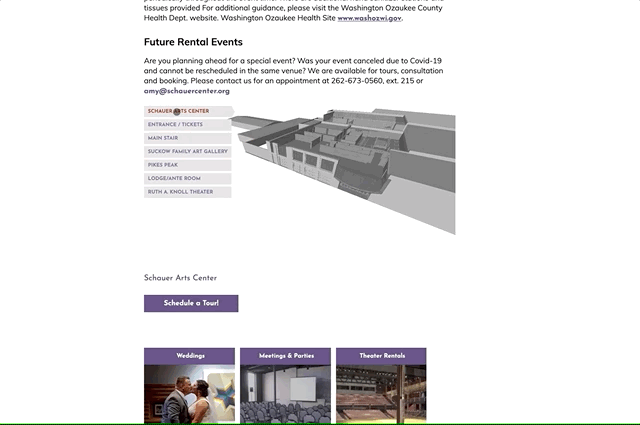
We also realized that the photos and galleries of the rental spaces didn't do justice to the actual space, so we created a 3D illustration of how the space works.
“The website made class enrollment easier, boosted rentals, and streamlined performance data—transforming how the community connects with us.”
Schauer Center