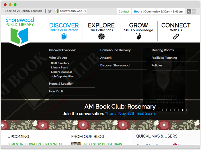
Creating websites that foster patron engagement, enhance civic pride, and position public libraries as vital cultural hubs
Explore our library offering by different focus modes covering our experience, accessibility, values and service level, as well as decisions about technology and data.
You are inOur Library-Focused Tools for Patron Engagement
We create independent or integrated tools for patrons and visitors to help libraries showcase the width and depth of their organization.
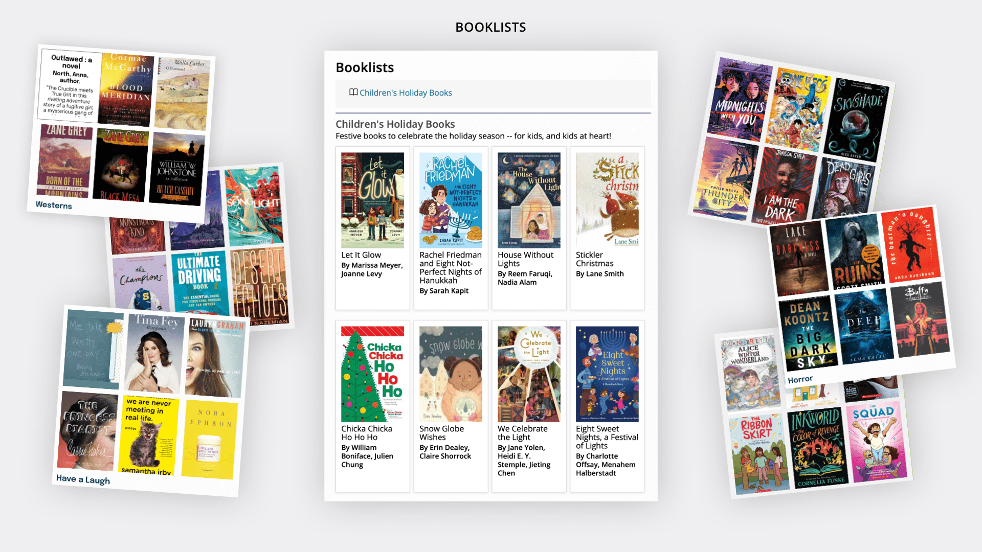
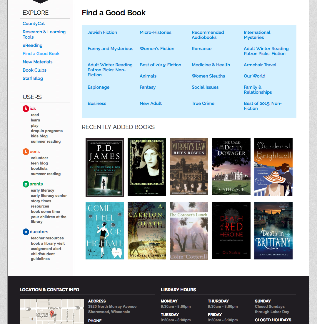
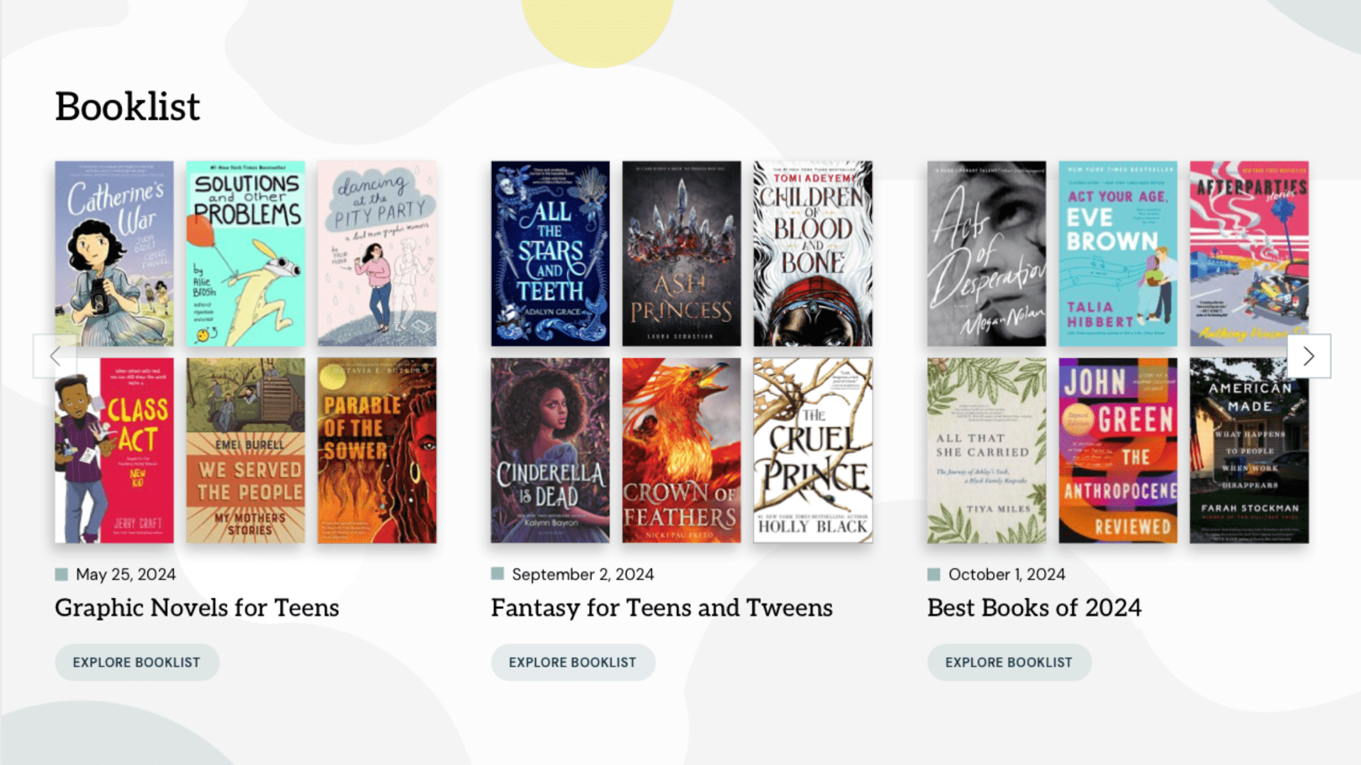
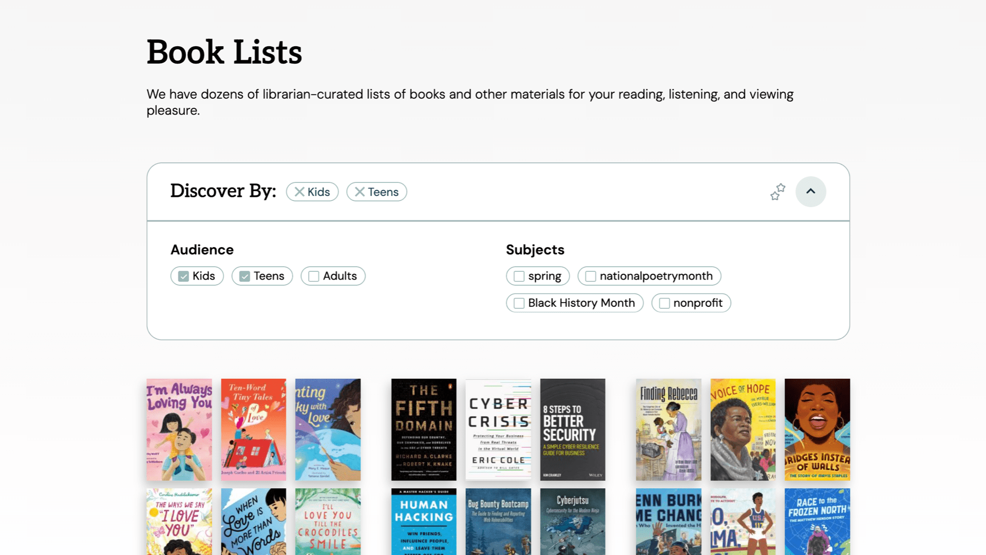
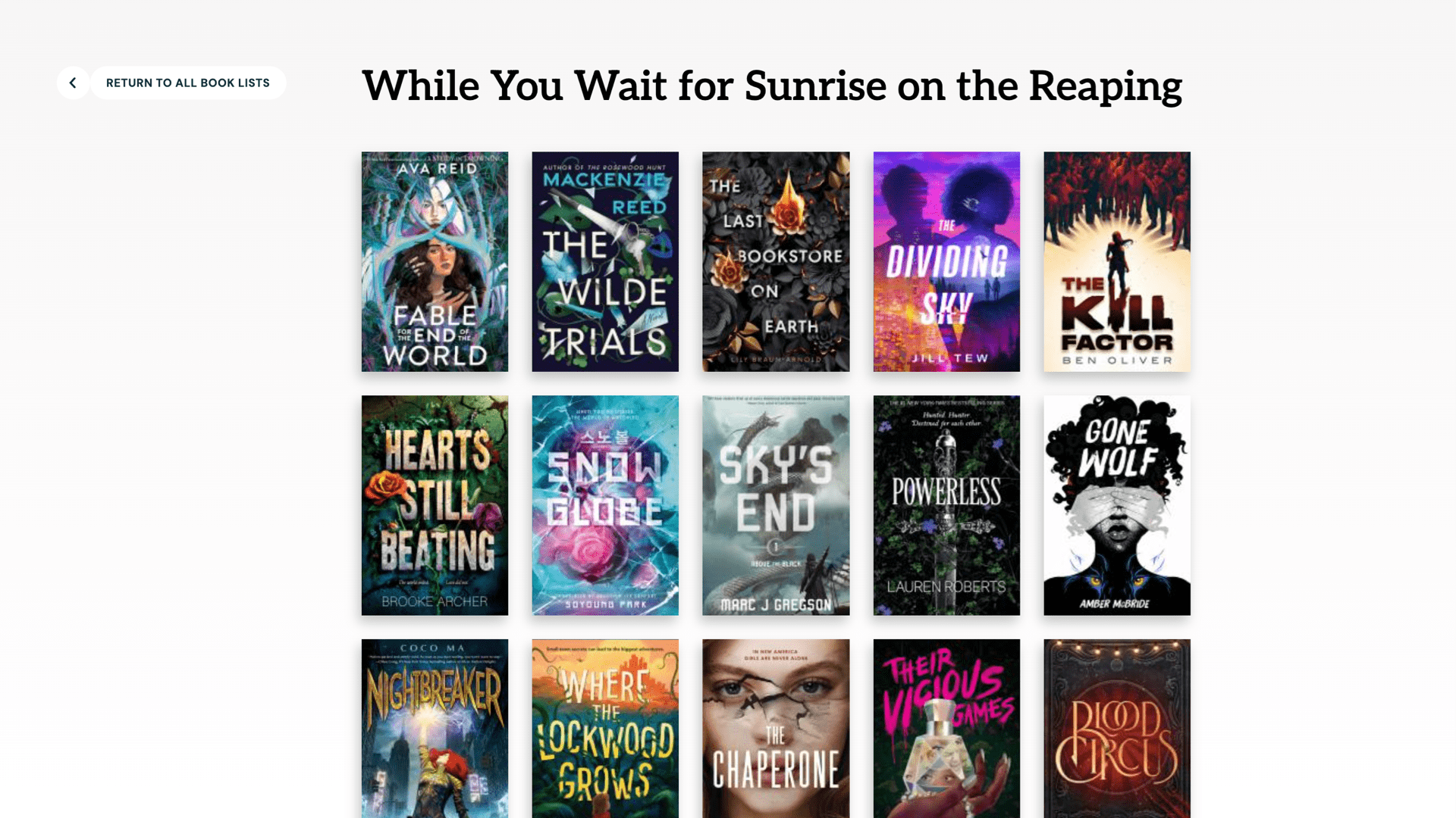
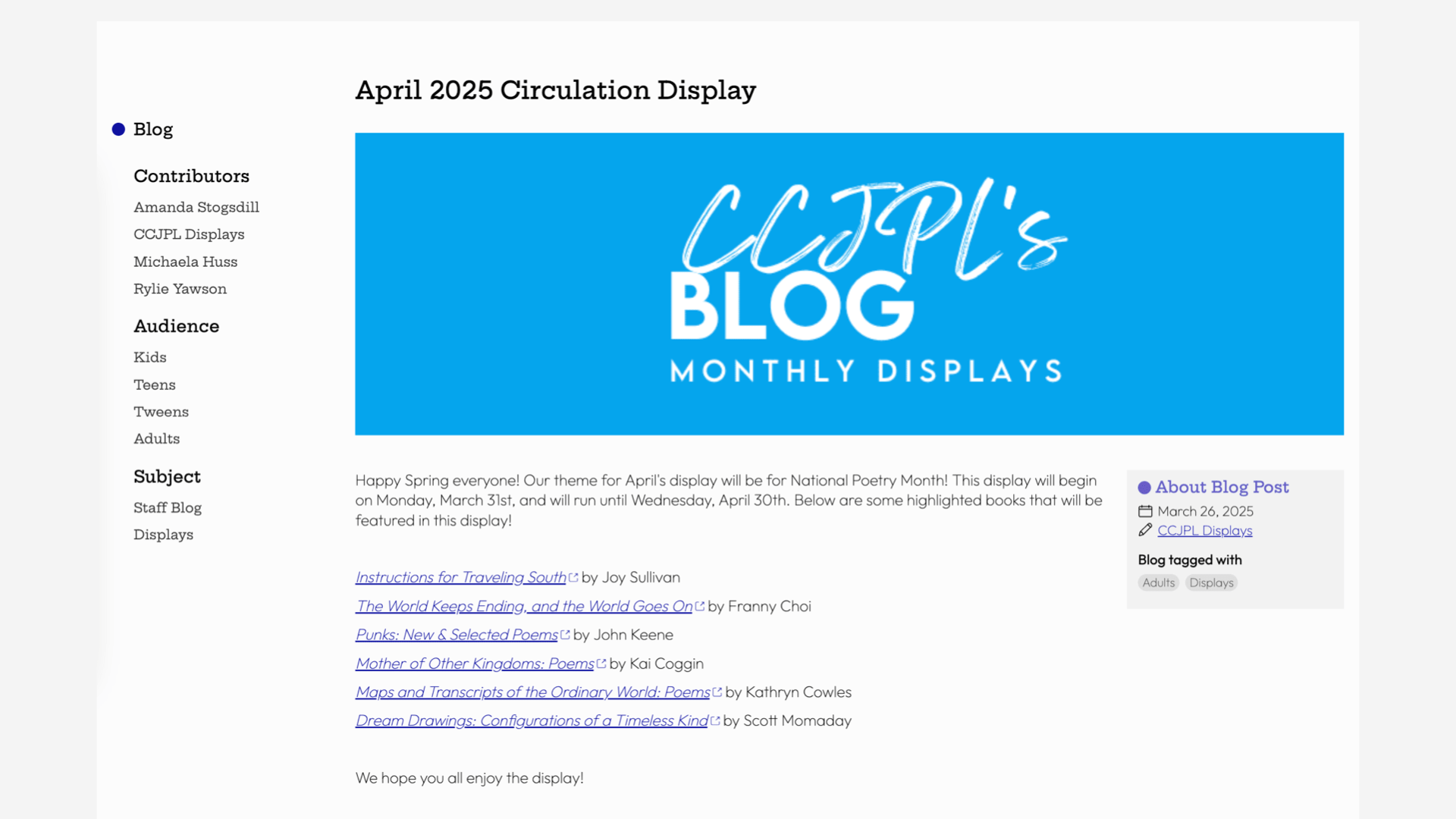
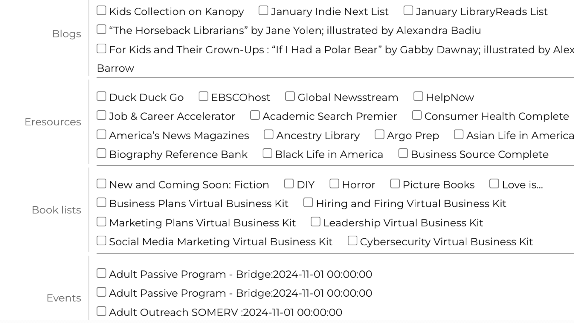
View All Tools Show Less ToolsBook Lists
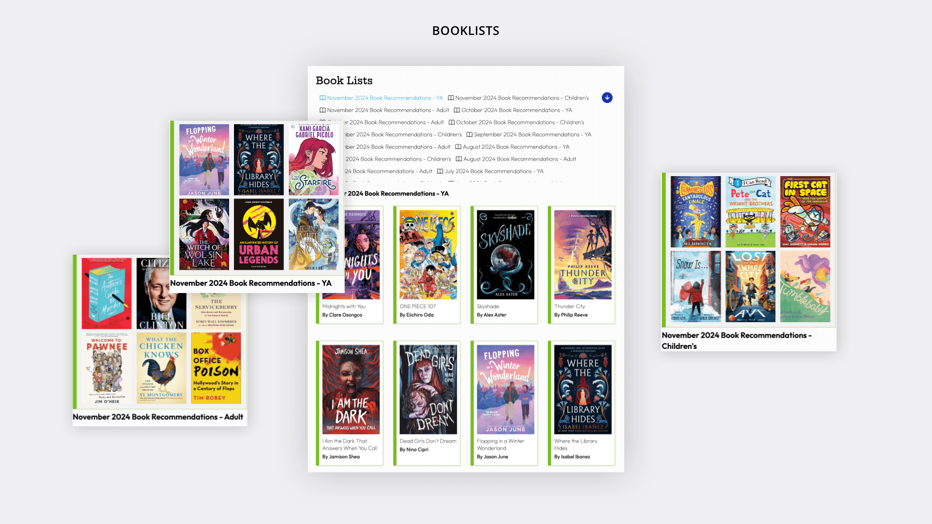
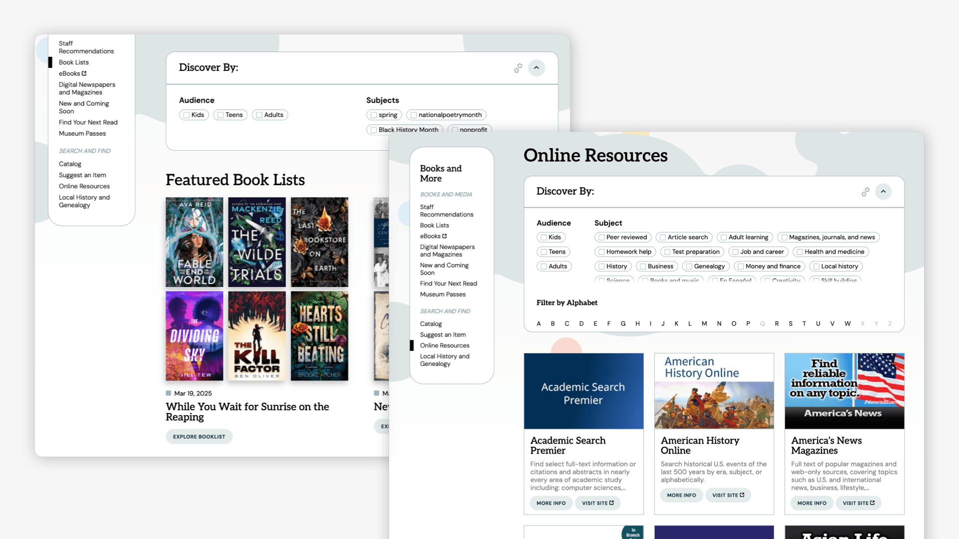
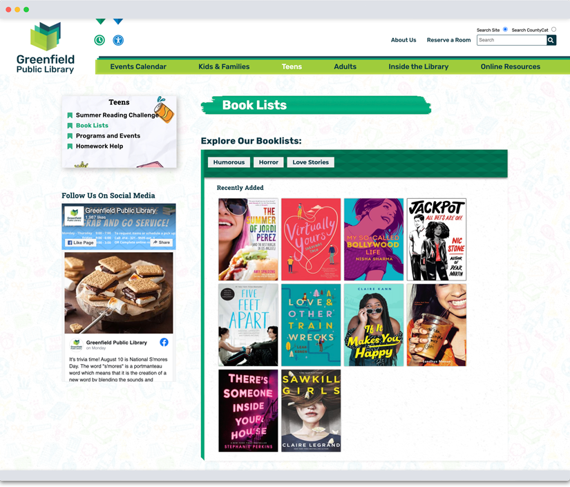
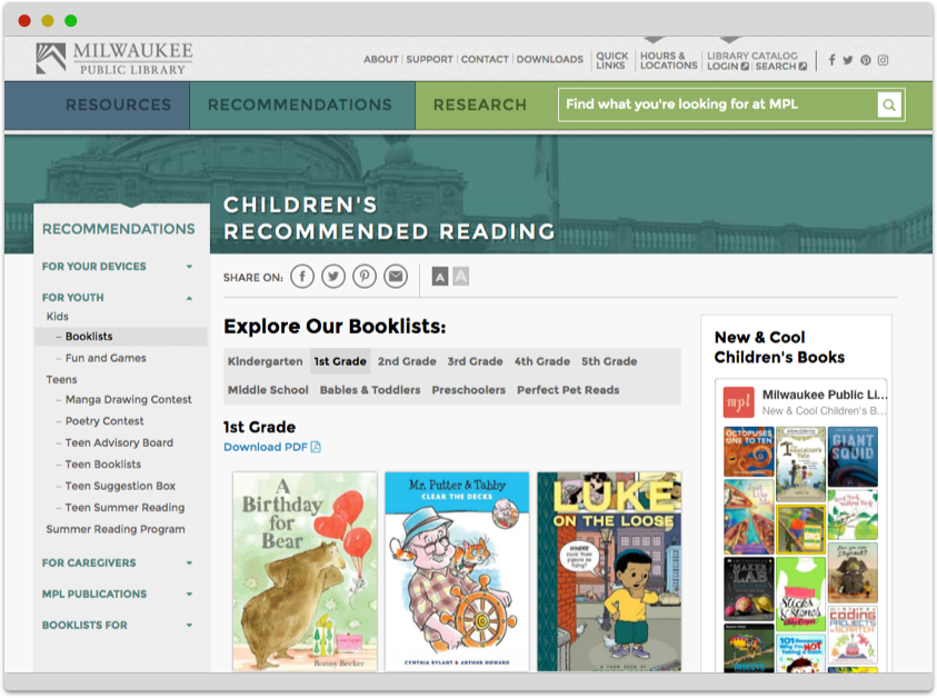
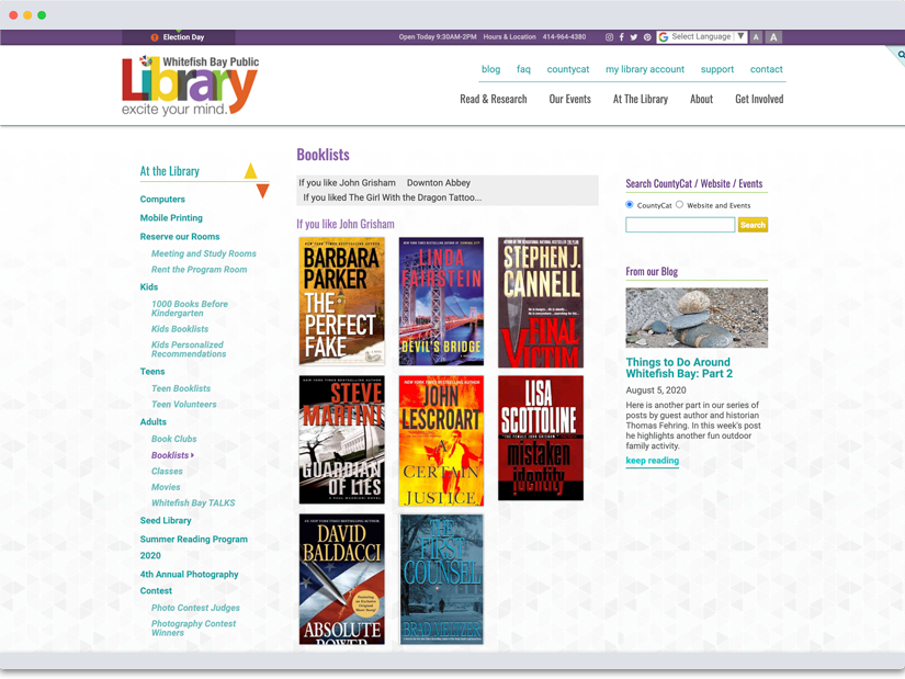
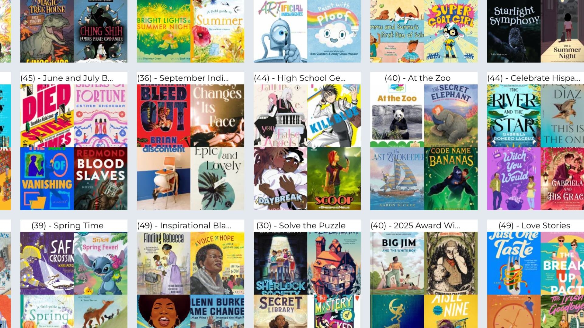
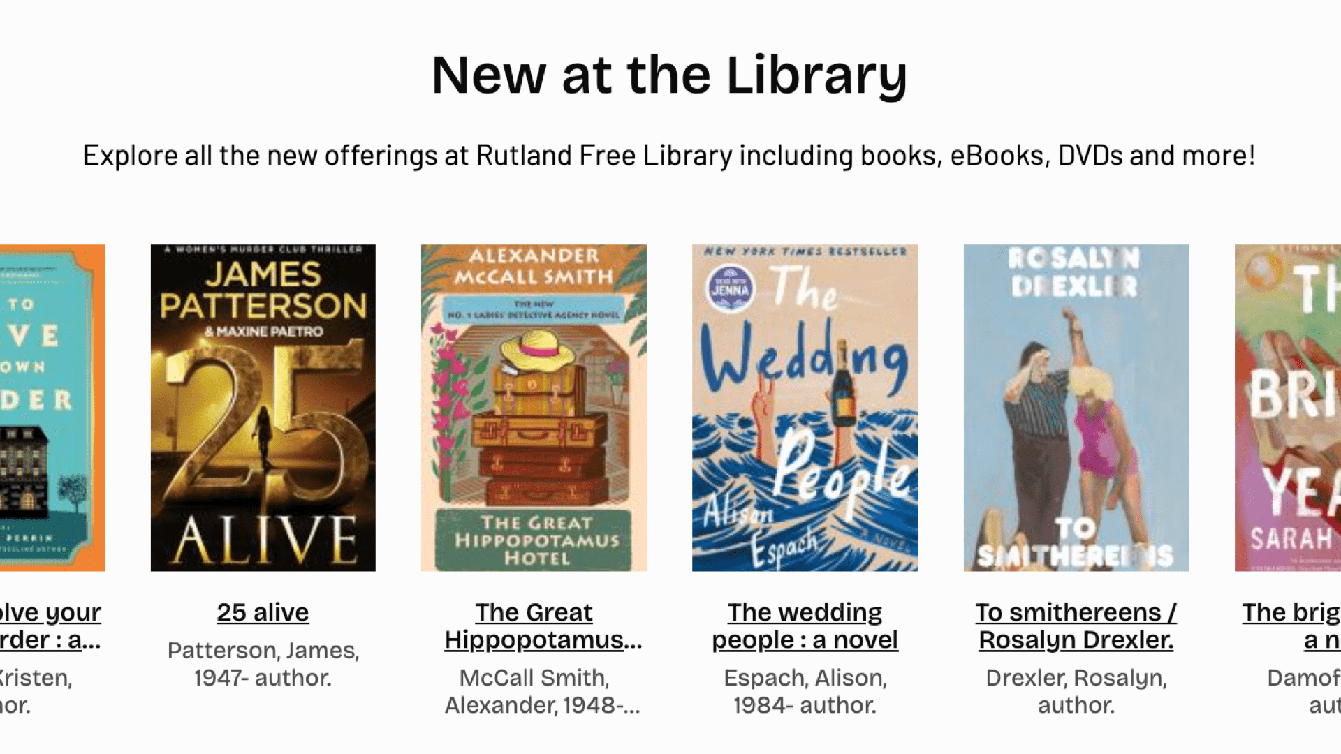
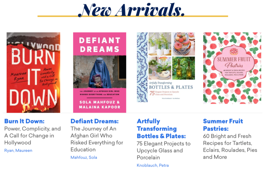
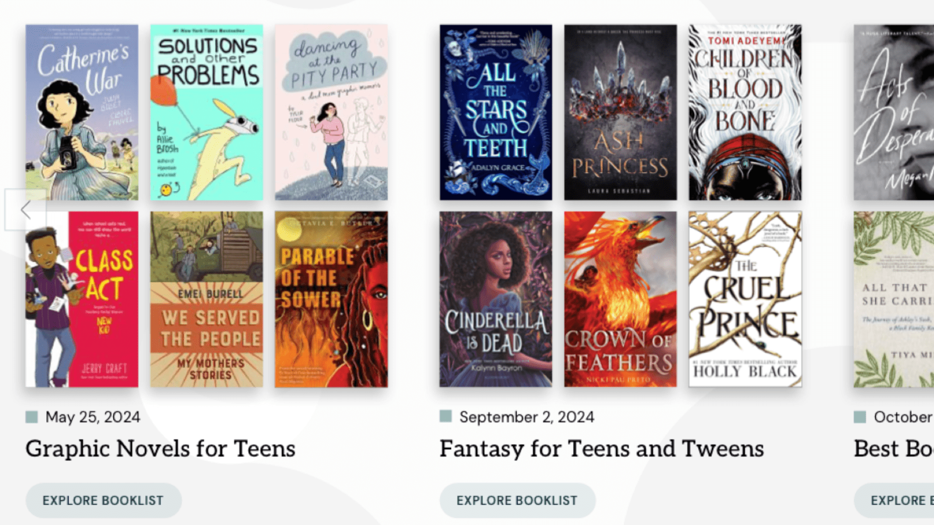
Create book lists around audiences, interests, librarian favorites, etc. Can be books, e-books, DVDs and other non-book materials.
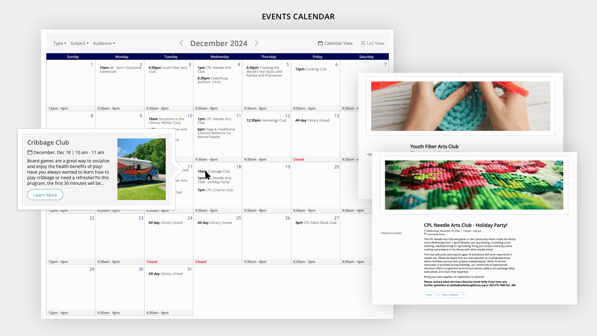
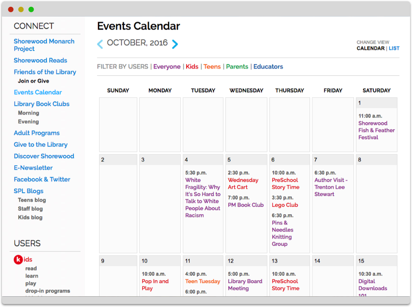
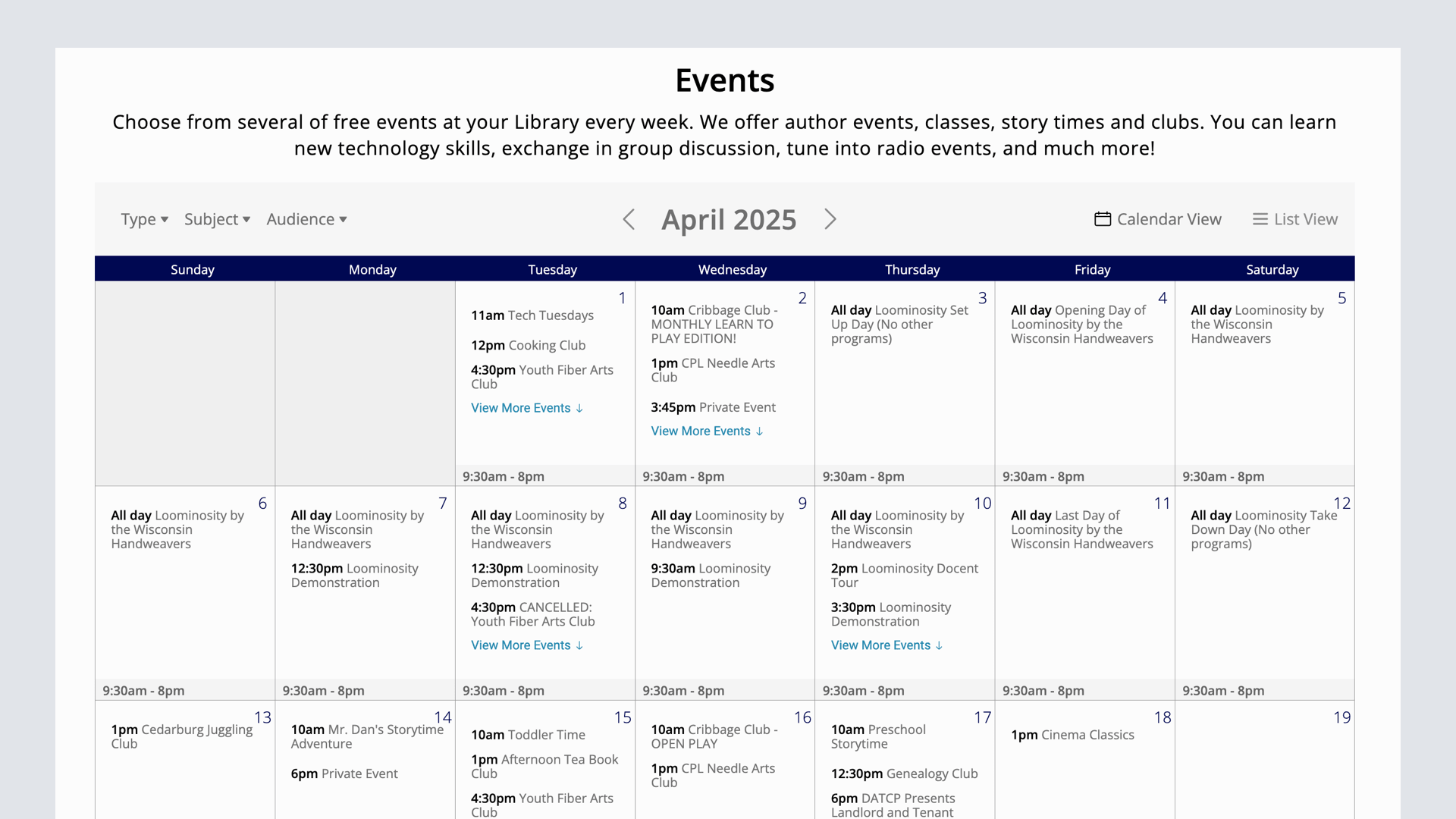
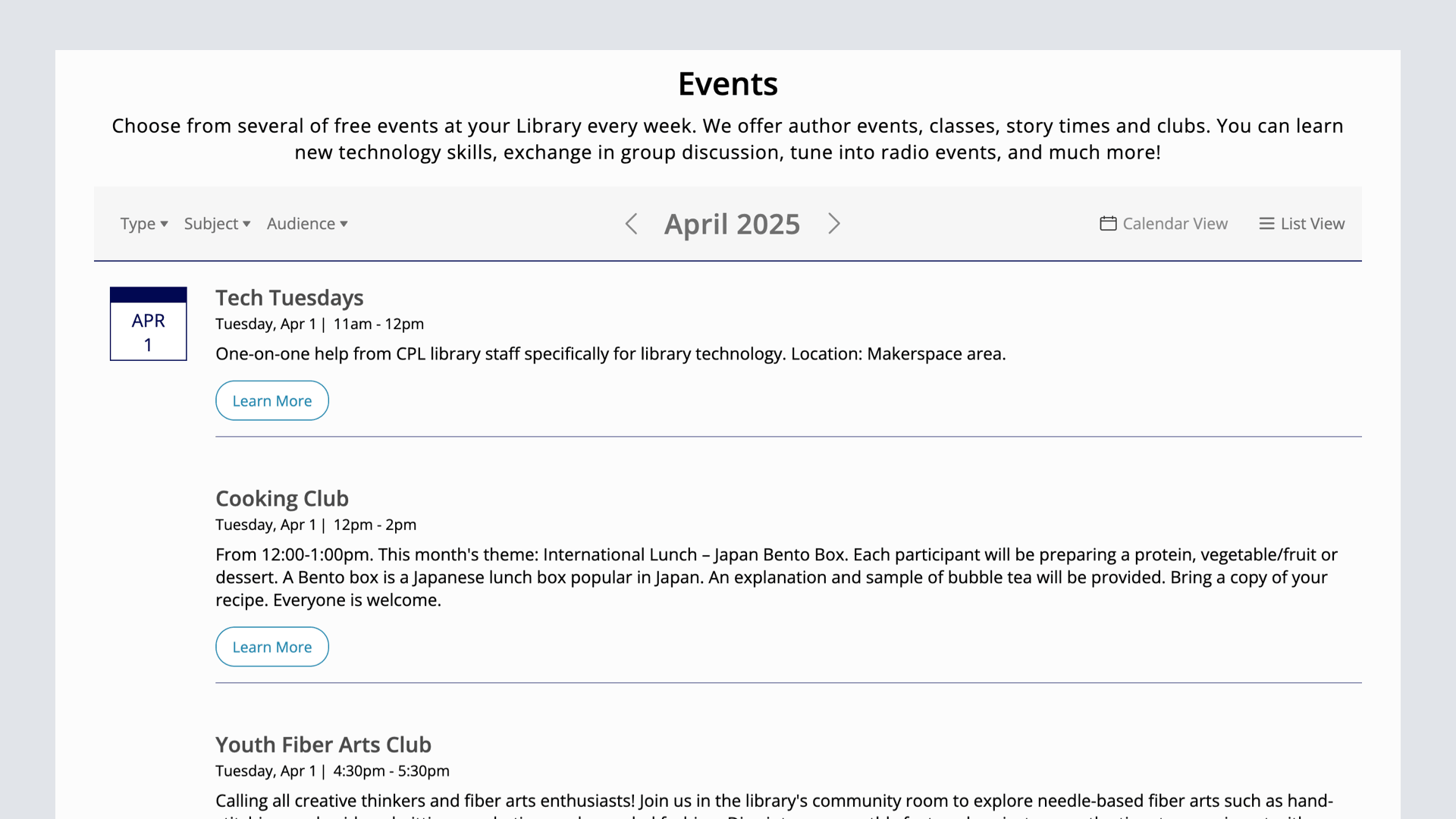
Events
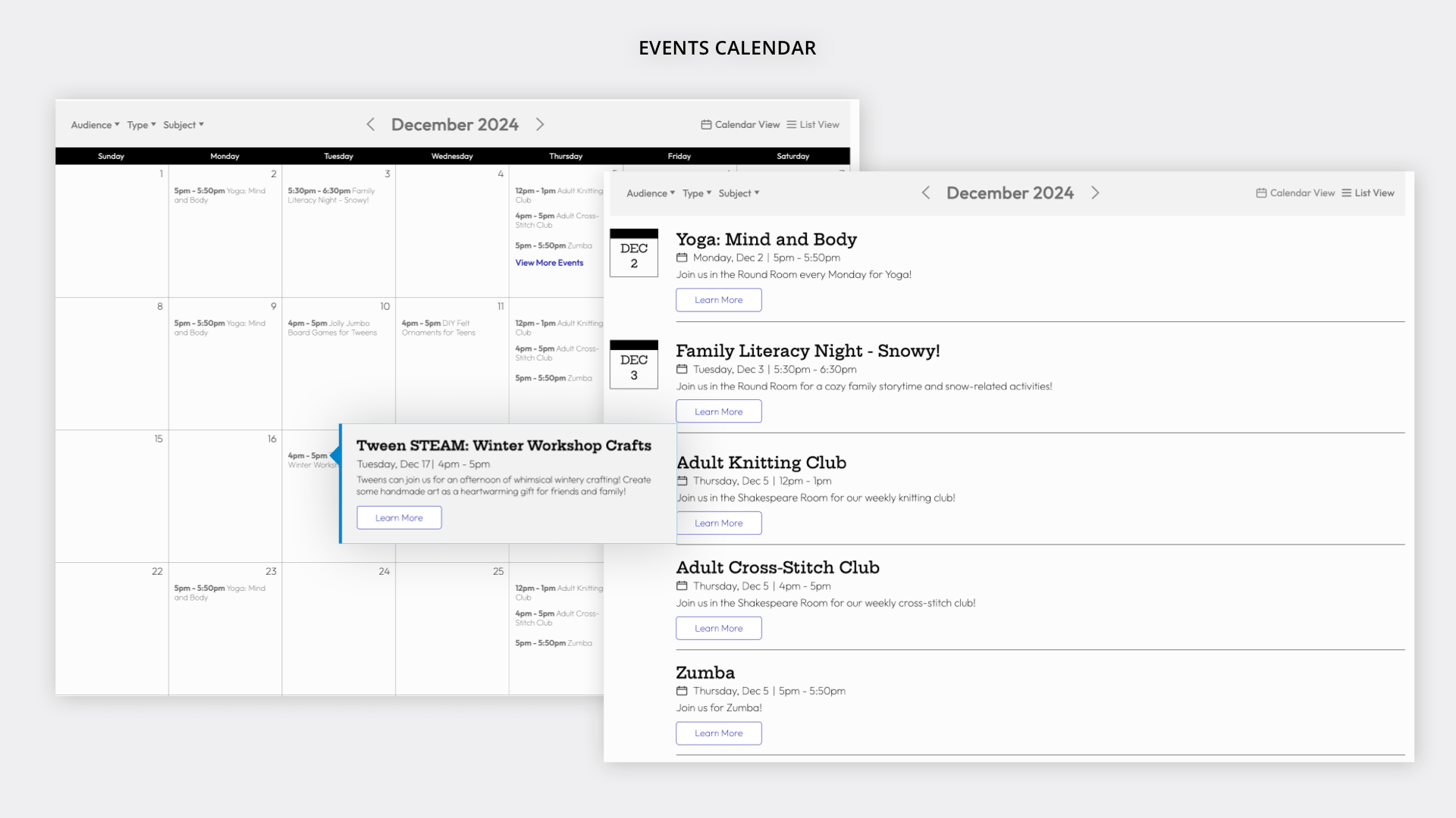
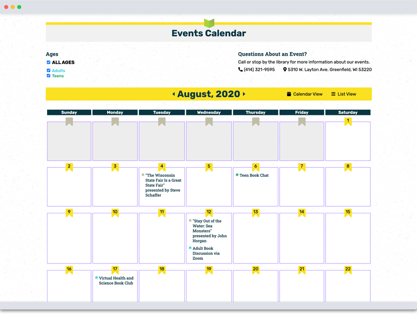
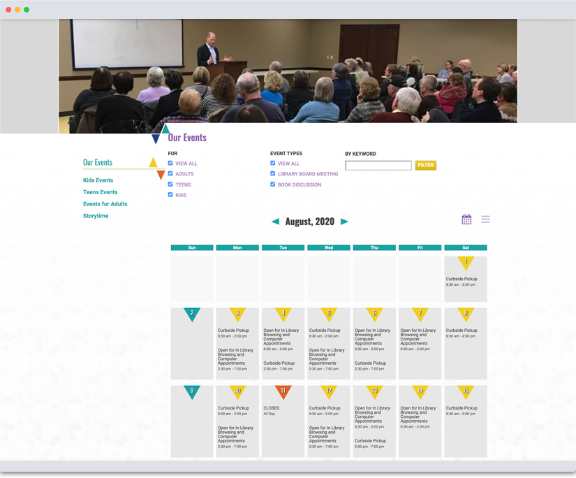
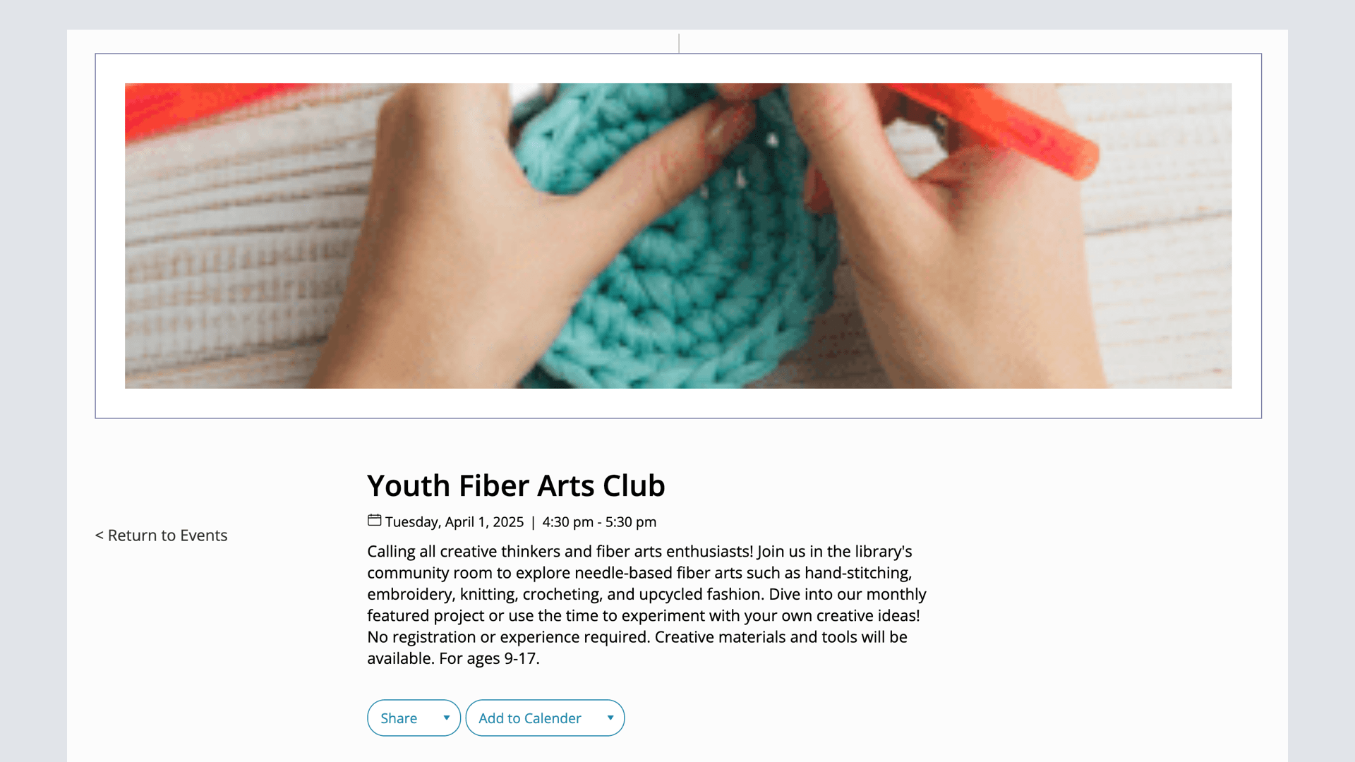
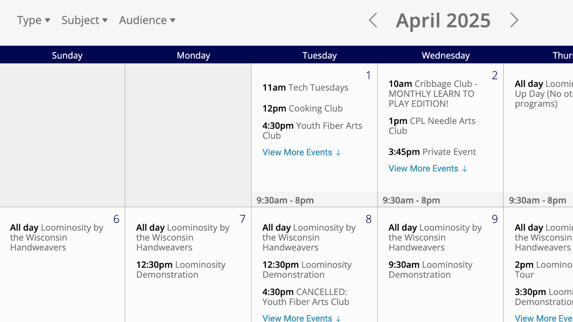
Events, including events calendar with list and month view, individual event pages, start and end dates and more.
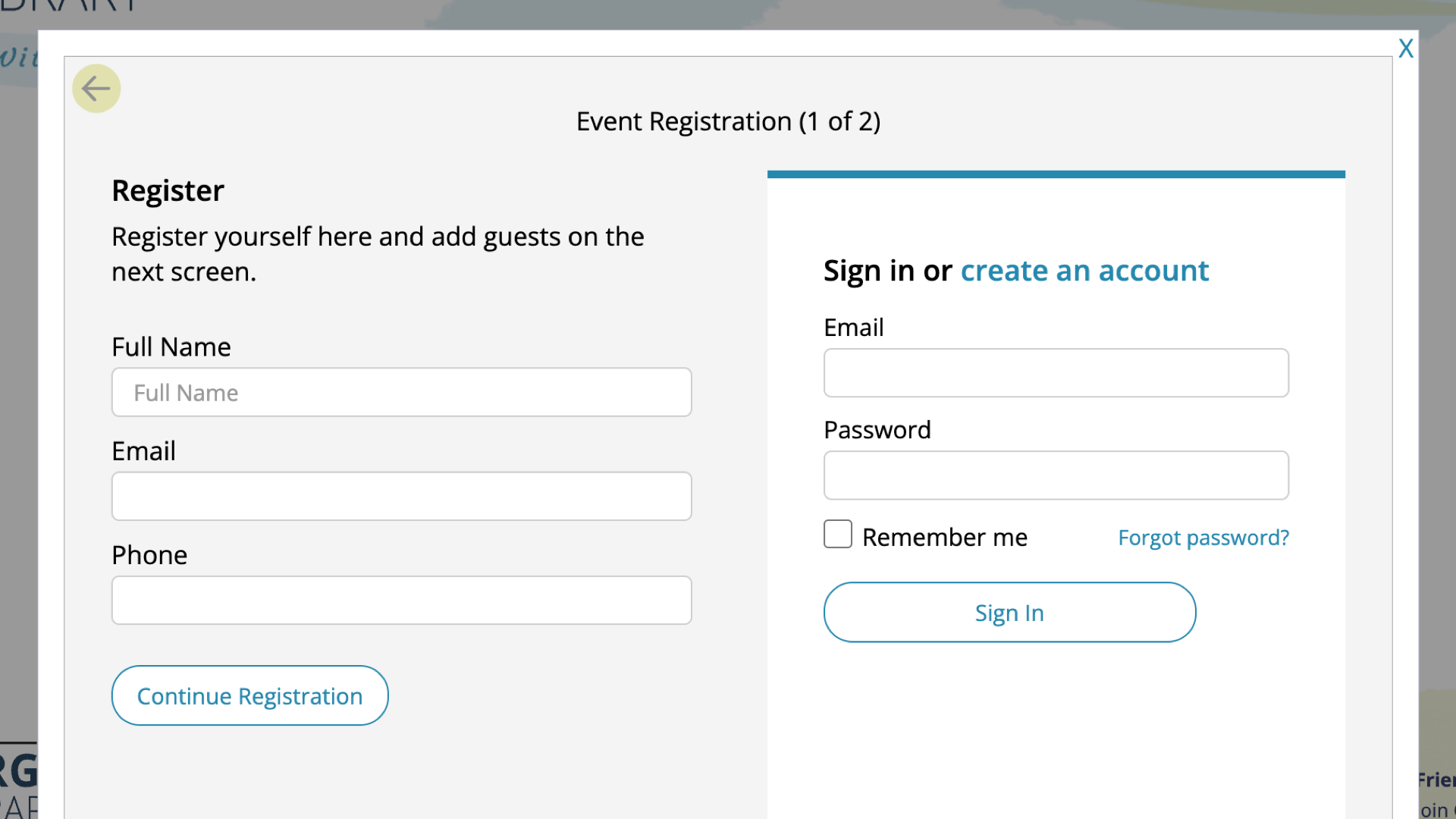
Event Registrations
Event reservations including wait lists, maximum spaces, reservation guests, event notifications via email, event lists and actions and more.
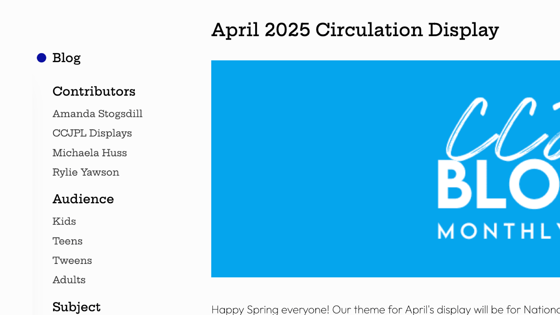
Blogs
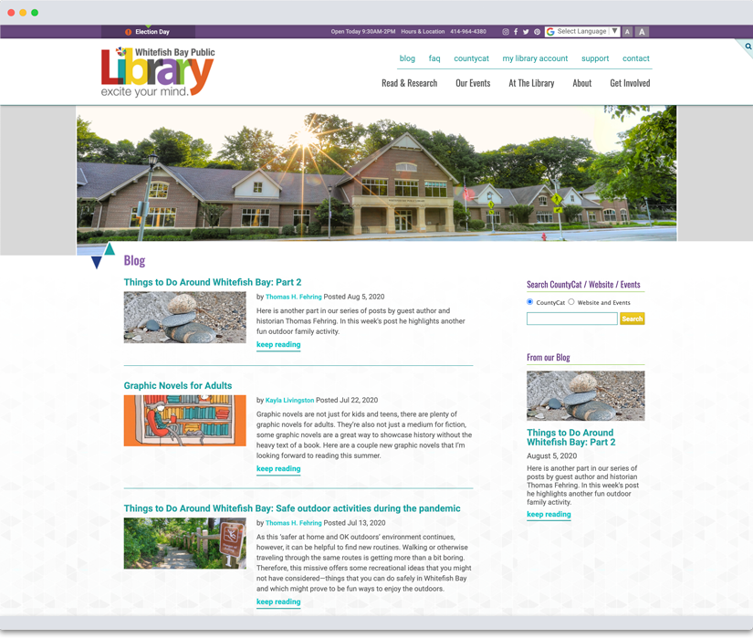
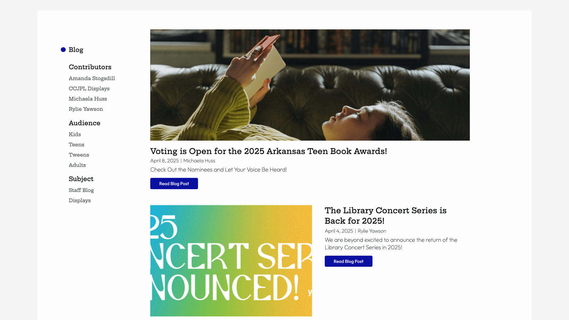
Blogs (or news) are an explorable and taggable yet ephemeral way to communicate programs and events, and have can be added to other pages and tools.
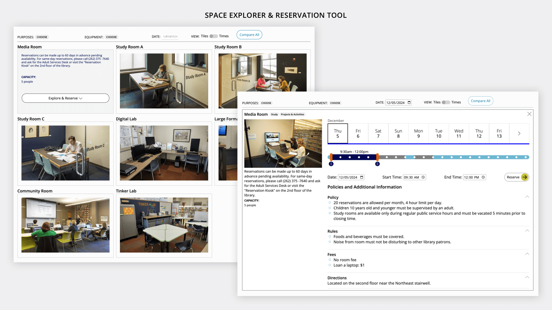
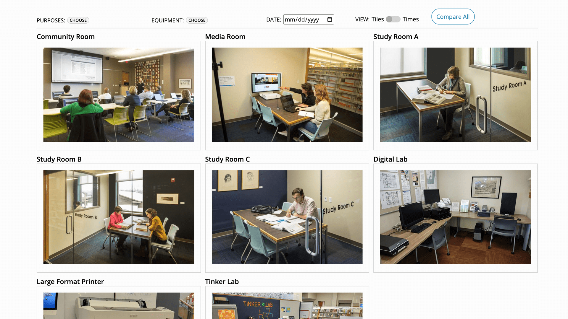
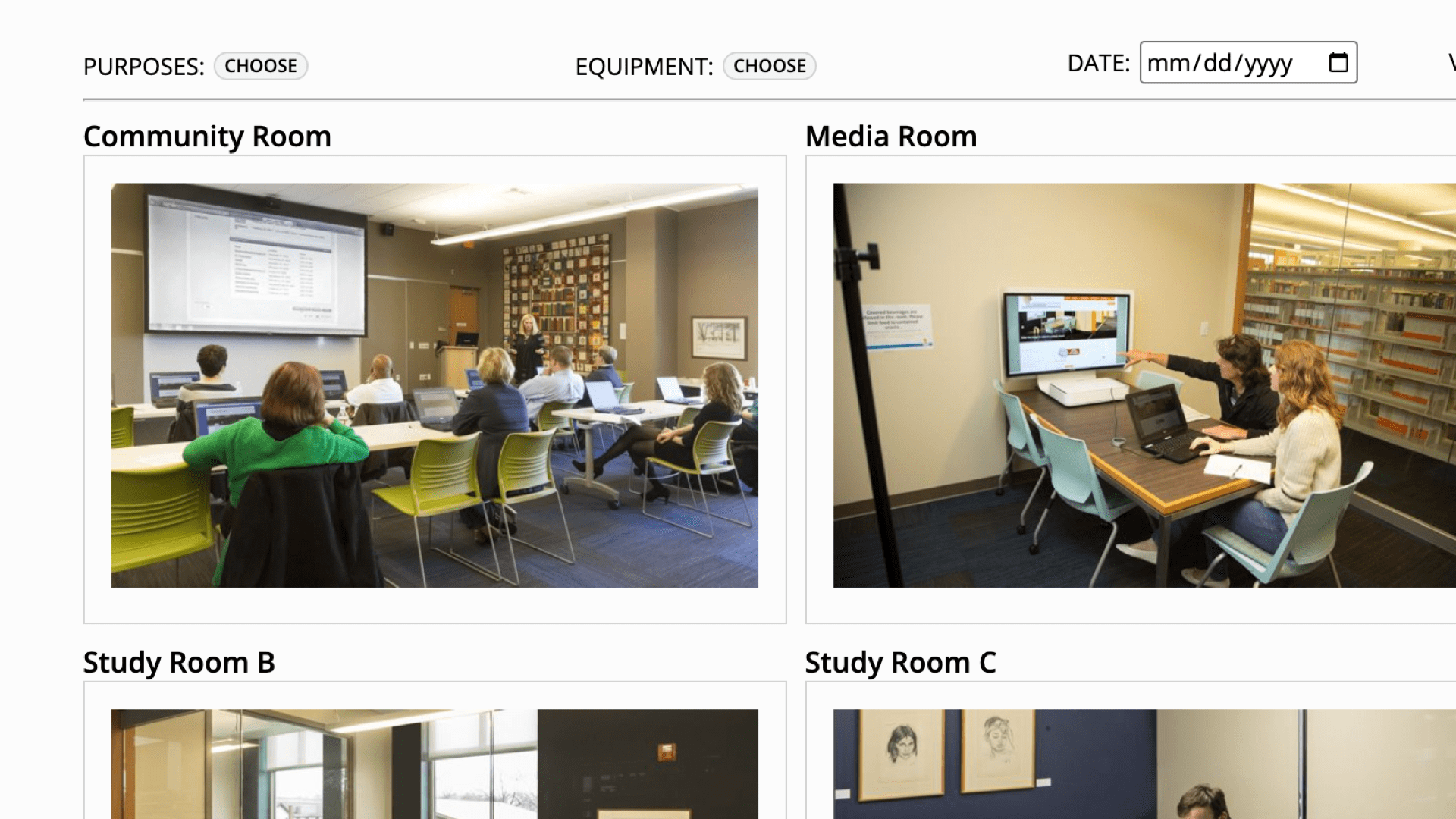
Spaces
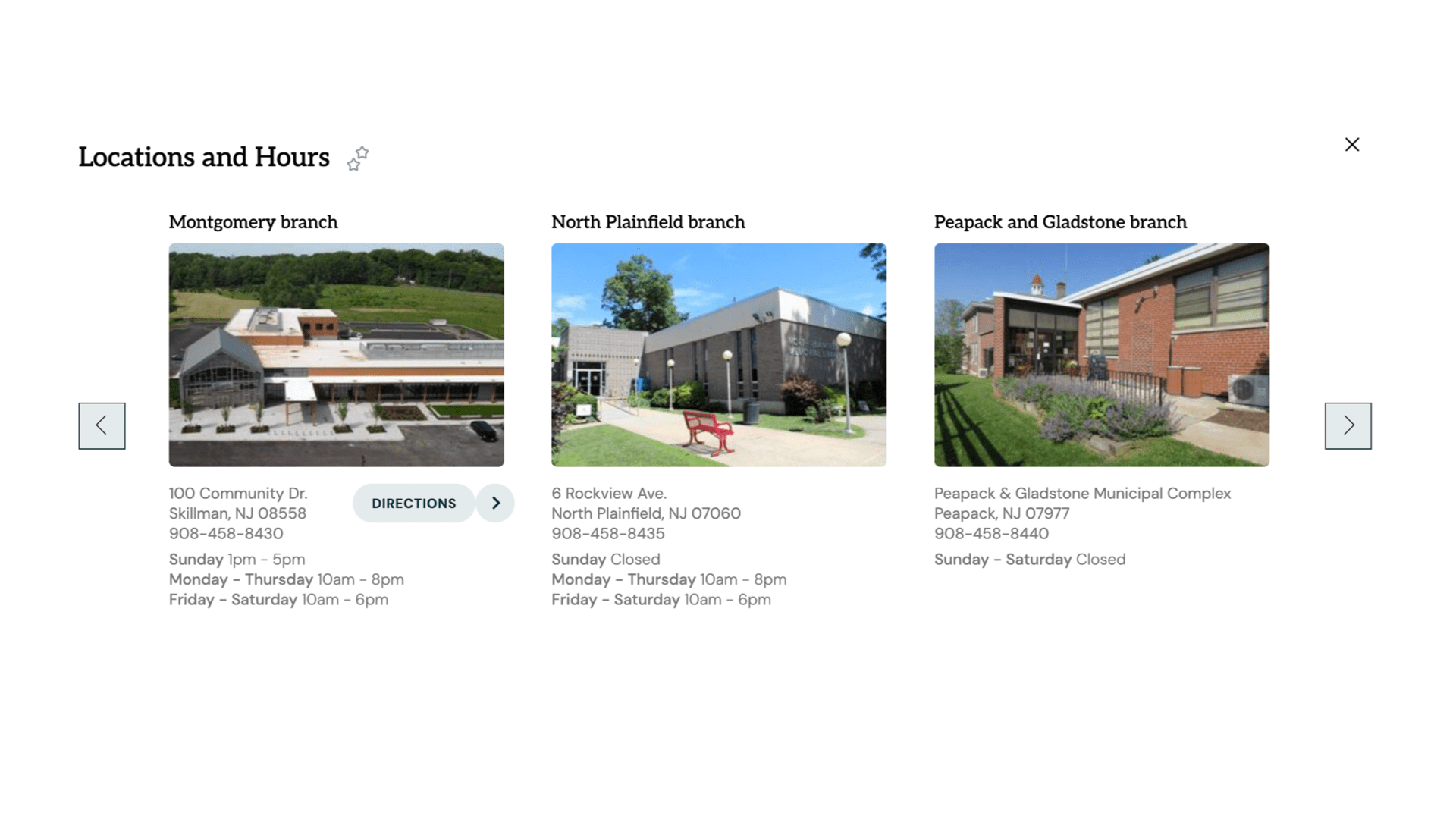
Describe and display special spaces within your library such as study, collaboration and meeting spaces
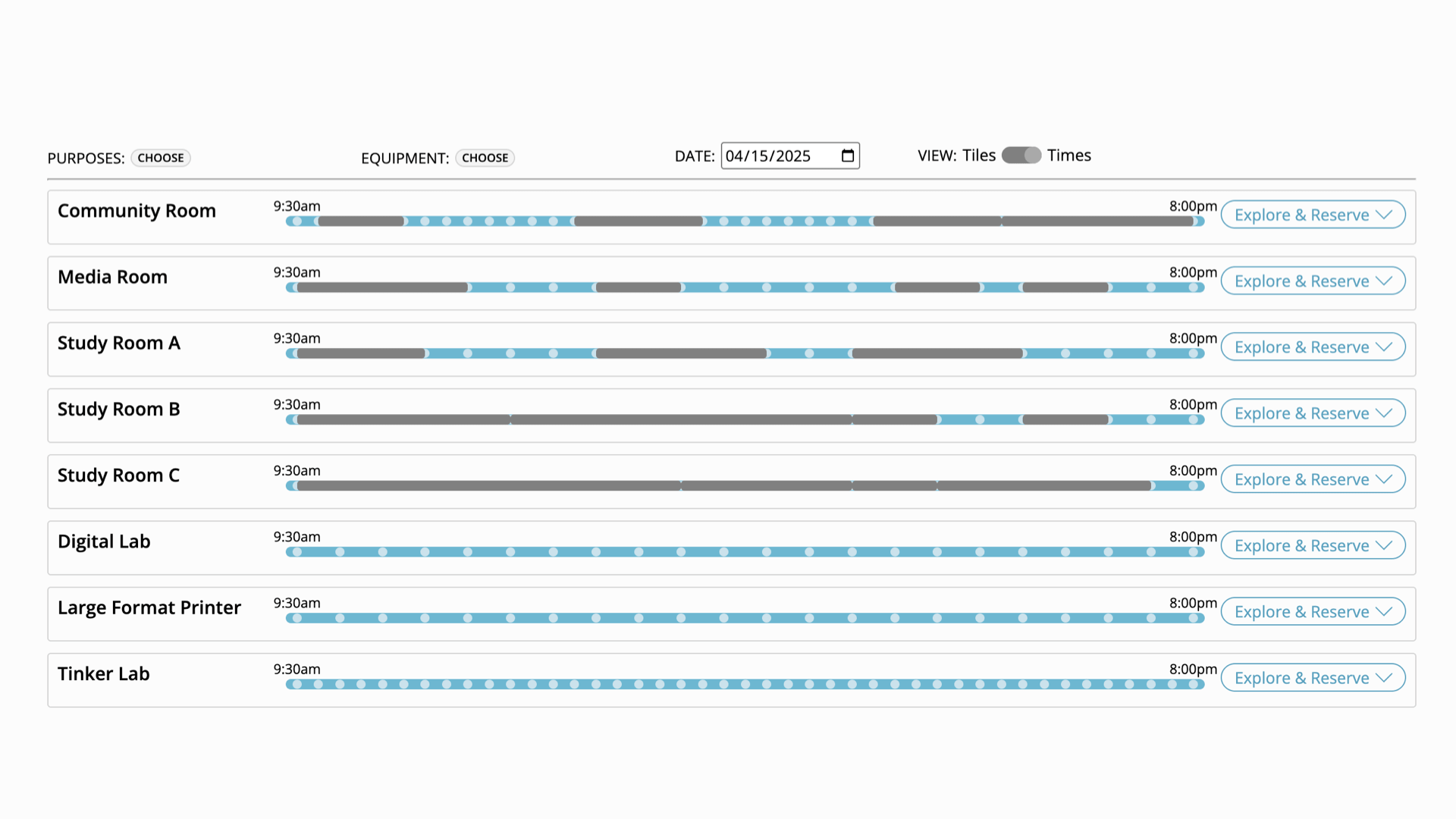
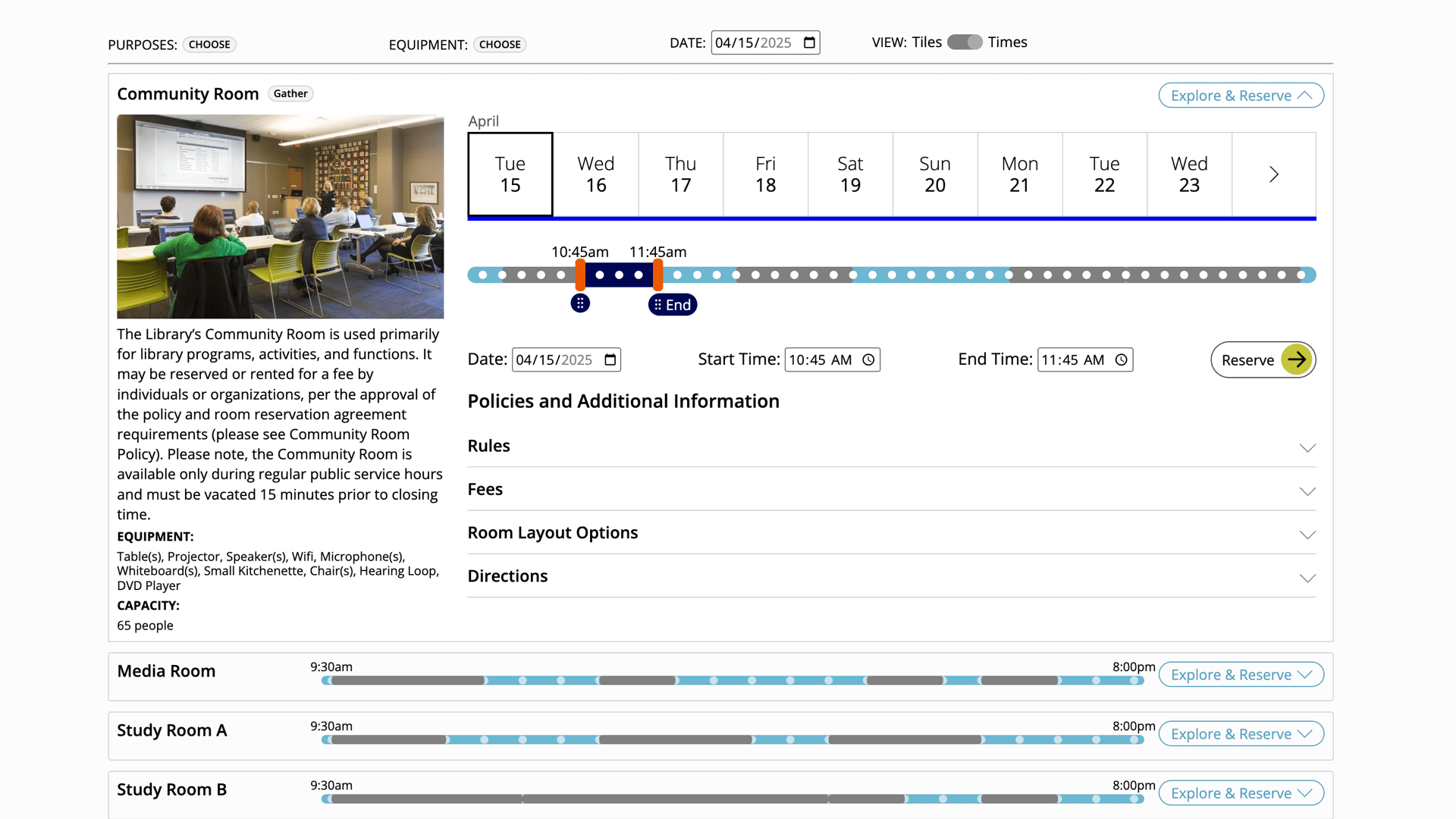
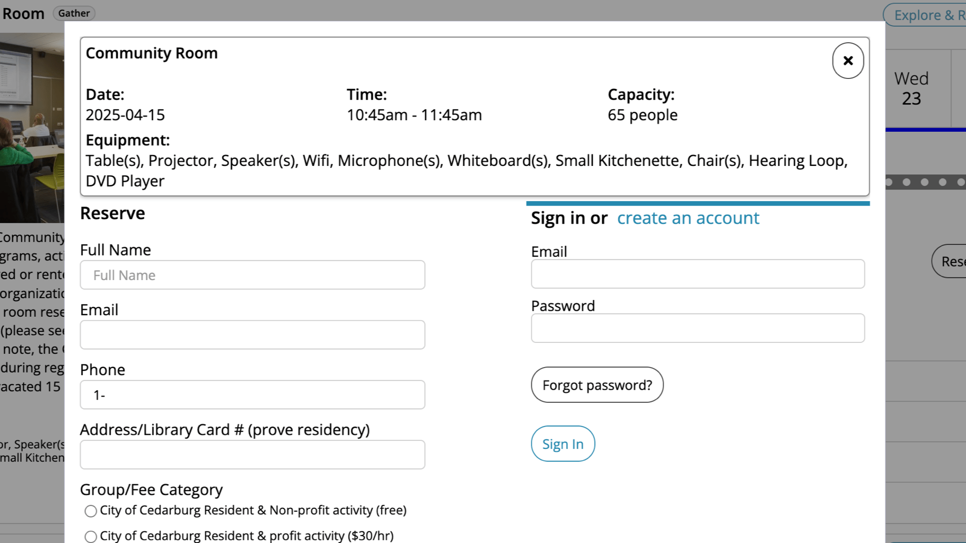
Space Reservations
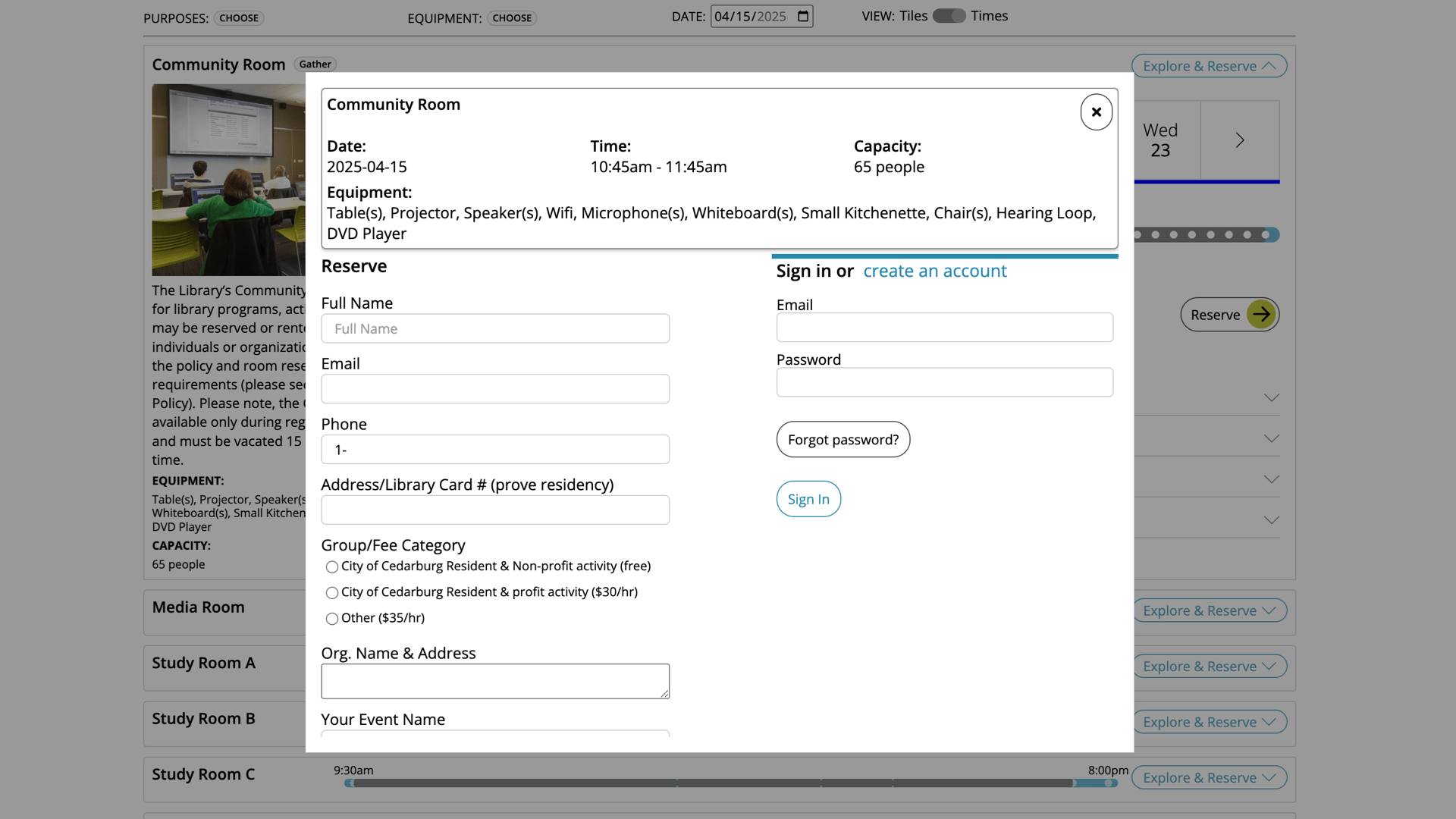
Full space reservations system, including space hours, min/max reservations timing, reservations approvals for meeting rooms, etc.
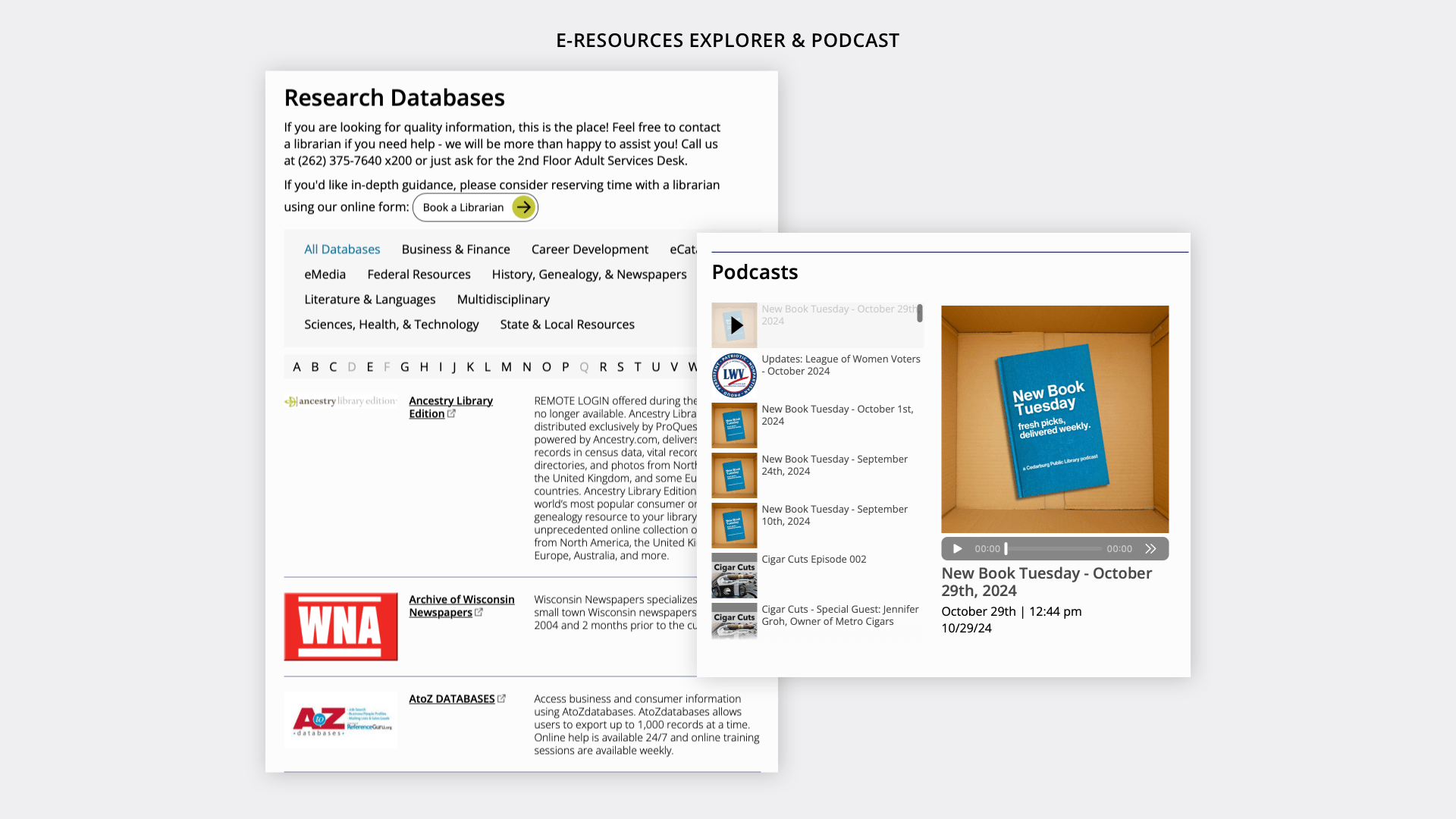
Eresources
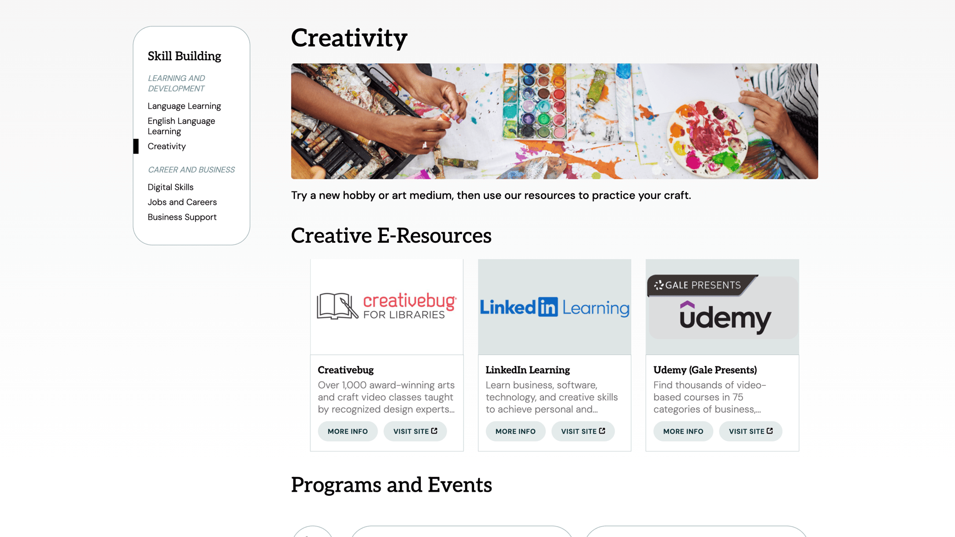
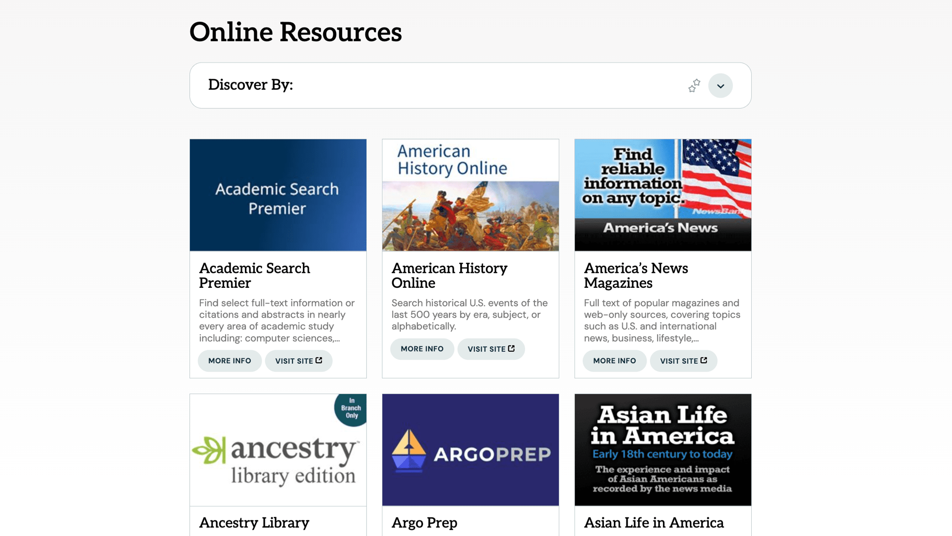
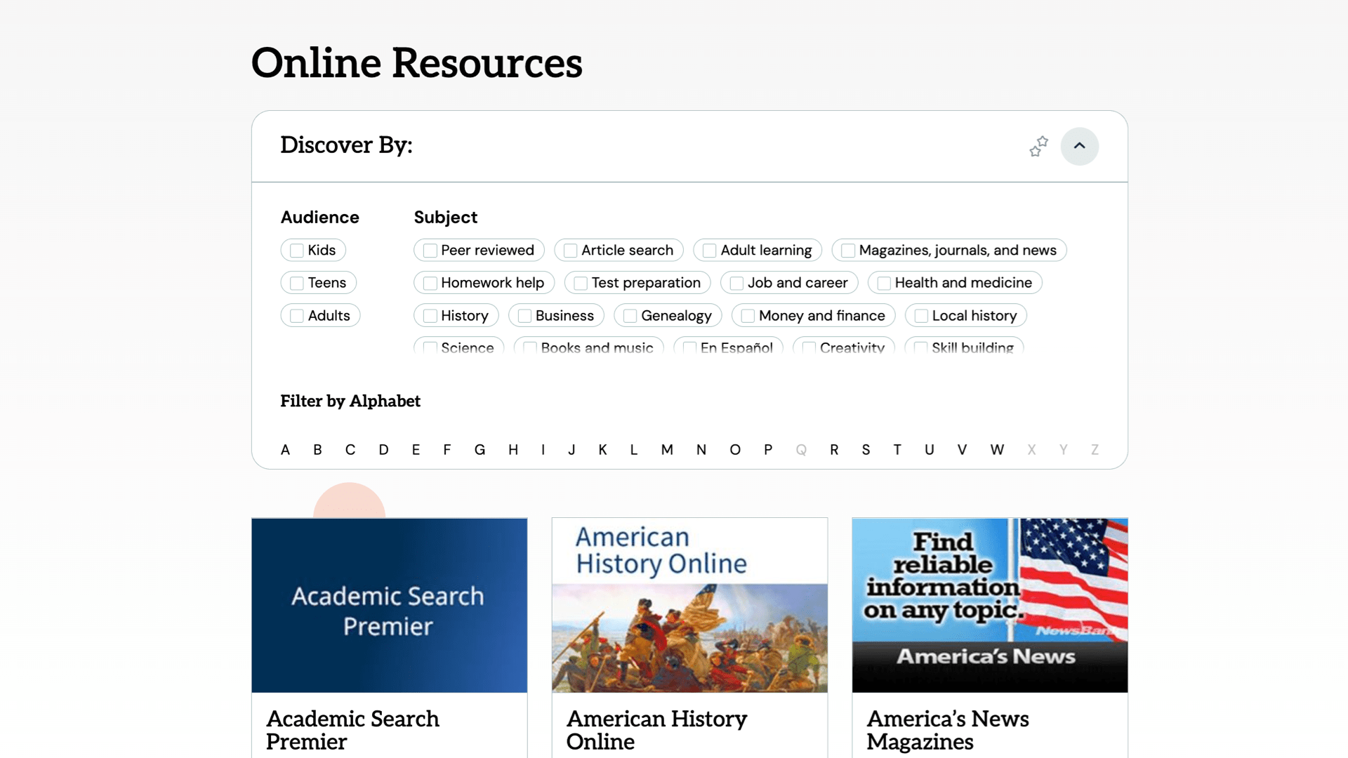
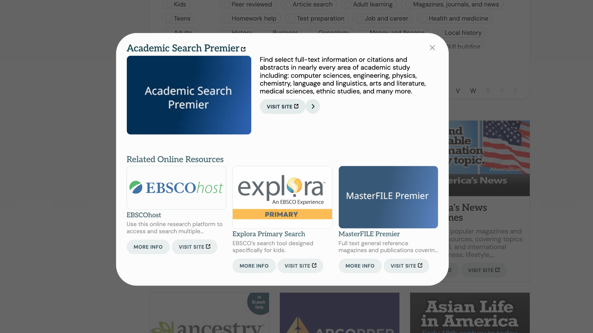
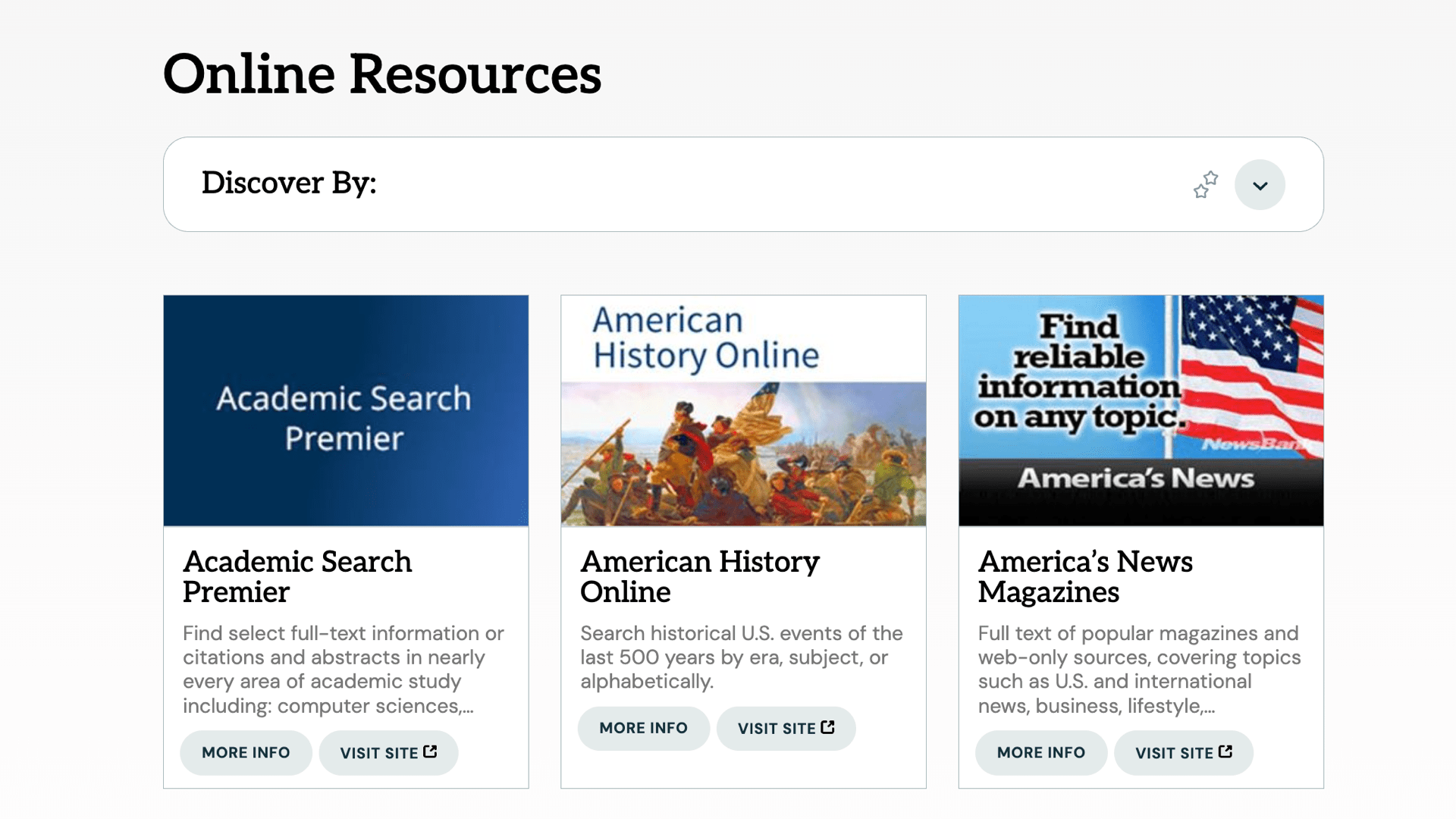
Dynamic list of Eresources the library provides, including an explorable interface, search integration, and availability on home, pathfinders and other pages.
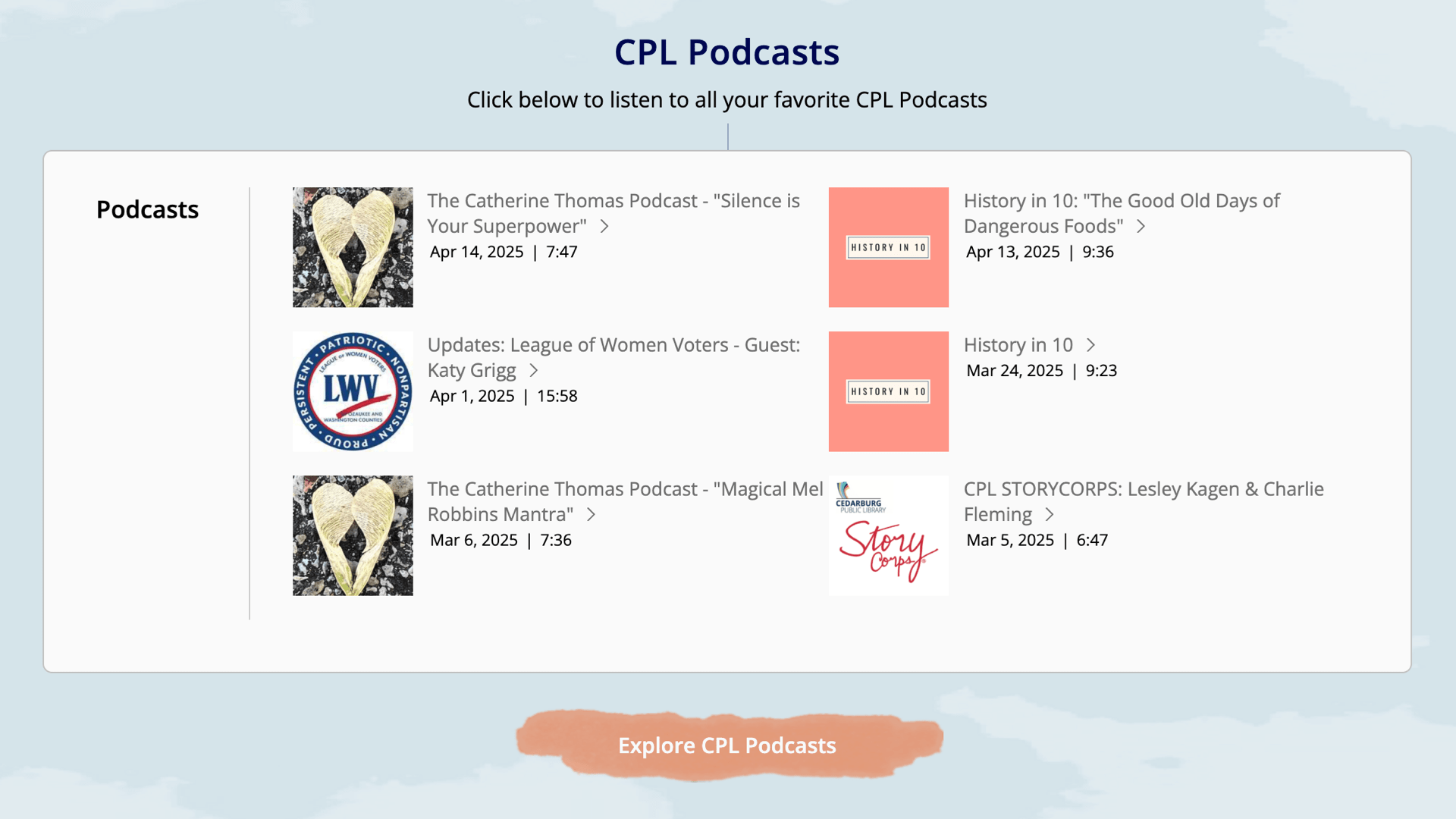
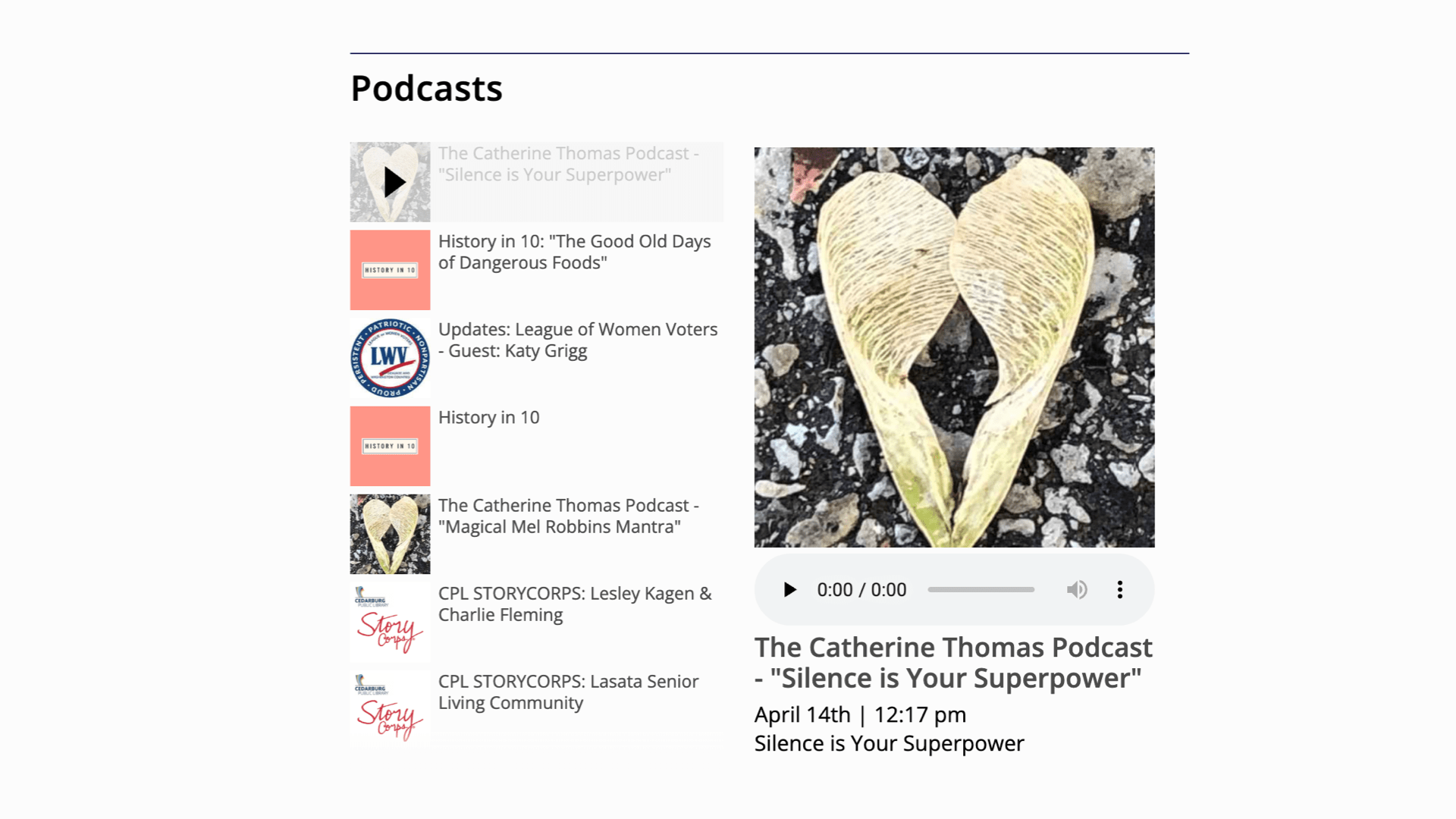
Podcasts
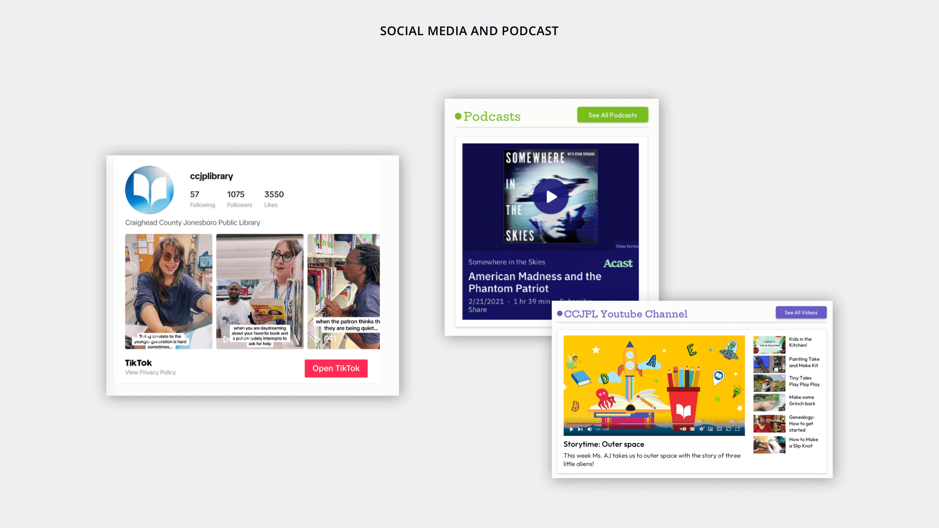
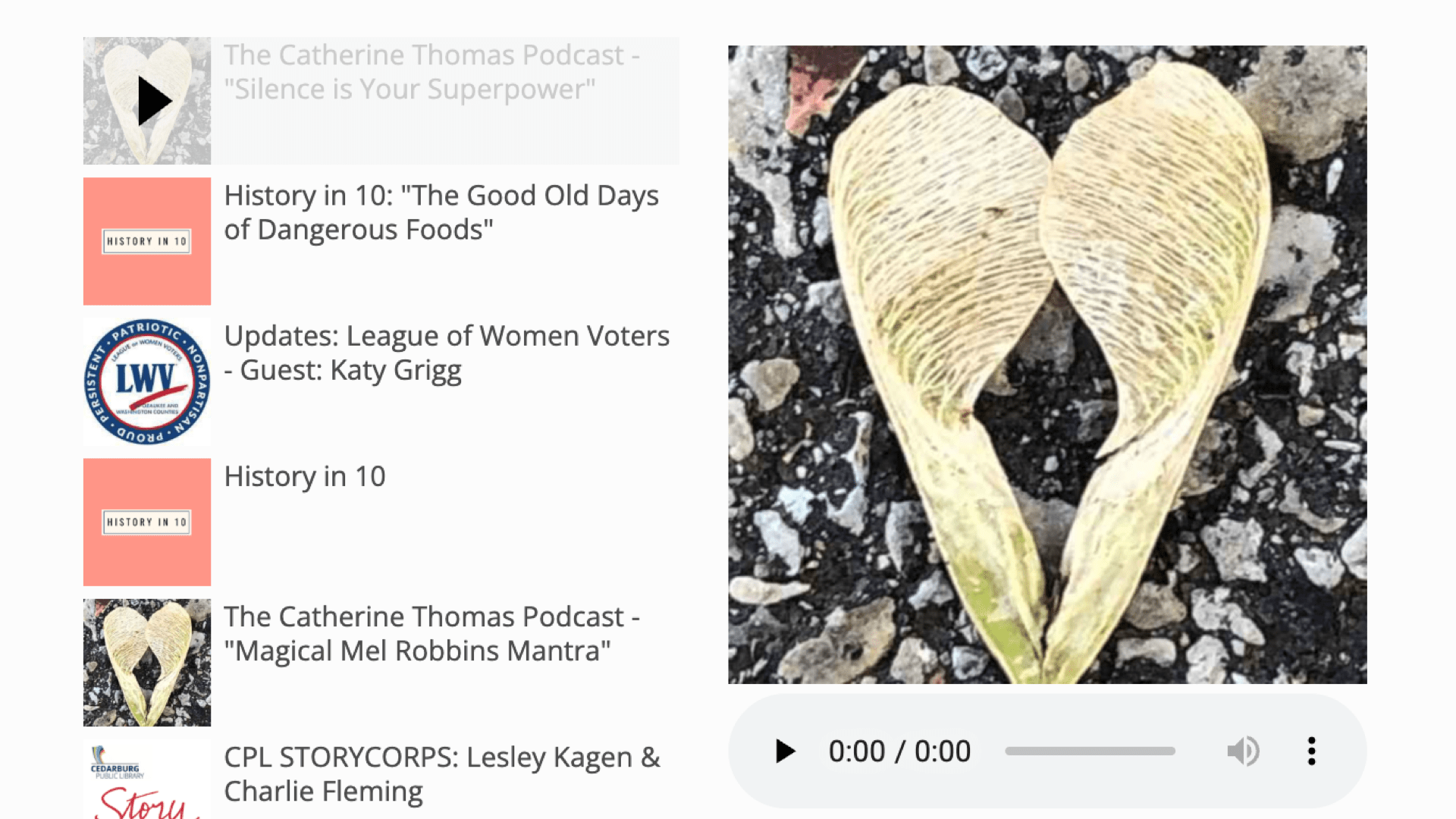
Load from your podcast provider's RSS feed for an on-site embed, and include in site search.
Meeting and Minutes Manager
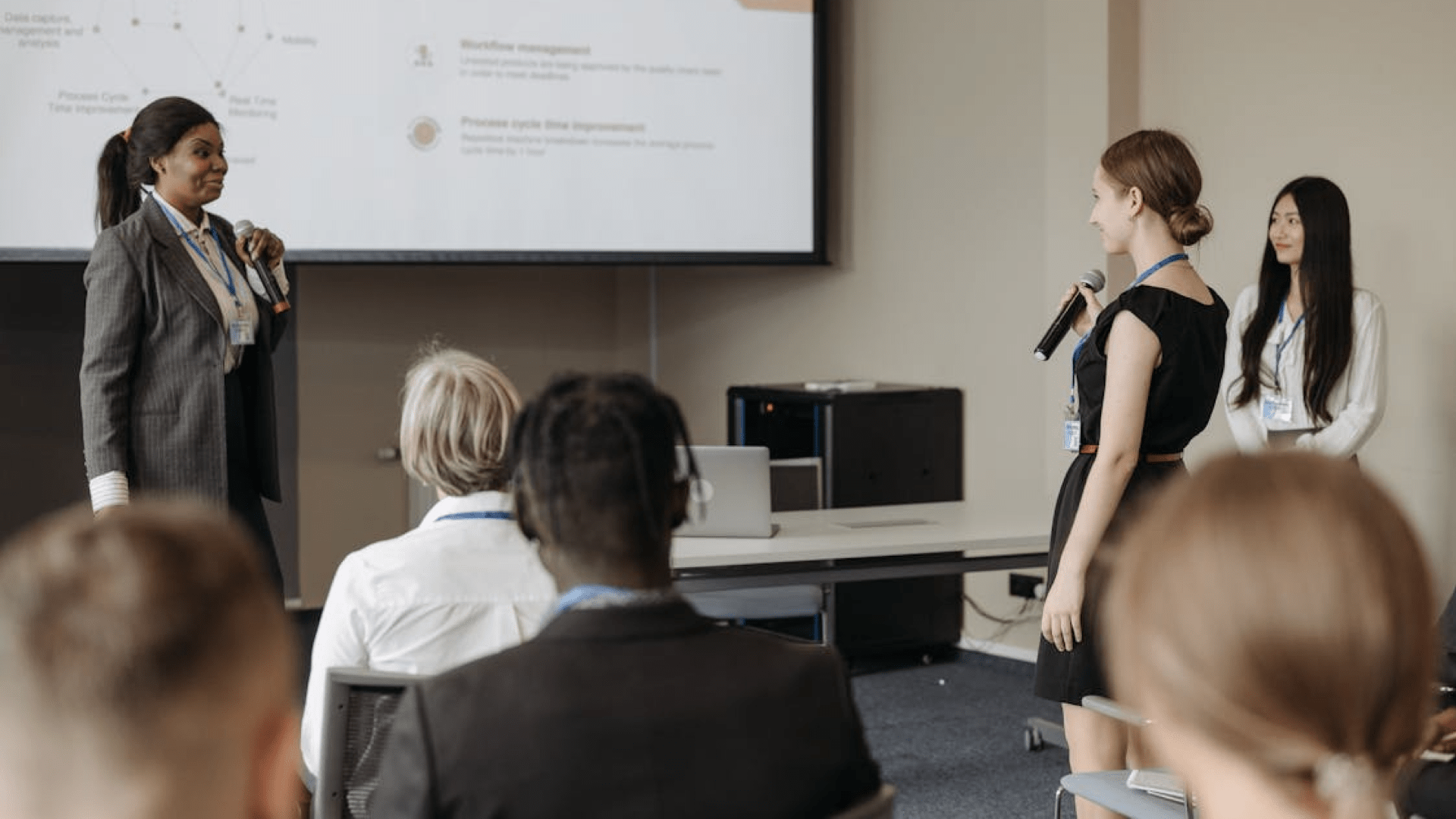
Have a simple, clear database of meetings, meeting minutes, youtube or other video/audio embeds and other documents related to each meeting.



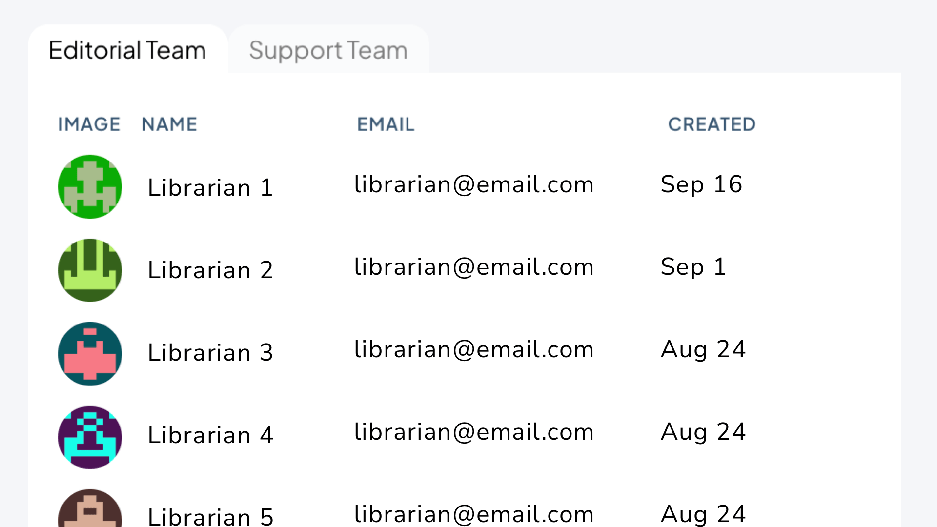
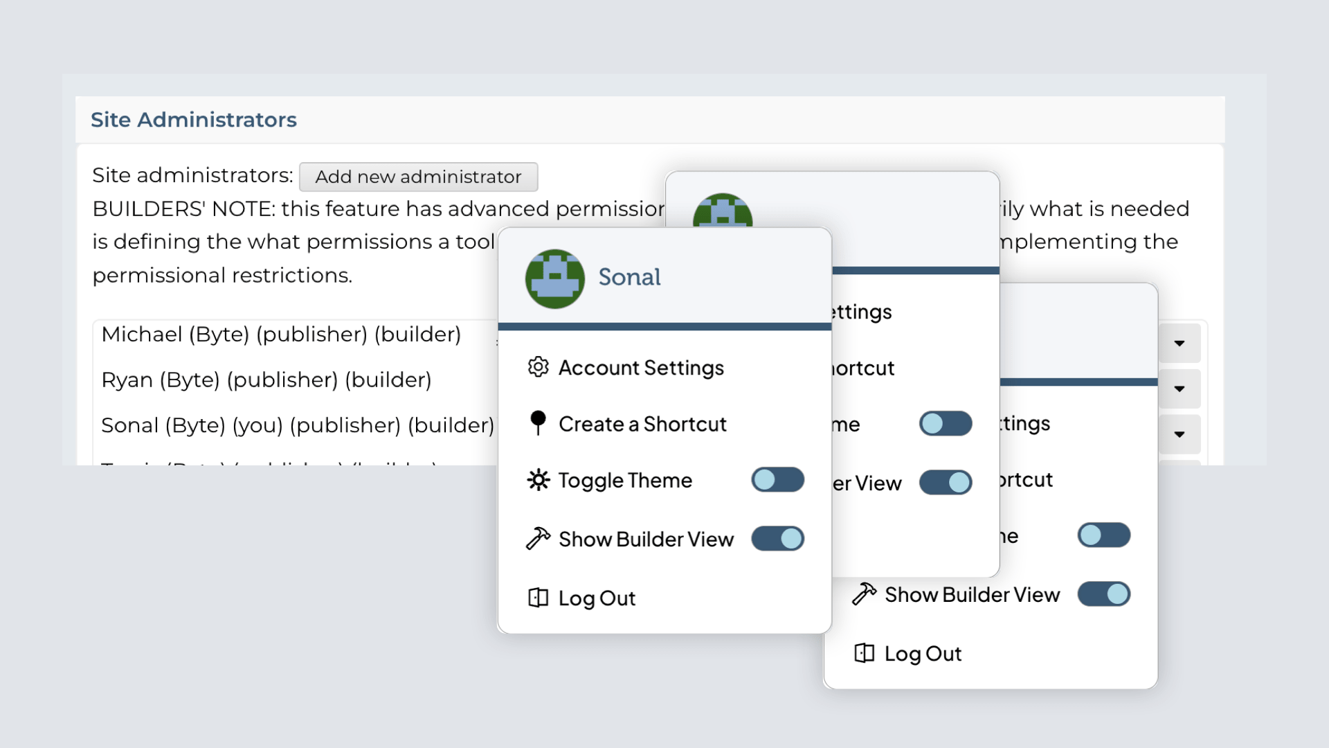
Our Admin Tools for Improving Librarianship
We creating tools with librarians in mind so they can easily manage content and develop a curatorial library voice that connects with patrons
View All Tools Show Less Tools
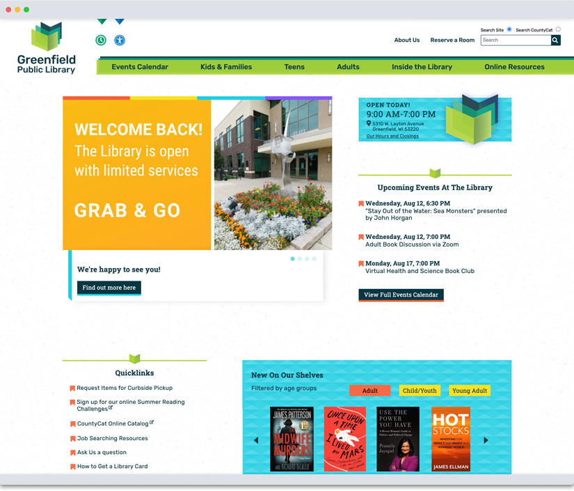
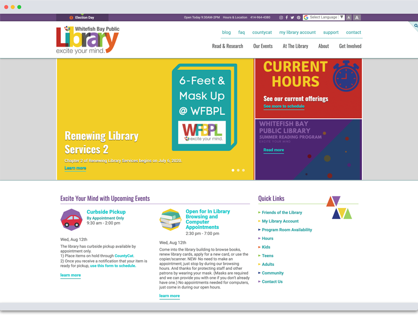
Whitefish Bay Public Library worked with Byte to redesign our website. Byte had worked with a number of libraries before working on our project, and they had a strong understanding of library services right from the beginning. They were able to take that understanding, and translate that into a site that fits our needs and the needs of our library patrons.
Byte spent time getting to know us, as well as our brand, and they did a wonderful job of translating that into our site. The site that Byte designed was a huge improvement over our previous site. The new site is very engaging and library focused.
Each step of the way, Byte made sure that the website matched our vision and helped to steer when we required guidance. It's been a few years since we first launched our site, and I'm so glad we chose to work with Byte on this project. They've continued to offer excellent service and respond to our changing needs. The content management software is very easy to use so that any staff can be easily trained to make updates. With our site from Byte, we've been able to offer so many ways for discovering new books and authors including a list of new materials featured right on our homepage as well as booklists that link right to the catalog. Overall it's been a great experience and I'm extremely proud of the site that Byte designed, developed and built for the library.
Project Timeline
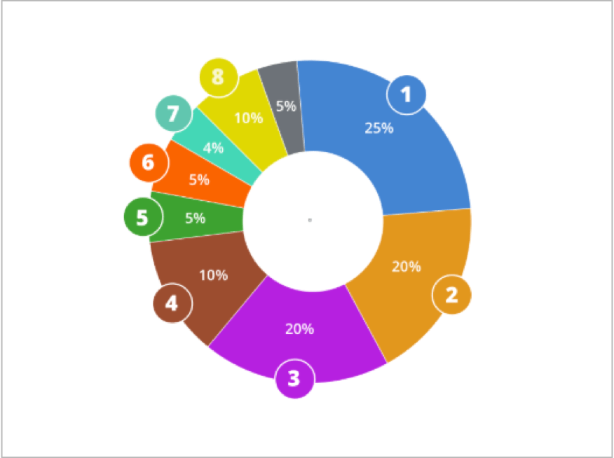
While we have a standard project timeline, each project is different and this gets modified to suit the project and client’s needs. Because we don’t know enough of the STPL project yet, we’ll show a recent project that contained these four phases:

Our Process
Discovery & Strategy
This phase included the discovery process where we understand audiences, use cases, and personas, and started to explore content needs as well as auditing any data or content already available for the project. Then, we explore site maps to organize content for the site
Steps
- Understanding the Objectives
- Understanding Audiences & Goals
- Content Audit and Mapping
- Comparative & Industry Research
- Site Map Theme Explorations
Deliverables:
- Audience & Content Strategy Document
- Site Map Themes
Information Architecture
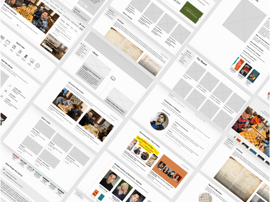
This phase includes site wireframes which focuses on defining which content should exist on key pages and focusing on content hierarchy, density, and layout of the site.
Steps
- Defining Home Page Wireframe
- Defining Template Page Wireframe (Secondary & Tertiary)
- Defining Special and Data-source driven pages
Deliverables:
- Home Page Wireframe
- Deeper Level Pages Wireframe
- Special Page Wireframes
Design
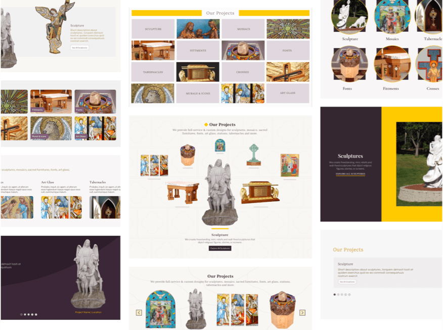
The design phase starts with mood boards and brand discovery, moving into concepts that shape a larger vision. We explore multiple directions, then refine and iterate—sharing rough or polished designs as clients prefer. Finally, we adapt across screens and pages and complete the design system.
Steps
- Brand representation through wordage & mood boards
- Early site designs
- Final design with grand vision
- Solutions for all screen sizes
Deliverables:
- Word / Mood Boards Discovery
- Early Competing Site Designs
- Final designs for all pages
- Responsive Design
Build & Testing
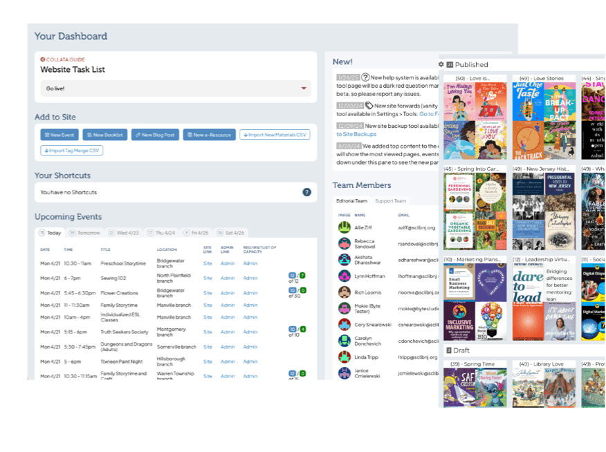
We build the site from the final design—coding, testing across devices, and setting up the CMS. Content is imported, features added, and clients trained on a staged site. After thorough testing and validation, the site launches smoothly, followed by ongoing support, updates, and check-ins.
Steps
- Front-end Programming
- Data Integration and Back-end Programming
- Accessibility Testing
- CMS & Tool Build
- Site & CMS Tour
- Data & Content Entry
- Issues
- Go Live Checklist
Deliverables
- Responsive Site
- CMS with Issues System

I’m unsure of how to start this testimonial, except that Michael is a part of my circle now, and I will forever be a promoter of him and his team. As a natural storyteller, let's take you on the journey of how I came to this conclusion. I personally have a graphic design background and just enough web design background to be dangerous. I initially did not want to use Byte. I thought it was a risk, and I didn’t feel confident that they could handle the challenge of producing our dream website. (Our former website could only be compared to a GeoCities website from the 1990s.) I was outvoted. Quickly, I realized that I had been wrong, and we got the right company/team to work with us on this project. As the graphic designer of the library system at the time, I spent a lot of time hands-on working with Michael and his team. Michael and his team did a great job of taking the websites we were flirting with (yes, I said flirting with) and turning our favorite features into beautiful elements on the new site. They were very hands-on with helping cultivate our wishlist, setting realistic expectations, and then exceeding them. They handled the rotation of staff members involved in the project gracefully and respectfully. Although I left the library before the project was completed, what was created was precisely our vision. It has personality, structure, easy navigation, beauty, and vibrance. This website will last years to come and is a much-needed upgrade to my community’s library system.
1 in 4 adults in the U.S. lives with some form of disability and there are many accessibility features that benefit everyone. At some point in life, every person benefits from accessible design — whether due to aging, temporary injury, low vision, or simply needing content in a quieter setting. By investing in accessibility, you’re investing in everyone in your community.
ADA Title II Digital Accessibility Process
Planning & Strategy
The Title II WCAG rules are the same for everyone, but each library will have a unique method to be compliant and set up continuous improvement. We start our planning with an audience and content assessment that helps us run a strategy session to define and map out how we'll achieve short and long term compliance.
ADA compliance also includes PDFs, audio and video files. While not necessarily housed on the website, we'll need to plan to test and mitigate any issues that arise there. The deadline for ADA compliance depends on the service population:
Larger libraries need to be compliant by April 24, 2026
Smaller libraries (<50k population) need to be compliant by April 26, 2027
Since this is a start date, we don't need to have everything set up, but we have to have a plan for finding, mitigating and opening the doors to new issues visitors might be having.
Audit Tool Setup
An initial content and accessibility assessment happens in the planning phase, but we need to set up a permanent audio system that shows all issues and their resolutions. This audit tool will include every reported issue and validation, as well as the mitigation.
One of the big questions is how the audit tool will be populated, and this depends on the library's needs and technologies. Some libraries use automated tools and community testing via contact forms, others prefer to use more manual inputs, like when someone visits or calls the library to report an issue. In the end, the audit tool is the central registrar of all issues and solutions. Other libraries will want to have external manual testing, and those issues will be added to the audit tool as well.
Once the audit tool is ready, we'll start adding issues from automatic and manual tests in the next phases. As well, the audit tool can generate an audit trail that can be shared externally, as needed.
Automated Testing
There are multiple tools to help find accessibility issues that need attention. We'll decide on which tools have the most validity for the site, and find any automated ways to continuously check for new issues to add to the accessibility audit. If hosting with us, we'll also be able to employ our own automated tools.
Any time issues are added, we need the ability to validate them and mark the false positives, that way new false positives from automated tools in the same place don't get added. Of course automated tests are no match for the real world usage, so automated tests are only part of the picture.
Manual Testing
Manual testing can be done by library staff, consultants and by the community at large. Any issues found in manual testing can be added to the audit tool and then mitigated later on. There are many ways issues can be added, including:
Library staff often have hands-on connections with patrons in lab computers, and will see a patron struggling with a library page or tool, and will have the ability to replicate the issue later on to add to the audit tool.
External consultants that specialize in site accessibility audits can be given the ability to add issues, or can add them via a spreadsheet CSV.
Community input like "bug bounty" pages that give gift certificates for valid issues the community find, and those issues can be added via a contact form.
Communication & Input
We see two key elements of compliance are about how you communicate the library's accessibility intentions and how you invite the community to connect to you.
Communicate accessibility intensions -- the library wants to make it clear that accessibility is important and to give visitors a chance to report an issue. Many libraries have accessibility statements in the footer of the site, or on a page. While accessibility statements can be seen as performative, we find them worthwhile if there's something actionable that can be done about any issues.
Invite input -- be it via an email, contact form, in person, etc. These actionable reports are vital because the library will learn about any issues it didn't discover through automated or manual testing. Responding to all patron input is a good idea, and helps the patron know they are valued.
Training
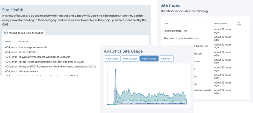
While many accessibility issues are infrastructural, and difficult for staff to manage, in the end most of the issues are going to be content related, which is managed by library staff. Our CMS has a site health tool that dovetails into the accessibility audit tool and can help staff find and solve content accessibilities. As well, our digital asset management system has accessibility options built in for images, so when someone saves alt tags or captions, they'll be used anywhere that image is used.
We'll help train a point person or all editors on best practices, and be available for testing and mitigation. We will monitor our issues system and the audit tool to help recommend better ways to solve accessibility issues.
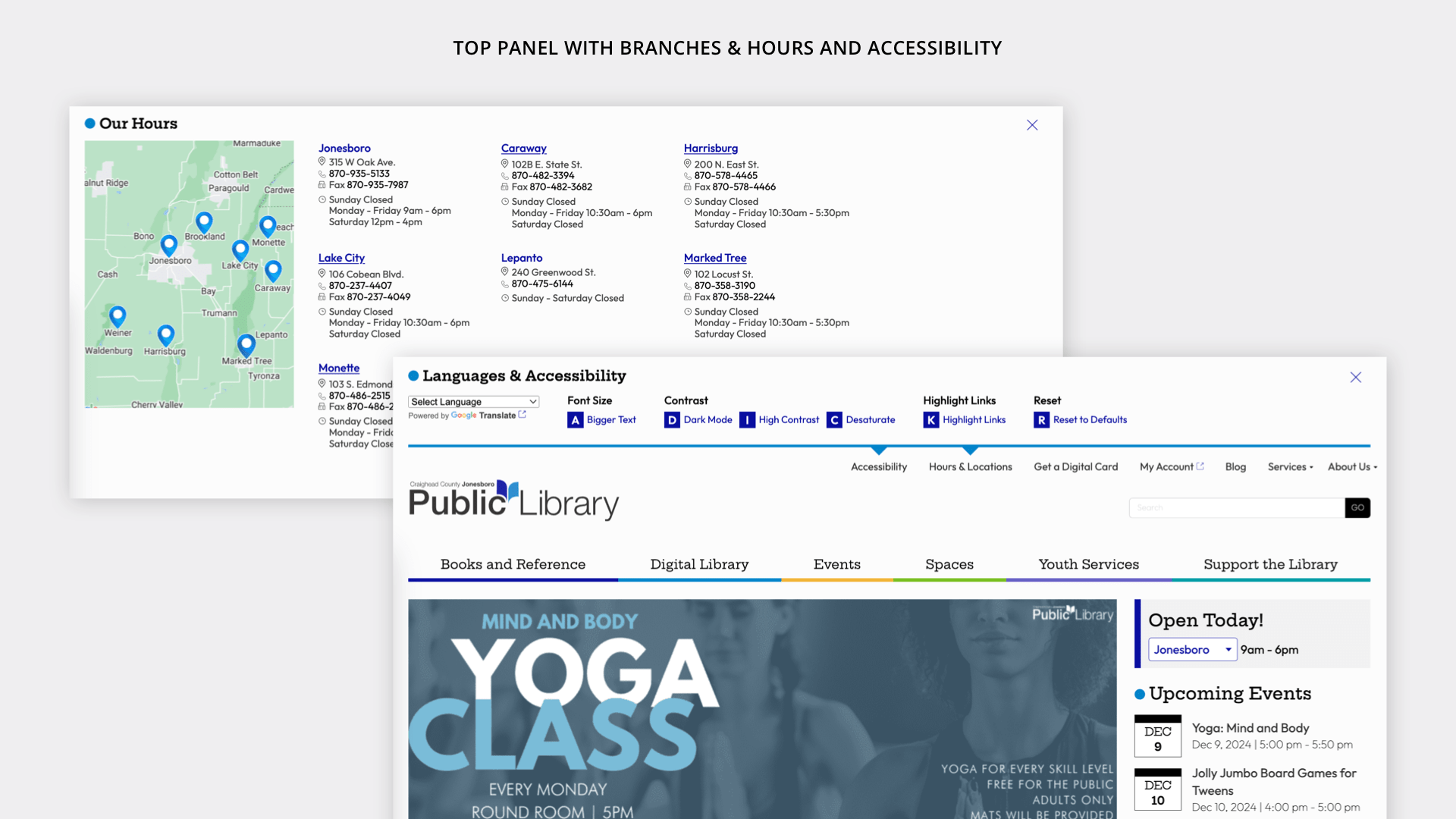
Front End Accessibility Tools
Featured tool
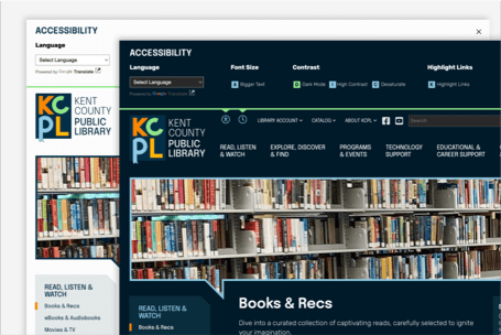
Dark Mode
Reducing the amount of light emitted from your screen and is extremely helpful for low-light situations for users and their environment
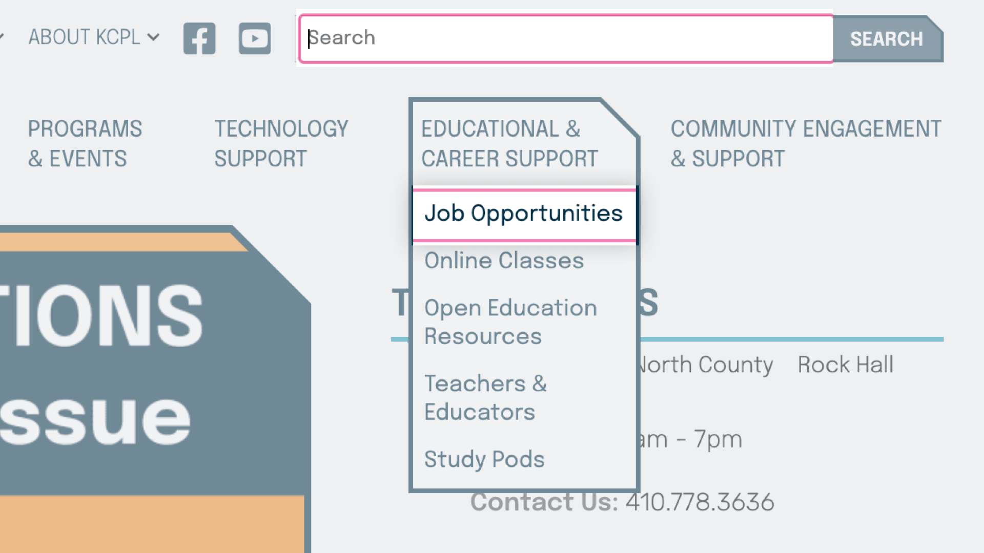
Keyboard Navigation
A feature that enable individuals to navigate and interact with websites using only the keyboard or screen reader software
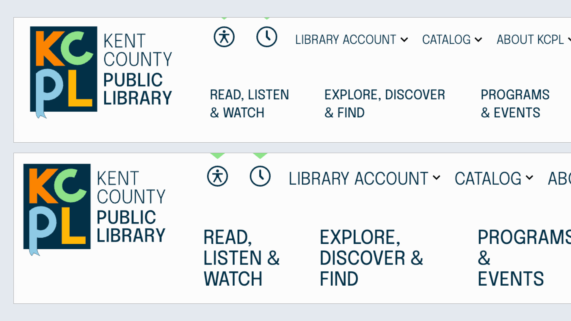
Font Size
Larger text size available for those who need larger letters via the accessibility interface or the browsers' zoom tools
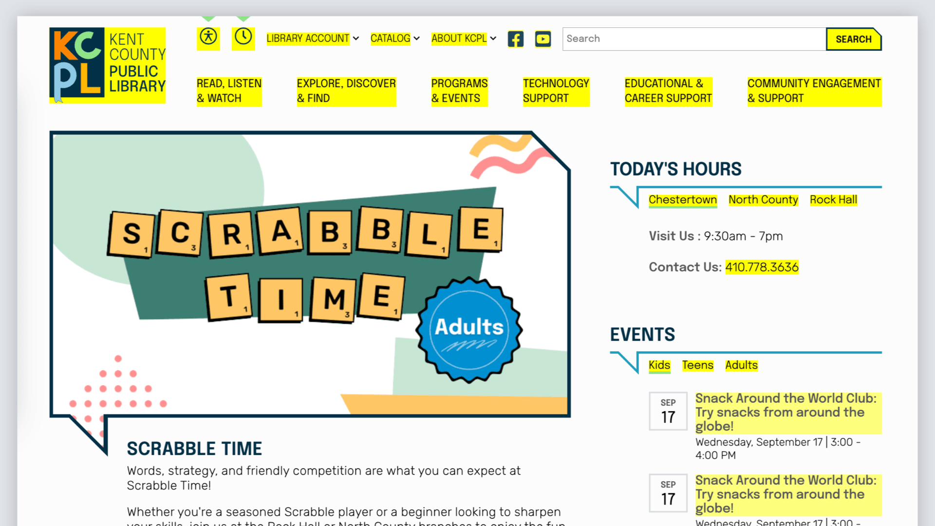
Highlight Links
For users with poor vision, this feature adds additional styles which offer a better opportunity for perceiving hyperlinks
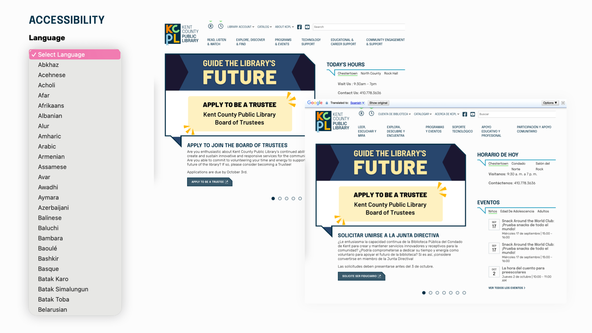
Language
Integrated language translator allowing site visitors to convert full site into language of choice. Supported by Google
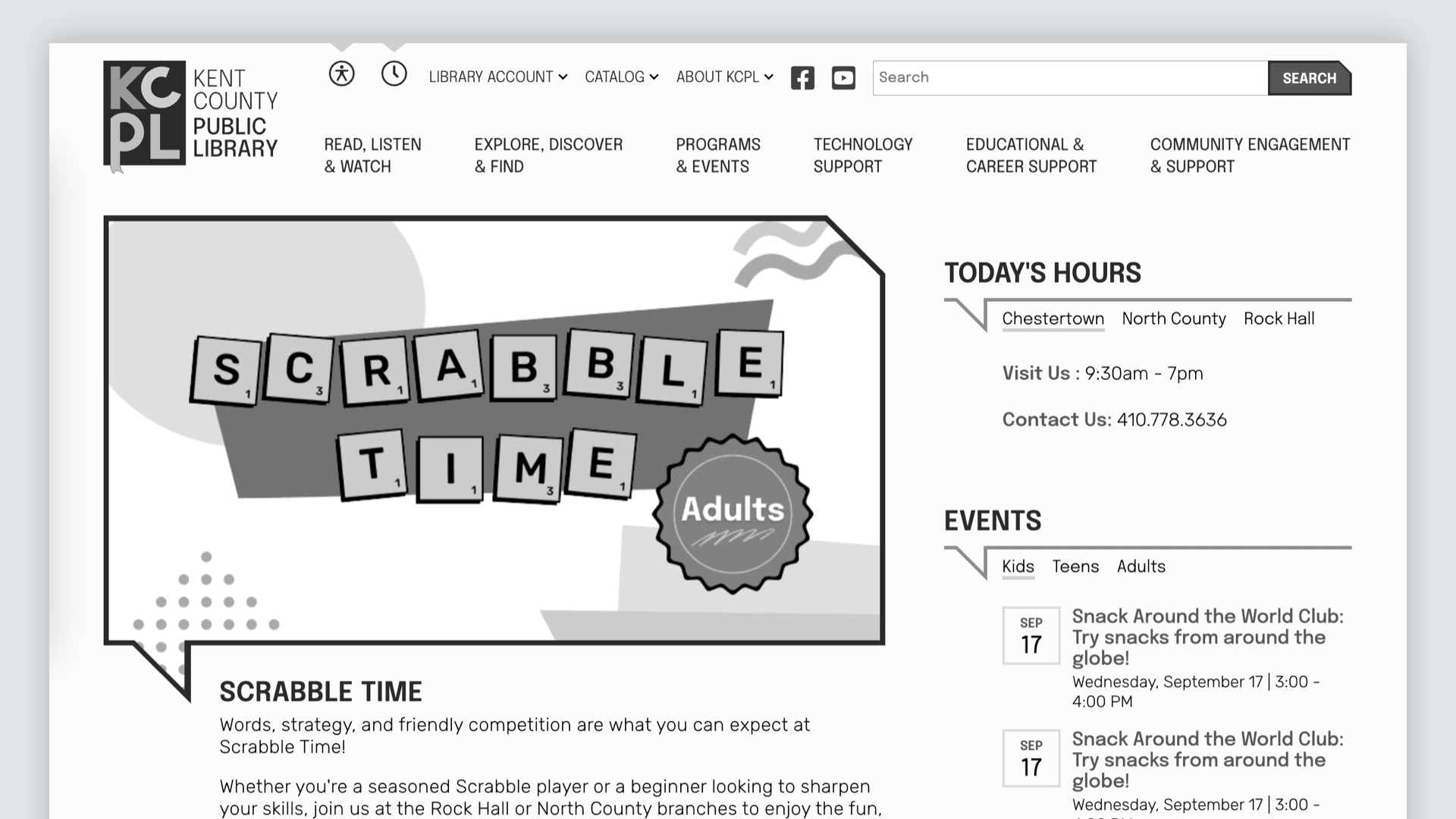
Desaturated Mode
Color can not be the only means of conveying information.
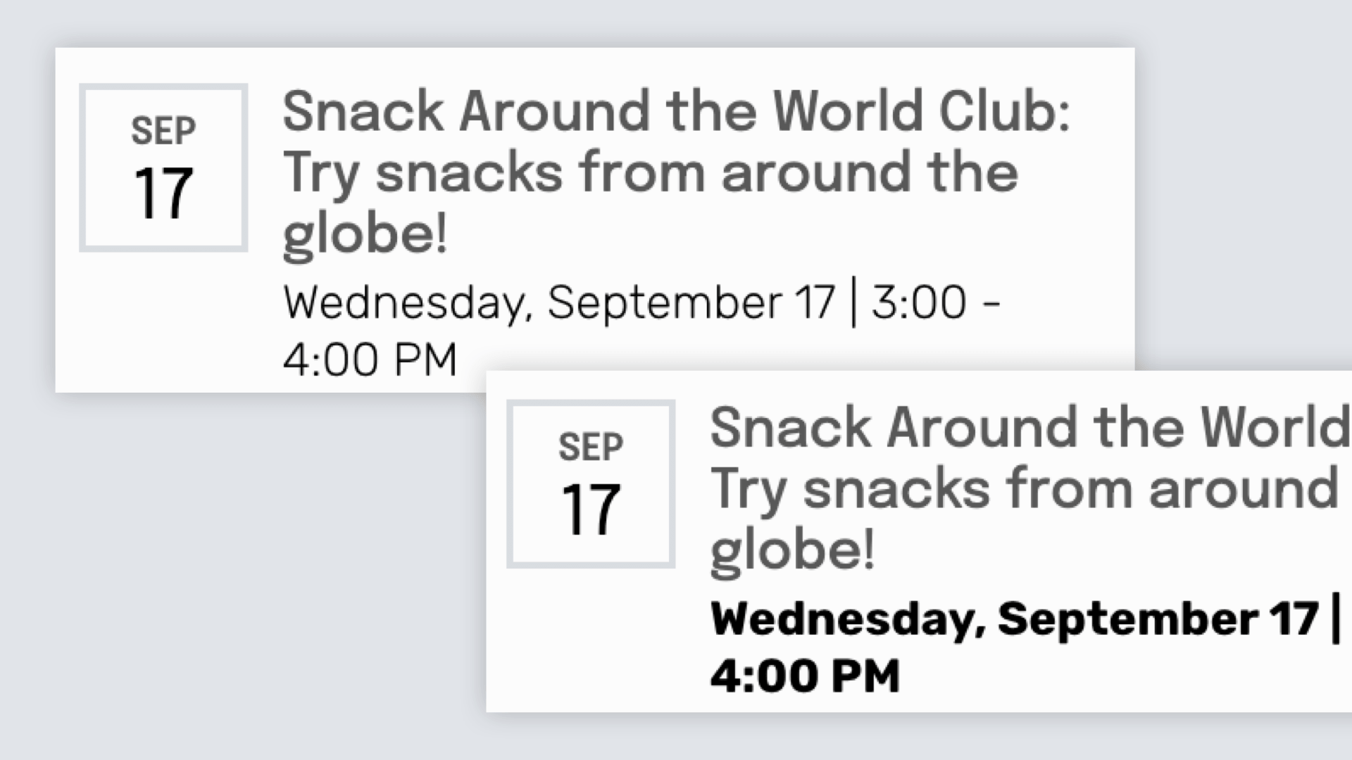
Contrast
Increase text contrast across the entire site to help with readability
Back End Admin Accessibility Tools
Digital Asset Manager
Invest into your images and assets library to help all site editors
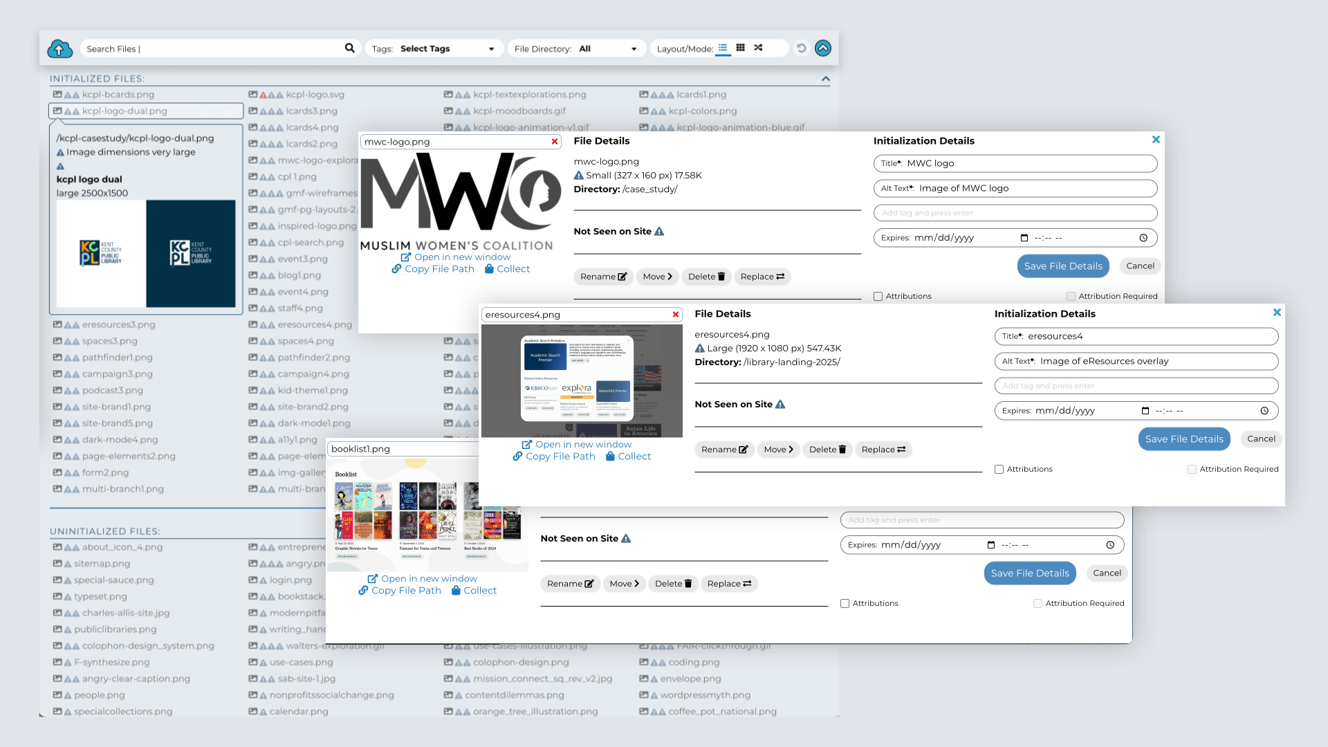
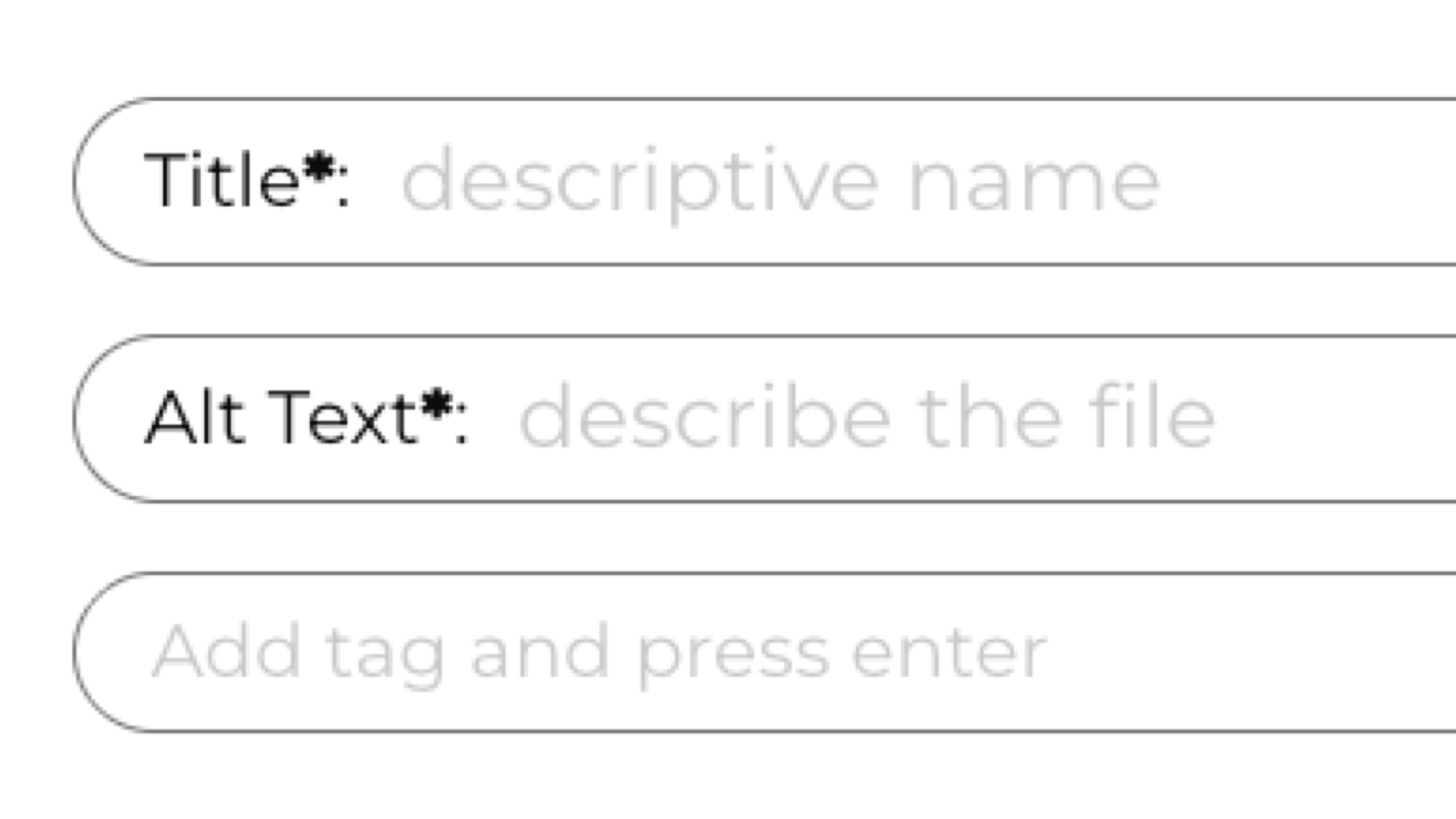
Alt Tags & Data
Used to explain what is happening or what an image represents and good for SEO
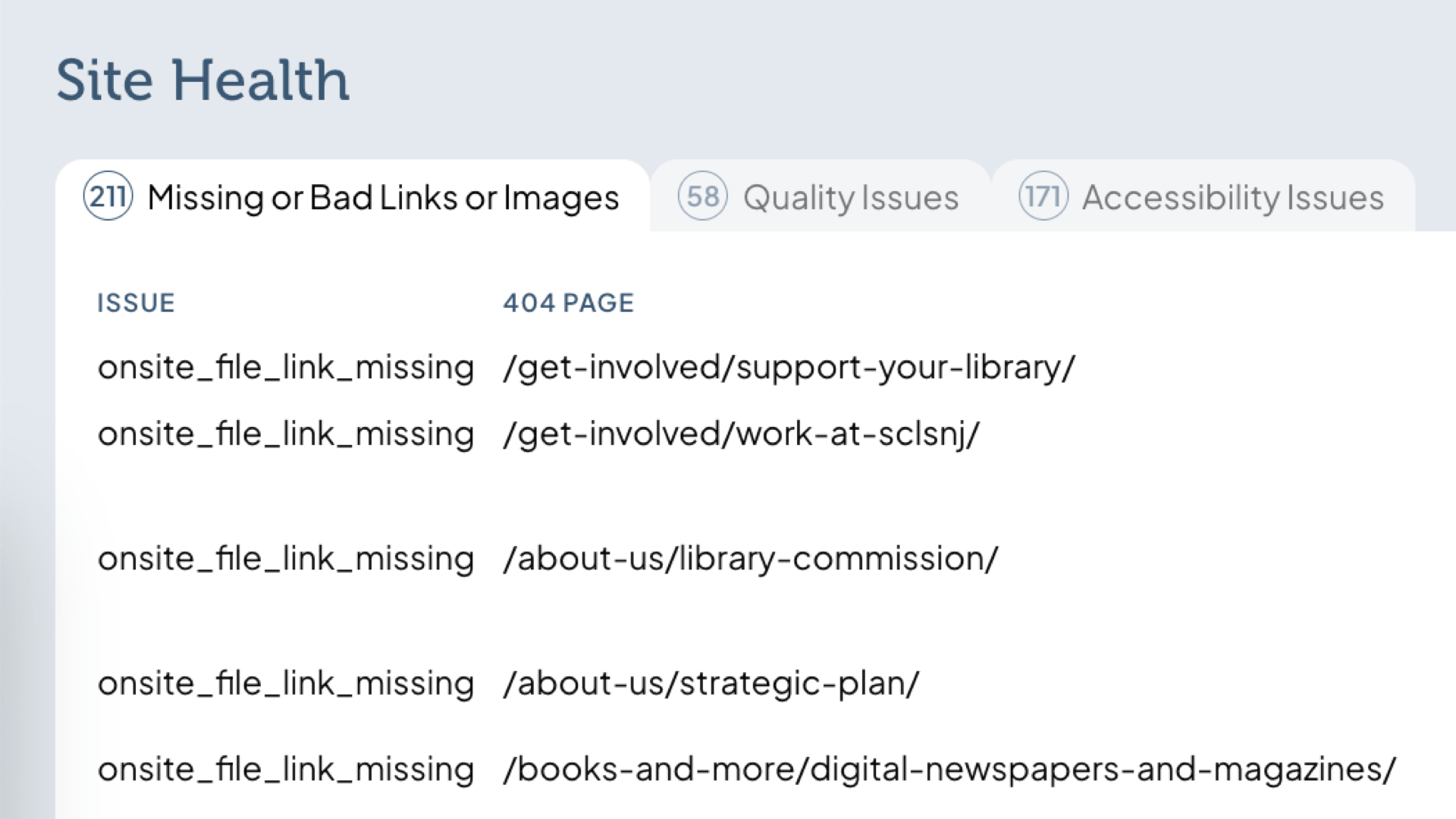
Site Health Tracking
Solve usability and accessibility issues by finding missing links, images without alt accessibility tags, and oversized images
Unintended Advantages of Good Accessibility
Better accessibility is always a good idea, and helps in a myriad of ways beyond helping the most affected visitors.
SEO
Search engines will make better sense of your content, driving more traffic
Internal Search
More useful keywords will be found by visitors using search
Translation
Translation tools will be able to better understand the context of a page’s content
AI Connections
AI can be useful for summaries and as an alternative to search engines
Our Values
Privacy
Preserving privacy in libraries is essential for safeguarding freedom of inquiry, and we rely on tools and systems that prioritize visitor privacy and data protection. Good librarianship has us dismantling Google Analytics, Meta Pixels and sales tracking,

Universal Search
It’s very common for library websites to have separate search systems for catalog, site and other resources, and the visitor has to choose which before they start. This creates silos of information that keeps people from connecting all the library does. U
Open Data / Source
Open data is a way of opening up a library or institution’s non-sensitive data to be useful to other organizations, applications or people, usually in ways the data creator or manager didn’t imagine. Open data drives data visualizations, analysis, applica

Accessibility
Public libraries were founded and built on open standards and accessibility, and their websites need to be open to everyone. Accessibility isn’t a binary and there is no panacea, but we’ve built accessibility into our practice, our content management syst

Info Architecture
Most library sites have a plethora of worthwhile content, and the first job is to find a hierarchy that helps people find and digest the library’s offerings. The second job is to find semantic meaning behind the content and start categorizing it more as a
Common Service Package
Each library has different needs and has a custom service package, but this is an outline of a standard library project. Services include:
1. Research & Strategy
The discovery phase is important to outline the needs and goals of the library, and delves deeper into audiences and their needs (“use cases” / “user stories”), and to determine all aspects of a library’s available data, imagery, media and metadata. These strategy documents inform every part of designing and building the site. Working with libraries, we’ll help guide the process and consult to iterate through the long tail of audiences and use cases.
2. Site Information Architecture
We start the information architecture phase by creating sitemap “themes” based on the available and proposed content of the site, including suggesting new content that can meet the needs of the site visitors and library patrons. In order to find the best design, we wireframe key pages and templates to find the right amount of information density, visual hierarchy and usability. Wireframes are the best way to abstract the data, content and functionality outside of a brand or design.
3. Site Design
We will work through a series of explorations of creative direction, layouts and depth. We will add brand elements to found ideas, mixing in the wireframes and applying site styles. We add secondary and tertiary design elements that aren’t part of the brand to make a more unique, unforgettable experience with a unique voice that’s also highly usable and accessible. We take the brand deeper into the interactive dimension, including forms, motion, screen “painting” and subtle effects that enhance each user’s experience.
4. Site Build
Coding an interactive requires HTML/CSS for every screen size, modern browser, data connectors, image interfaces, etc. We also wire up and test the site’s content and databases. Modern browsers include: Chrome, Firefox, Edge, & Safari. As the project progresses, we’ll set up and maintain development and production environments, and include staging as necessary. Code will be commented & prepared for future developers to maintain and extend, requiring a minimal learning curve. Databases will be pure data so future developers can easily pull content and data from the website.
5. Content Collection & Transfer
While we’re always available for strategy, content sessions and strategy recommendations, we suggest clients transfer their own content. It helps you train and test the site, and gives you (We do offer content collection and transfer for organizations that don’t have the bandwidth.)
6. Site Go Live Process
We will go through our pre-live checklist that includes testing a variety of features, from embeds on external sites and applications, creating forwards from top pages that change URL, checking for references to staging domain, identifying any content marked as embargoed, double checking image sizes and site speeds, timed “cron” jobs are working as expected, and more. After going live, we’ll manage post live checklists and create forwards for top URLs that have changed.
Common Issues Libraries Face
Issues
Our Solution
Outdated or No Content Strategy
If we don't put visitors first, the focus of the site becomes more about the library itself, and disconnected from the visitor.
A Content Strategy that Puts the Visitor First
We start any website project with questions about visitors and their needs, and start a content strategy that's people first. This helps every step of the site wireframing, design and build be focused on visitor needs. As well, content strategies are meant to be living documents, so the investment will help direct other communications like social media, signage and newsletters.
Stuck in Cycle of Outdated Content
Many libraries are using CMSes that are difficult or work against the administrator. Any hinderance on content creation will mean less updates, and less updates will give the community less reason to visit the site. The community will miss out on all of the good things happening at the library.
Library-focused CMS
We’ve built a library-first content management system that prioritizes good librarianship, allowing site content to always be up to date with easy management but also built in tools such as book lists, events calendar, digital resources, blog and other library-focused tools. As well, good content is an investment into data and media / images, and the investment pays off by making a quick blog post or promotion easy to create with correct data, better imagery and small things like pre-filled alt tags and captions.
Disconnected Silos of Information
Your events are on one site, your ILS is another, and the main site doesn't connect anything. People then skip the main site and go right to the silo, missing great information and promotions.
Federated Search and Content
We connect all the library's data into the site itself, so events, new arrivals, book lists and catalog searches all have direct connection to the original data source. We import or connect data via API, so it's a seamless experience when viewing events, databases or materials embeds. Site search is seamless -- all the data in one segmented output that helps people understand both the results and each result's context.
Too Much Librarian-Speak
Many library sites are filled with words and phrases the visitor doesn't understand. (Who doesn't love a good reader's advisory?)
Content and Brand Voice for People
When we center people in the content strategy and consider a brand voice, content starts being created with intention. With UX tools like audiences and personas, content creators can envision specific visitors when they're writing or editing content, and this makes the site more human and fun.
Disconnected or Minimal Branding
Libraries often have outdated or minimal branding, or none at all. A brand is more than just a logo, color and some fonts. It’s a personality that needs to be felt and loved.
Brand That Resonates with the Community and Communicates the Library's Vitality
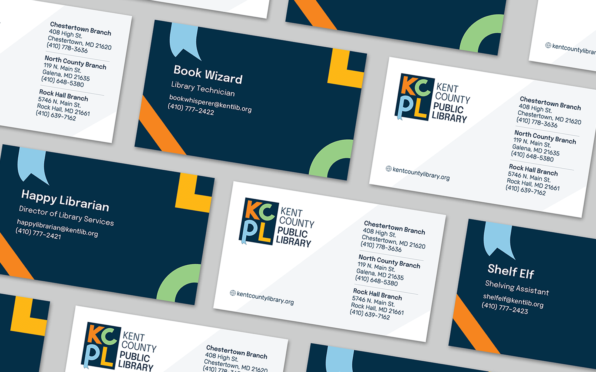
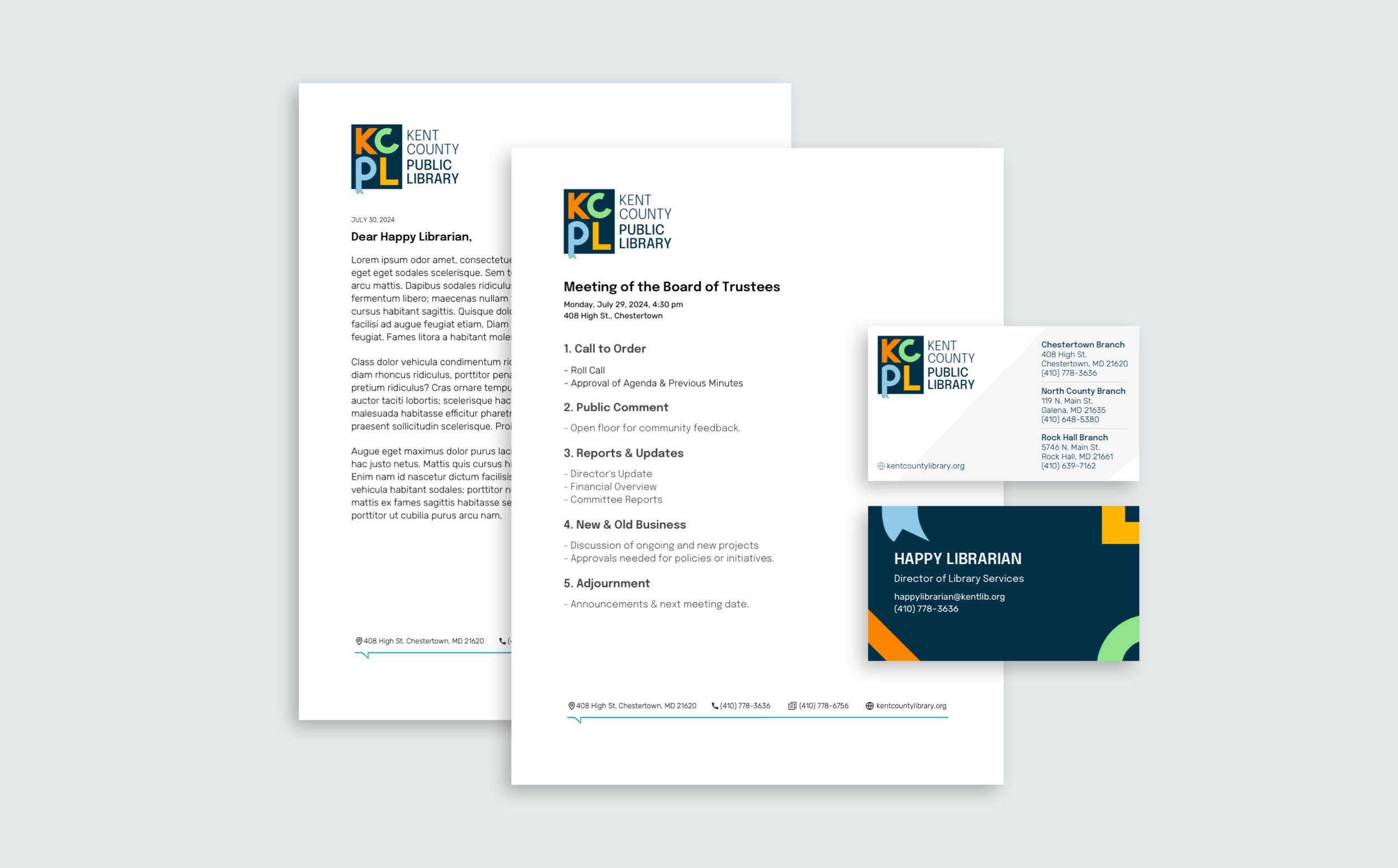
We create brands that resonate with the library’s patron base and the community at large. There are many touch points for a brand, including the logo, wayfinding and signage, library cards, and digital marketing. We work with libraries to connect all these dots and give meaning that engages patrons.
Why a New CMS?
We love the idea of Wordpress and Drupal, along with the plethora of open source CSMes, but we've learned over the years that they just don't work for public libraries.
Their not data-first, which means their basic data structures are merged and unreadable without a machine. As well, the usability and safety of these make prevents administrators from making updates just enough that sites are more out of date and less useful. While we could work around many of the issues, there are just too many issues.
So in 2020 we embarked in creating a whole new CMS built for libraries.
What we found was that the 1000 things we'd like to change about Wordpress is a lot easier when you create the software. Suddenly we had the opportunity to create a file management that's more like a DAM, a page editor with the right abstractions, search that was segmented, API connections that flow in and out of the site, and data editing experiences that are powerful but feel natural.
Architecture at a Glance
Full Stack
On the server side, we use LAMP, the same stack as the most common content management systems because of LAMP's maturity, stability, security and ubiquity. We also employ standard front end CSS and Javascript, and always keep our technology layers simple and clear.
LAMP stack development is powerful but inherently easier, which allows us to focus on finding solutions for more interesting problems.
Search and Other Specialized Servers
We also run specialized servers for specific tasks like search, AI and other machine learning systems. We consider these progressive enhancements, and they're not required, but can help open possibilities for better site experience for visitors.
Technology Stack


Collata: A Library-Specific Content Management System
Collata is the data-focused, design-driven content management system that connects visitors to goals, minds to messaging and site managers to site intelligence. Collata is a recent fork and complete rewrite of our more general ByteCMS, and has a plethora of library-focused features.
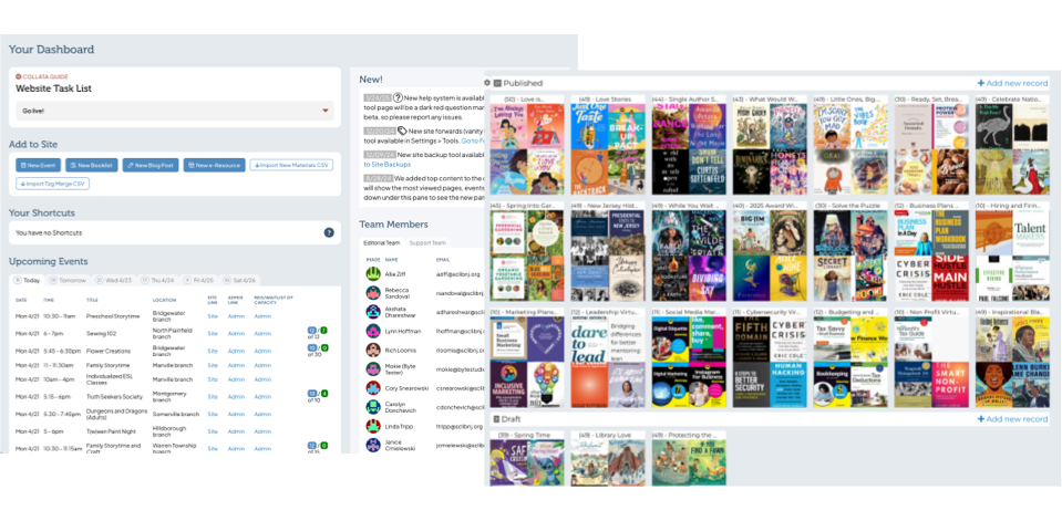
Native Data
Data abstractions get in the way of data readability and usability. We have native data tables for events, book lists, eresources, etc. for interoperability and future use.
Taxonomies and Tagging
We connect data to site pages, views and site search through grouped taxonomies and tagging, groups include audiences, subject tags, eresource types and more.
Data Import
For more data-focused libraries, we have CSV optional imports for new materials, events, book lists, podcasts, videos, etc. This allows for better curation offsite.
Relational Data Export
We have full export features, but not only are they CSVs, they’re relation CSVs in a format we call gCSVs that have data relationships and hierarchies baked in.
API Consumption
We build connections for ILS search and new materials, discovery layers for research and database search, events for a cohesive calendar, videos and podcasts, and more.
Digital Asset Management
Librarians can invest into their assets and make future updates and content creation easier with asset tagging, copyright info, and pre-filled alt tags and captions.
API and Feed Exporting
We can create data APIs or feeds for visitors or systems integrations to integrate site data in reporting, kiosks, digital monitors, etc.
Limitless Templating
We built the system to have unlimited TWIG templating so site developers and designers can build advanced interfaces with full accessibility. Let your brand and message shine!
Ongoing Support
The best support from the team that's invested in your library's success. Our support helps libraries ask questions on style, content, data and general advice, and we’re always happy to talk new ideas.
Analytics & Events
Knowing what's popular on your website and identifying improvements are important, but not letting a visitor's activities be tracked by Google or Meta is vital. We offer private, cookie-less analytics to ensure visitor privacy. We also help identify and set up events we want to learn from, like what percent of visitors use search, and our private analytics is excellent at tracking aggregate events. It's an open system so we can export data to analyze offline, or feed it into the CMS to have easy-to-understand data.
Got Questions? We have answers.
We create independent or integrated tools for patrons and visitors to help libraries showcase the width and depth of their organization.
View All FAQs Show Less-
Q: How long does a library website take to build? A: Depends on the service population size and desired features, and ranges between 2 and 6 months, plus potential time for content transfer / creation, approvals, etc.
-
Q: Should a library have their website developer copy over the site content? A: While we do copy a library's content on request, we don't recommend it. With a library-focused CMS, copying content is relatively easy. As well, it's a good task for both training and beta testing, and will ensure that training will happen for all kinds of content layouts and types. Most importantly, when a client manages their own content, they have a consistent voice and most accurate content, and the act of copying it over helps the library communicator really understand what's being said and how to simplify and clarify it the most.
-
Q: Can we update the site ourselves, or do we need to contact you for changes? A: For library websites, all content and data like book lists, e-resources, blog posts and site tags will be manageable by design. We've spent a lot of time understanding a library's needs, so we've made a very usable and easy-to-manage content management system. As well, for any data, if you change it once, it'll change anywhere that appears on the site.
-
Q: Can you make the site easy to use for patrons with low tech literacy? A: When we build a site, we first work through a content strategy that helps define audiences and their needs. The entire process is patron-driven, and the sitemap exploration takes everyone into account. As well, we can help a library find a voice and terms that address specific needs from low tech patrons.
-
Q: Will our site meet accessibility standards (WCAG)? A: Yes! We build for accessibility, and test against modern accessibility issues. Accessibility isn't a one-time task, it's an ever-changing discipline, and requires understanding from site editors and content creators. We'll help libraries learn how to create content that works across multiple devices and readers.
-
Q: What platform or CMS do you use? Is it open source? A: We've found that common off-the-shelf CMS platforms are not made for the needs of a modern library. While some libraries opt to try to fill the gaps by using plugins, we tend to use a CMS we built called Collata, and we've built it to have a hosted version and an open source version. It's built on the same platform that Wordpress, Drupal and many other CMSes are built, so it's easy to install and manage anywhere.
-
Q: Can we integrate with our catalog (Aspen, Vega, Polaris, etc.)? A: Yes! We have built API connections for searching, new materials, booklist generation, and more to most modern ILS platforms and discovery layers. This allows for full federated searching from your main site, and includes segmenting and visual indicators to help the visitor understand the context of the results. (It's important to note that we don't connect ILS patron usage or data to the site, only collection data.)
-
Q: Can we integrate with our current events provider (LibCal / SpringShare, Communico)? A: Yes, and it's important to have events content live on the site concurrently so people that are searching on your site can also see upcoming events. We have built integrations with a variety of events and room reservation platforms. (As well, you could use our native events calendar with event registrations and room reservations.)
-
Q: Can users search the site and catalog from one place? A: Yes! We integrate many ILS providers to build a federated searching system with segmenting and visual indicators to help people understand the context of the results.
-
Q: Will the site be mobile friendly (or responsive)? A: Yes, of course!
-
Q: Who handles updates, backups, and security patches? A: We do, in a simple monthly fee that includes site support.
-
Q: What happens if the site goes down? A: It's important to note that unlike Wordpress or Drupal where an errant plugin could just bring down a site, our Collata CMS has no method that an administrator could bring down a site. That leaves server or network issues, and we have a host of protocols to help mitigate any issues that arise. We'll likely know about a failure on this level through our monitoring systems, but if a client noticed something failing first, they'd email or call, and our team will spring into action.
-
Q: Do you provide staff training? A: Yes! Since we've given up on Wordpress and Drupal as serious library CMSes, we're able to control the entire CMS experience, and as such we've created a system that's fully intuitive and CMS searches find content no matter where it lives, so training is usually a more subtle set of concerns, like styling and best practices. We're always available for refreshers and new staff trainings.
-
Q: Do you provide staff documentation? A: No, there's not a use case so far where this would help anyone. The CMS is very intuitive and powerful, and the issues tend to be more about style and substance, and those answers live in the help sections and the Issues section of the CMS, where we give screenshot tours and answer questions.
-
Q: Can we make updates without breaking the design? A: Yes! In fact, it would be pretty hard to make a mistake that could break the design, and if you did, we'd solve it with you.
-
Q: How long do you support the site before a redesign is needed? A: As long as needed ... we have 20 year old sites that are still working fine, albeit behind the times visually or in accessibility.
-
Q: Will you be able to add Google Analytics to the site? A: We'll try to talk you out of it -- we find Google to be one of the worst offenders of privacy. We use a private analytics system for all our hosted sites using a privacy-focused analytics software called Matomo. Matomo has most of the same features as Google Analytics, and it integrates well to our Collata CMS to help make a better administration experience.
-
Q: Can we track what patrons are using most? A: Yes, but in an aggregate, non-patron-identifiable way. Privacy is important, and we use a privacy-focused analytics suite called Matomo in a private network so no usage or patron data escapes to the wild. (We also collect most minimal patron data possible for events registrations, etc.)
-
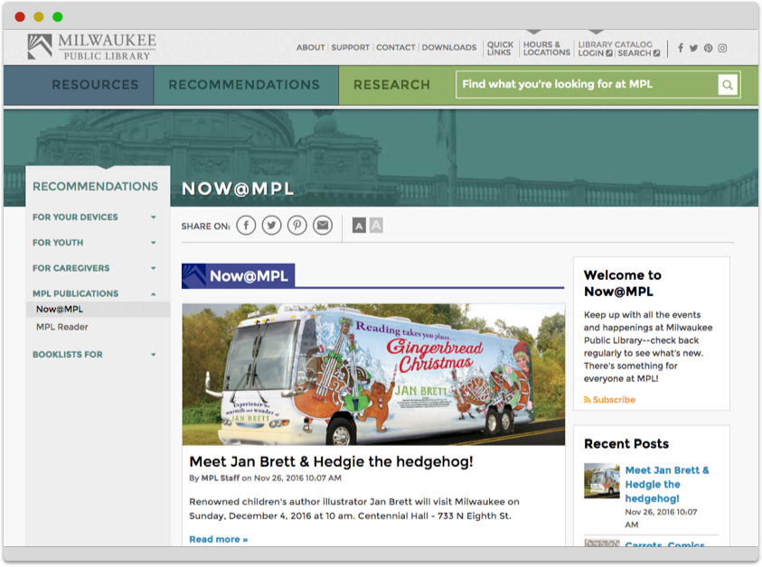
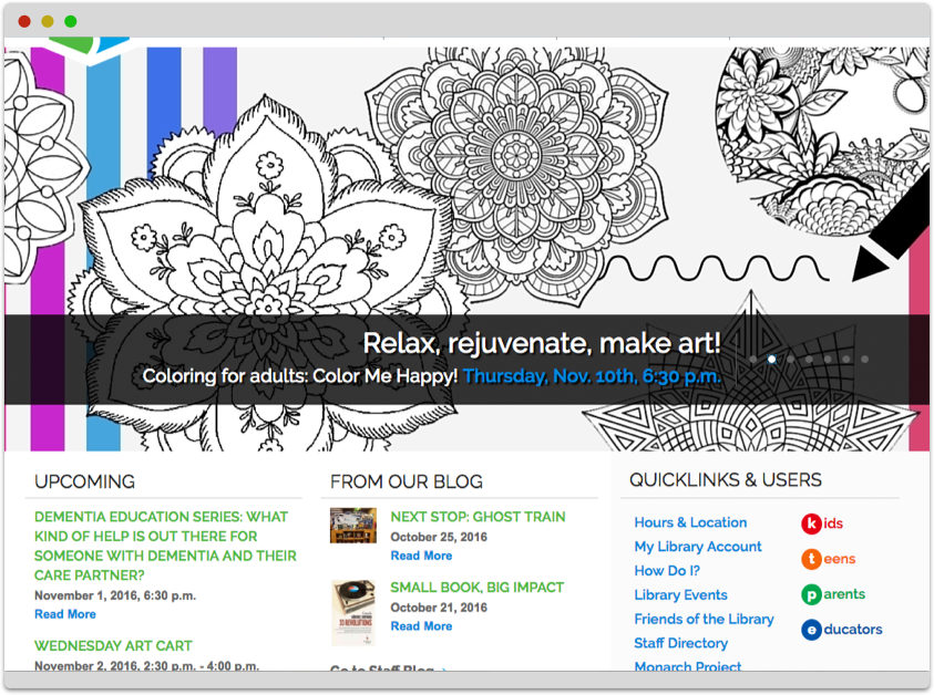
Q: How long have you been building library websites? A: 20 years was our first -- Racine Public Library -- but we began in earnest in 2013 with Shorewood, WI and Milwaukee, WI public libraries. We work with them both still.
-
Q: Is this CMS built specifically for libraries or adapted from a general platform? A: Built specifically for libraries, a project started in 2020.
-
Q: Can our staff manage content without coding knowledge? A: Yes, no technical experience is necessary to manage an entire library website.
-
Q: How flexible is the CMS for customizations, like homepage promos, e-resources, or events? A: Very flexible for all content changes, including page content and databases.
-
Q: Will a new site support accessibility overlays? A: Yes, but don't. Accessibility overlays are the wrong answer to accessibility, and often make it worse. We build all sites for accessibility, and have a preferences panel that gives all visitors the ability to choose their experience, including dark mode, high contrast, large text, etc.
-
Q: What hosting options do you provide — cloud, on-premise, or managed? A: We can build for any requested platform, but we almost always host our sites, and that way there's one cost for hosting and support.
Let's have a conversation.
