Work
filter your experience
Services
Suburban Library as an Trusted Oasis
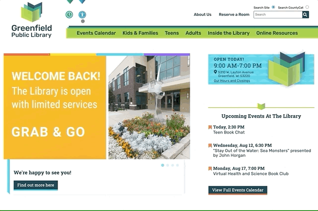
GPL had an incredible physical space, but the library’s visual identity and online presence didn’t reflect its role as a calm, creative community hub. The old brand felt disconnected from the actual library experience—a place that was both intentional and welcoming, especially with its surprising outdoor garden and inviting architecture. GPL needed a new way to express who they were, starting with their brand and digital home.
Overview
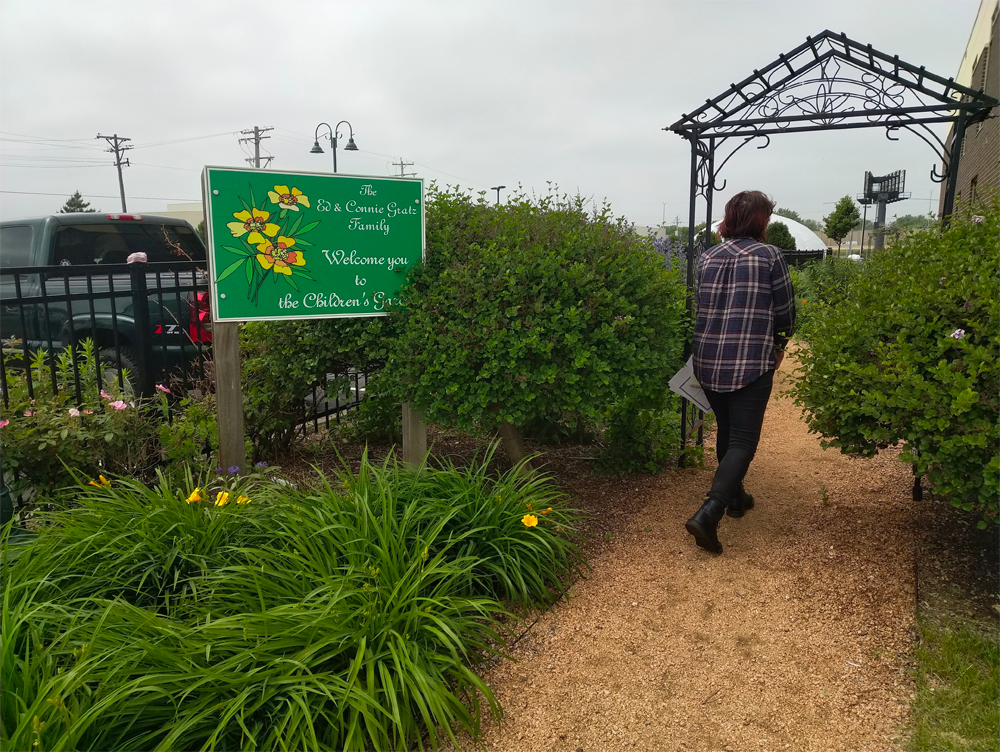
Greenfield Public Library (GPL) had recently moved into a beautiful space in the municipal campus of the suburban city, and the library building is so incredibly well designed and orderly, with plenty of dashes of community spaces fulfilling the third space ideal many libraries are embracing. One of our favorite parts of our visit was their garden, a small, enjoyable oasis in an unexpected place, a perfect third space.
We had the opportunity to create the brand and build the website for GPL, and the idea of "trusted oasis" became the theme we wanted to explore.
Branding
After doing a variety of library websites, each library is different with unique focuses, audiences, collections and spaces. We start projects with a deep look into audiences and their needs (use cases), at the content they'd want to see, and the goals we have for them, like knowing about events, using the community rooms, etc.
GPL was an unusual case for us because while the brand was old and didn't feel at all like this library, it was set, so we had to make a site that could fit into this brand. We found what we'd consider the best case approach, finding an edge of the brand that was at least closer to the library's feel. This base case version did clarify one of thing for GPL -- they really did need to redo the brand.
Building brands for libraries are not easy, not for the stakeholders and not for the designers. (Just ask Seattle.) Libraries are easily more than books, but a stack of books is so commonly used represent a library. (It's perhaps similar to how "save" buttons on the web often have an icon of a disk -- who even remembers those?) Any organization that is managed by administrators and committees or boards will have trouble with branding -- people have strong opinions. But when a library sees the old brand dressed up as good as possible and they don't see themselves, it's time to dig in and find some new ideas.
GPL's brand was created through a wide exploration of multiple ideas. While it's common to present a client with the three more finessed, finalized versions, we've found some libraries need rougher, earlier versions of many more ideas. They want to be part of the "ideation" process.
In the end, we landed in the tangibly abstract, a logo that ends up being an object more in the eye of the viewer. Of course a brand needs to have more visuals than a logo and fonts, and we define backgrounds, typographic icons and lots of little details that help tell the feeling of the library across multiple media. We also provide a colophon in the content management system so that future administrators can easily find the assets and typography ready for use on-site or off.
Accessibility
Library websites are for every single person in a community, especially for the people rarely seen in the community. Every site we build has an emphasis on accessibility, but we took the time with GPL to find some new ways to help people of varying abilities. (In our world, accessibility is shortened to a "numeronym": a11y, 11 representing the length of the word. See also internationalization: i18n.)
For GPL we created an accessibility panel, not visually unlike the an accessibility plugin. Off-the-shelf accessibility plugins aren't worth a dime usually, we can't just drop in a plugin when we're done with a site and call it accessible, far too many failure points and generally those are seen as counterproductive in the a11y. But we like the idea that people of any ability might have preferences to read in high contrast or dark modes, so we included these as part of the a11y panel. Tabbing and aria labeling are also important to make the site more accessible.
Adaptations
A site lasts a long time and is more relevant to users when the content management lets the site's owner adapt content easily. Rarely is that tested so quickly as it was for GPL -- GPL's site came online in the early throes of the coronavirus. The site's CMS gave them an opportunity to quickly set up STEAM at Home, virtual storytimes, virtual nature clubs (with pick up curbside gardening kits) and lots more.
Lagniappe
The a11y panel was the big little extra we added to the scope. (We don't charge extras for our lagniappes.) We also also created different themes for kids and teens, giving a little flavor to specific audiences always improves the experience for them. Each section uses one of a set of brand-friendly colors and uses that for architecture throughout the section, giving someone a sense of place no matter where they are.