Work
filter your experience

Services
Immortalizing ancient manuscripts in the interactive, open-source, digital space.
Scholars, artists and explorers alike have an all-new, interactive way to experience The Walters’ collection of over 300 ancient manuscripts from the 8th to the 20th century.
The Beginning
We first heard about The Walters' manuscripts at a hackathon in Baltimore. Ariel Tabritha and Kimber Wiegand spoke to the collective builders about what we considered one of the most interesting collections of The Walters. Manuscripts are hand-lettered and illustrated books, often for prayers or learning, from long before and well after the invention of the Gutenberg press. The Walters had been long in the forefront of the open access movement, and had already created a site that housed all of the data and images surrounding the collection and releasing their work under the Creative Commons 3.0 license.
Their online interface was basically a digital repository that was built only to open data, but was almost impossible to parse unless you were an expert in the field. We wanted to take the next step in opening the data: making it usable and explorable. The current site worked like an a series of directories on a hard drive, with only title or curatorial indexing. A reader could dig and dig to find a manuscript and then a page but then back multiple times to switch pages, back more to switch manuscripts. A reader either knew exactly what they were looking for, or they were frustrated.
The Walters asked us to design & develop a new interface for their digitized manuscript data, making it possible for users to search and browse these beautiful piece of history. Like the start of any data search and discovery exploration, we didn’t know what this would look like, but we did know we needed to build an interface that made the unique manuscript data at once engaging, searchable and even serendipitous.
With that in mind, we started our design exploration at the source: the data.
Early Explorations

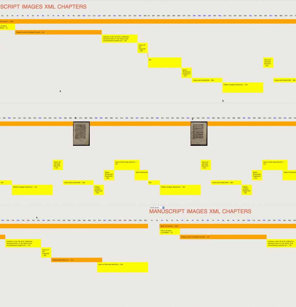
When we really started digging through the data we realized just how deep and confusing the data was. We expected right-to-left and chapters and illuminated folios. But why are some manuscripts’ pages out of order? What are these bookmarks and flyleaves that are throwing off the page sequencing? And what about these single-page scrolls, which have no covers at all? What are the relations between manuscripts, the common categories or tags?
It became clear that these manuscripts were so much more than just books. What other nuances were we missing? We sought understanding of the data by creating a series of increasingly interactive prototypes, including a hand-coded prototype manuscript explorer. Our manuscript explorer was built for a grand total of 10 people, our team and the Walters' team, and would never see the light of day beyond that. We can only do our work if we can ask great questions, and the explorer helped us get lost and then ask for answers until we really got a sense of what the data meant.
Visitor Explorations
We also spent a good deal of time thinking through the experience of a visitor to the site. What kinds of people were digging through the data, and what were they hoping to find? Are they looking for relations between manuscripts or were they binding scholars or were they people looking for art inspiration? We explored the user base by asking lots of questions and charting though what we call the "user segments" and their needs, their "use cases".
Iterating through the visitors and documenting their hopes and needs, we could start defining what the user experience would need to include. We create a list of overarching principles we will follow throughout the design and build process. For Ex Libris, visitors needed a curatorial view first, but then immediately jump into the full collection. They needed to know the context of the manuscripts from any place in the system, and know how the keywords worked between manuscripts. They needed to know how chapters work but be able to disregard chapters completely. They needed to be able to skip the text completely and do visual explorations in a manuscript. Most importantly, we needed a system that would almost never yield zero results -- it was far too easy to look for islamic texts but accidentally choose 15th century -- so the moment they choose a keyword, we needed to help them find work, no empty clicks.
A Page-Turning Experience
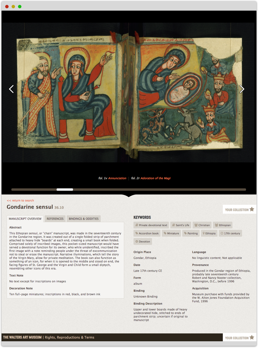
Most manuscripts take the form of a book, so we found a page-turning interface to be the ideal way to present the manuscript data. We used archive.org's page turning library as aa base, but we needed to build a lot of ideas and connections over the top of it. Our extra interface systems present the user with opportunities to jump straight to specific illuminated pages, to “flip” through a preview of each spread with the scrollbar, and to even see the manuscripts’ folios in a grid or vertical scroller.
We also include the keywords, descriptions, meta data and the bindings and oddities in sections below the page turning system. Interfaces can be didactic and not overpowering, letting people understand the context of the manuscript will exploring the content.

Search and Discovery Strategy
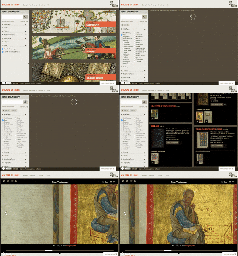
Once we had a good sense of the data and how users would interact with a single manuscript but be able to see the context below, we developed a strategy for how they would search & browse all 300+. A modern google-style search box where users could enter their own keywords would most often lead to 0 results, so we established a custom strategy to fit the data. To learn more about how we did this, read Sam’s blog post on the project.
 We developed multiple different access-points:
- Filtering by established keywords
- Filtering by user-created keywords
- Sample searches
We proposed Sample Searches as a way to teach users about the unique search system, as well as give non-researchers an overview of what they might discover.
We also used our overarching principles at every step of the project to ensure our discovery and search side didn't miss the original hopes and needs of the users.
There's a moment in some project where you know you've really found the interface when you or your own team gets lost in the content beyond the interface. We spent hours and hours learning about the koran and and its teaching of Arabic, about Books of Hours carried about by children, and about lobsters which are really crabs but 14th century artists hadn't figured out how to draw them yet. The manuscript content was amazing, but the discovery and search interface makes it come alive.
Lagniappe
One of the things you'll see common to most Byte sites is a little something extra, a lagniappe, as the Creole French term goes.
For Ex Libris, we found the content intriguing in so many ways to us, we found ourselves wanting to share, but that system wasn't in the budget. So we threw in an easy collecting and sharing system so people can collect any number of manuscripts or folios and share them with a friend or online.

Awards and Recognition
Byte and The Walters won the 2017 gold Applications and APIs MUSE award from the American Alliance of Museums for The Walters Ex Libris website. The MUSE Awards competition received more than 200 applications from a wide variety of institutions in North and South America, Europe, Australia, and Asia, and is considered the highest award in the United States for museums.
Byte and The Walters were also invited to present the project at an international conference for museums in the Best in Heritage conference in 2018 in Dubrovnik, Croatia. We presented alongside a wide array of international projects within the technology space for museums, and learned about efforts across the world that museums are doing to connect people with collections.
Byte was incredibly committed to realizing this vision from day one, and their expertise in both functionality and style led to the development of a final product above and beyond what we had envisioned.
Walters Ex Libris