Work
filter your experience
Employing a most human approach online
Shorewood Public Library (SPL), a high-traffic community hub with programming for all ages, wanted a site that reflected their inclusive values, supported tech-savvy growth, and brought their vibrant in-person presence online. With curated booklists, robust blog content, and a loyal readership, they needed a clean, intuitive site that could adapt with them—and work across all devices.
Overview
Shorewood Public Library (SPW) is an inner-suburban library that has great reach into the community with programming for kids, teens, parents of young adults, and an older community that’s embracing technology. They boast one of the highest usage rates in the state, and wanted to help build that community online.
Strategy
Being a pillar of the Shorewood community, they needed a site that reflects their values with both imagery and brand. They also needed a site that was clean, easy to use and dynamic, and worked on all screen sizes. They have a dynamic events calendar, curated book lists, and a blog that we imported from another platform. They also take great advantage of their kids and teens sections, and promote both early literacy and adult adoption of technology though their campaigns and bucket systems, and gain audience through great content on the blog and the site.
Process
SPL was the first of many of our modern library websites to go live, so a lot of our process structure was first executed and tested with their website. This process was also created in concurrence with building Milwaukee Public Library's website, so we had an unusual opportunity to compare and contrast audiences, use cases, goals and content.
Our standard process of creating multiple sitemaps to explore different themes started with here. SPL wanted to talk about what a patron could do at a library but without jargon. We found a very human, actionable way: "Discover | Explore | Grow | Connect."
Of course a navigation item named "discover" would be a bit unclear if a visitor knew what they wanted to find by more traditional nomenclature, so we added a secondary set of words as essentially subheads of the navigation section. It was also one of the earliest uses of a "mega nav," the navigation that covered a substantial portion of the screen with a more meaningful content hierarchy, so it's easy to mouse over four navigation items to learn all the library does.

Content Management is Key
We created the first version of the site in 2014, and it was our first modern library website that went live. We made substantial improvements in our library CMS over the years, so we upgraded the site in 2018. Since SPL wanted to keep the design exactly as it was since it was so successful in their community, it was an interesting study of the value of better content management.
The best data came in form of the coronavirus in 2020, where while the library closed, the site visitors increased by 50% and the page views doubled, more than any library we know. Of course it was the content that drove people to site, the content management made possible to make those kinds of content changes easily and quickly.
Lagniappe
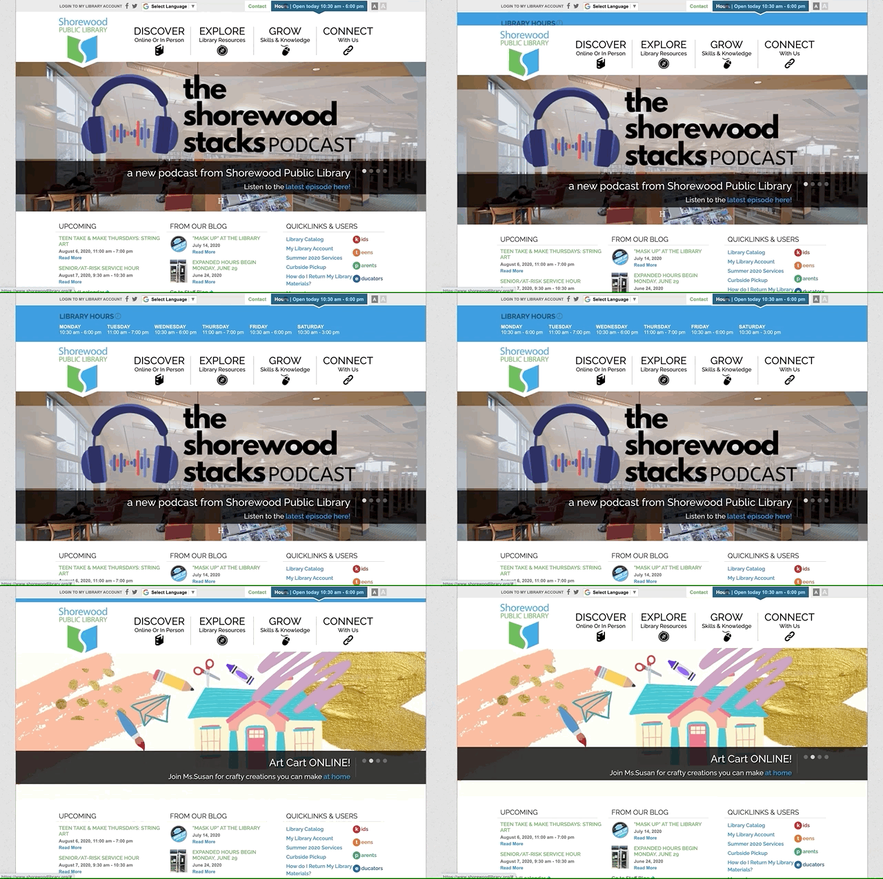
Usually as we're getting close to finish with a website, we discover some features we just needed to build even though we were out of time for the project. SPL's hours were an easy page to find, and putting them in the footer is easy, but the best way we could show the hours, we discovered, was a clear, easy pane at the top that says today's hours along with an easy pane that opens to show all the hours. Now when we see it, it's so integral to the site it's hard to imagine a site without it, and we've built something similar into every library website we build.

