Work
filter your experience

Services
Inner suburban library excites with collection discovery tools on their dynamic website
Whitefish Bay Public Library commissioned Byte to build a site that was focused on delivering quality librarianship through discovery and to their patrons and the community. With a strong patron base and a newly designed logo, WFBPL wanted to create an online experience that would engage users, showcase its dynamic offerings, and allow staff full content control—without compromising visual identity.
Overview
Whitefish Bay Public Library (WFBPL) is an inner suburban library on the north side of Milwaukee with a patron-driven collection, plenty of meeting and community spaces, and a strong patron base.
Process
Each library we work with is different with unique audiences, events, spaces and collections. We start each project by segmenting audiences and their needs (use cases). We create lists of the content they'd want to see and the goals like them to achieve, like knowing about events, new books and media, using the community rooms, etc. We use these audience segments and use cases to help understand what content will need to be written or collected.
Once we have a good sense of the content needs, we do a sitemap phase to help abstract sitemap ideas into different themes. Sitemaps themes follow users, programs, common use cases or the old fashioned about / our collection / our services, etc. WFBPL used a bit of a task-focused menu and a strong need-based utility / second menu.
Most site we construct start with wireframes for more content exploration, and then fill in the design to push brand. Like most projects, we created multiple designs to explore different visual themes, including colors, fonts, iconography and other visual styles, and worked through the ideas with folks at WFBPL. Once those were decided upon and approved, we go into build mode as our development team creates the site and builds in the content management to fit with their styles and content needs.
Brand Depth Explorations
WFBPL had commissioned a designer to create a fun, new logo for the library. Websites that just toss in a logo are usually forgettable and generic, and we are committed to making the web a better place, not more generic. (We're looking at you, Wordpress.)
A dynamic side design needs a deeper brand behind it so there's meaning in the rest of the design. Using the logo's parts and and colors and stitching them together into a more cohesive meaning, we found a design that looks like WFBPL from top to bottom, and befits the tagline "Excite Your Mind!"
Events Made Easy
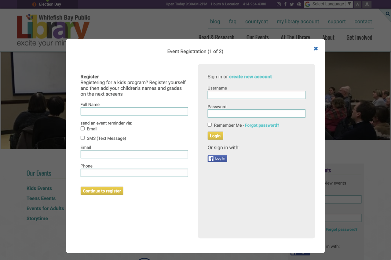
Great events are the mark of a great library, and WFBPL has a plethora of events for every audience. We include an incredibly easy-to-use events calendar / list for library sites. WFBPL goes a step further to allow registration for events, and reminders and updates via email or SMS. Events are easy to manage in the CMS, with direct features to message everyone about an event change or to cancel the event with cancelation notices going to all registrants.

Content Management is Key
For a site as brand-focused as WFBPL's site, content management can't get in the way of librarians adding and editing quality content. WFBPL has full control of the content without having to think about brand styles or the ways the styles work on a site. Good content management gives the site longevity and gives administrators the power to be more active and relevant without having to fight their CMS.
Lagniappe
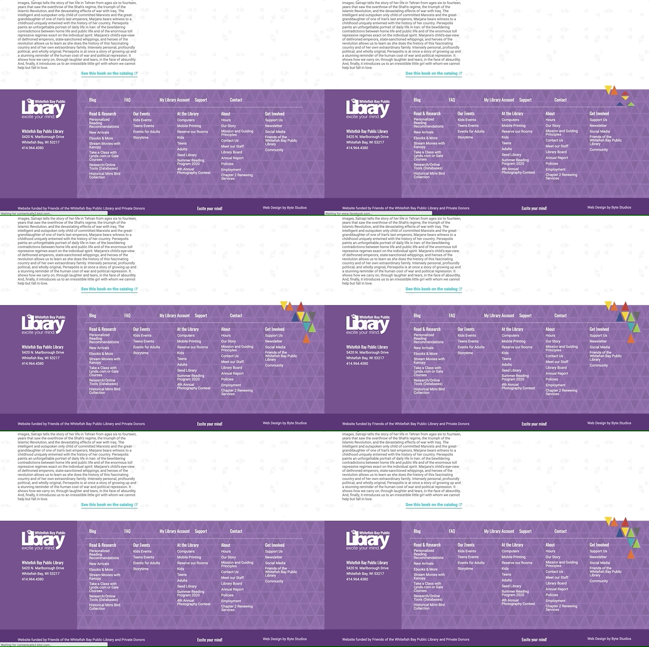
We usually add features or elements to a site that are beyond scope because they really make a site come alive. A site with a strong, fun brand like this calls out for animation, so animations we created! We have triangles from the logo in groups on the site, and in a couple of key places we created animations that seem to have the triangles fall into place. Nothing terribly distracting, but adding to the fun level of the brand.

(New quote from their blog, thanks Eva!)
I firmly believe that the Whitefish Bay Public Library has one of the best websites in the county. It is straightforward, intuitive, and doesn’t bombard you with too much information on the page.
- Eva Hong, WFBPL Blog
Whitefish Bay Public Library worked with Byte to redesign our website. Byte had worked with a number of libraries before working on our project, and they had a strong understanding of library services right from the beginning. They were able to take that understanding, and translate that into a site that fits our needs and the needs of our library patrons.
Byte spent time getting to know us, as well as our brand, and they did a wonderful job of translating that into our site. The site that Byte designed was a huge improvement over our previous site. The new site is very engaging and library focused.
Each step of the way, Byte made sure that the website matched our vision and helped to steer when we required guidance. It's been a few years since we first launched our site, and I'm so glad we chose to work with Byte on this project. They've continued to offer excellent service and respond to our changing needs. The content management software is very easy to use so that any staff can be easily trained to make updates. With our site from Byte, we've been able to offer so many ways for discovering new books and authors including a list of new materials featured right on our homepage as well as booklists that link right to the catalog. Overall it's been a great experience and I'm extremely proud of the site that Byte designed, developed and built for the library.
Whitefish Bay Public Library