By: Joy O'Brien on Nov 4, 2014
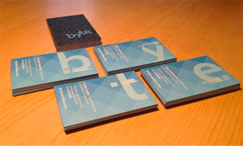
Anyone familiar with Moo, a popular printing company, will recognize that these are Luxe business cards. They’re about 3 times thicker than your standard card, and it’s noticeable. There’s also a very subtle blue stripe all around the edge of the card. It’s all about the details, folks.
Why does a web design company need a business card?
Let’s talk a little more about the design. And of course, in order to talk about design, we must talk about how it’ll be used. With all the contact information we could want just a google (or linkedin, or facebook) search away, what’s the purpose of a business card these days?
Lots of people have been eager to announce the death of this ancient method of exchanging information, and they’re partly right. They aren’t as strictly useful as they once were. When I’ve received a business card and stowed it away, it’s unlikely I’ll dig it back out to find your website— I’ll probably remember your name and search for you with aforementioned engines.
Then there’s the fact that a business card is physical. In this age of smart phones, you’d think we’d have some sort of app that would improve upon the old methods.
Still the reigning champ in networking
Nothing has beaten a nice business card yet, and the reason is *because* it’s a physical object. Tactile. Interactive, even. It’s easier than any app out there— no need to unlock, sign in or charge it. Even TED conference speakers, some of them the most tech savvy people in the world, prefer little pieces of paper over the new, digital options. Handing a business card to someone is like giving them a branded handshake— it’s a meaningful gesture, made even more meaningful by the way its been designed.

Our new cards make an impression.
We designed the cards to make the user want to take a long look at them, and here’s how we did it:
1. Card thickness. I know I’ve already said it, but a surprisingly heavy paper stock makes a huge difference.
2. They’re two-sided, with vibrant colors on each side. This isn’t especially innovative, but it encourages the user to flip back and forth between the two sides.
3. Each studios member has a personal phrase, unrelated to their contact information, written on their card. It's on a different axis from the rest of the information, which encourages the user to be inquisitive, and rotate the card.
Bonus: This can only be seen when all four cards/letters have been gathered, but they can stack on each other to spell out ‘byte’. The blue pattern in the background even lines up. Although I can’t personally claim full rights to the idea (it was a team effort), I will still accept your high-fives.
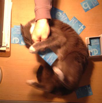
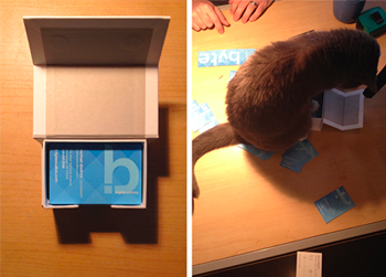
So, you want one? Come on by! Preferably before Mokey eats them all.

