Work
filter your experience
A seaside Italian villa, right in our backyard
A quick European getaway, or how a little lakeside house museum made a bigger splash.
Background
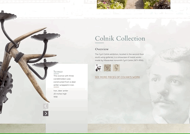
Villa Terrace is a hidden gem that transports you from the east side of Milwaukee to an Italian villa on the Mediterranean coast. It has innovative changing galleries by some of the most interesting artists in the midwest, and a permanent collection of Cyril Colnik's wrought iron work. They also have an expansive grounds called the Renaissance Garden along Lake Michigan.
The property is part of the Milwaukee County Park System, and like many house museums a good amount of revenue is derived from events and weddings. And it's easily one of the most beautiful spaces for an event or wedding in the area.
We built this site in concurrence with a sister museum website, Charles Allis Art Museum. Charles Allis and Villa Terrace are very different experiences, so we needed to connect the two sites together while at the same time making them distinct and experiential.
The difficult part is that both museums are hidden gems. We were asked to help change that.
User Exploration
Like any museum, there's a seemingly endless amount of stories to tell. A place rich with history can follow the story of the original owners, the building's architects, the exhibitions, the exhibition artists or the history itself of the process and journey of being a museum. We started by asking questions about visitors.
When the museum board started their search, they were ahead of the game and created a list of the types of users they'd like to attract to be more involved with the museum. That gave us a head start with identifying and asking questions to a variety of people that were described by the initial list. We also created our own list things people would like to achieve on the site (use cases) and the general process people become more involved (user journeys).
Content Strategy Exploration
These explorations lead us to a few different directions the content strategy might take. We've built a tool that helps us explore different competing content strategies easily and makes presenting site map and content ideas easy, so using our ByteMap tool helped us find an interesting path.
This process helped us realize how different Charles Allis was from Villa Terrace. Charles Allis was a traditional house museum with the owner/art collector's objects and art preserved from the time they died, and walking in was walking into a time machine. Villa Terrace has very little family artifacts and art from the Smith family who built it, and this museum's visitor experiences were completely different.
So we started telling concurrent stories, letting people choose their interest. Even the mapping was based first on what the visitor wants to experience -- from the perspective of the Smiths, from the perspective of a visitor, from that of the Renaissance Garden explorer, or from the perspective of a venue renter or wedding planner.
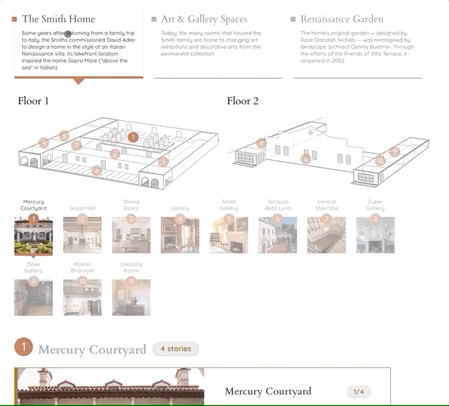
Collections
As this site was done in concurrence with Charles Allis, it was interesting again to see how much the museums diverged in terms of experiences. The collections are very different. We divided the interface for Charles Allis' collection by floors, rooms and then objects. Villa Terrace has the Smith rooms and the Colnik Collection, but most of the space is devoted to changing exhibitions and general space. So the collections wouldn't be by floor and room, it would be by user interest then location then what we called vignettes -- stories that attached to locations, so that any number of exhibitions could be shown in the experience of the place itself.
Visual Exploration
The experience of Villa Terrace is transporting and magical. It's open and flowing. It's personal. So to create a design, we followed these waypoints. Big images as backgrounds. Elements on the page flow at different speeds as you scroll. As you explore, elements build around you. Villa Terrace couldn't be a standard experience online just as it isn't in real life. We've learned that the more enticing a house museum's website is, the more secrets it divulges, people are a lot more interested in the space itself.
A common visual expression for us is content timing. A modern trend in websites is to not give people much information on any given page or screen, and keep text to a minimum and photos to a maximum. While Villa Terrace tells its stories well through photos, showing a basic amount of information doesn't help the disparate audiences see what's valuable inside the site. People make an immediate assessment on how valuable a site will be to them, so the menu or the content visible "above the fold" are the visual clues of how deep the content goes, and if the content has any relevance to them.
We see content timing as important, and on first screen you should have hints about what's inside. So, whatever the screen size, we wanted to show the first screen of the home page with the top of the events and exhibitions showing. When we go deeper on any page, you see a top beautiful image, but are prompted with content before having to even scroll. Content timing is the over-time equivalent to content hierarchy, and we spend an inordinate amount of time on hierarchy and timing to tell the best story possible.
To show the content depth, and the depth of the museum itself, we filled in content and details with "micro interactives" on the home and landing pages, always being able to scroll between a few elements of the Colnik Collection or vignettes of the story of the house or the experience of renting the space for a wedding or event. Let people wander the same way they could through a beautiful space, not list items and bold text the way sites often are.
Lagniappe
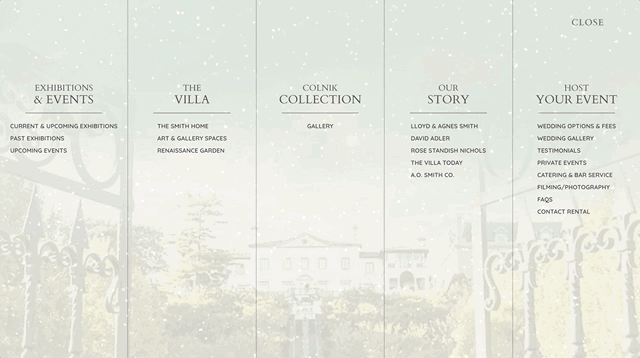
Most sites we do have a little something extra thrown in, a trick or tool or interface. Most of the time that involves a 3D experience or mapping, as those kinds of experiences communicate much deeper than images and words. Villa Terrace has a fun mapping experience driven by our content and user strategy. As well, we wanted to add experiential feels to the site, so creating a menu that's full screen and has a motion background that you whisk away the parts as you move the mouse.
We couldn’t have found a better partner in this process than Byte, the stunning results speak for themselves.
Villa Terrace Art Museum