Work
filter your experience
Revitalizing Kent County Public Library: A Dual Approach to Engagement
Kent County Public Library approached us with a dual challenge: to reconnect with a diverse community through an equitable, vibrant brand and to address a lack of fresh content caused by an outdated CMS. Our goal became clear—to create a welcoming, inclusive identity and an intuitive digital experience that repositions KCPL as a modern cornerstone of community engagement.
Kent County Public Library serves the residents of Kent County, Maryland, through its three branches located in Chestertown, Galena, and Rock Hall offering a diverse array of programs, digital resources, collections, and materials for people of all ages.
Discovery Phase
In our early conversations with KCPL and deep dive into defining and understanding their audiences, we discovered a couple of things:
- Diverse Audience Base: The library serves an incredibly diverse range of people across Kent County with significant differences from one area to another – from rural to urban, from youth to elderly, but also niche audiences such as entrepreneurs and part-time patrons.
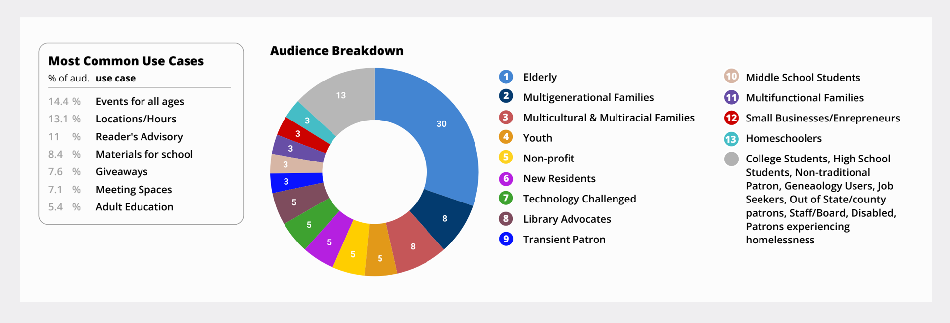
- Outdated Visual Brand: We discovered that KCPL's existing brand no longer meets their needs. It was outdated and failed to reflect the inclusive, dynamic nature of a modern library, limiting its appeal across Kent County’s diverse population. This outdated branding didn’t just affect aesthetics; it hindered the library’s ability to community its multifaceted role as a community hub, resource center, and welcoming space for all.
- Stuck in a negative cycle of engagement: The library team was caught in a negative cycle of engagement. Struggling to update their site content consistently due to unfriendly CMS, they faced low patron engagement online. This lack of user interaction provided no positive reinforcement for updating content, further diminishing their motivation to maintain the website. The result was an outdated online presence that hindered their ability to effectively reach and engage with the community in an increasingly digital world.
These discoveries illuminated our goal: to create a digital solution that is equitable to all and reignite community engagement. To address these challenges, we set out to rebrand KCPL as well as equip them with tools so they could do the meaningful work that libraries are capable of.
Brand Design Phase
First, we started with the visual brand. The challenges with their current brand demanded more than aesthetic changes. They require a comprehensive reimagining of the library’s visual identity, driven by the imperative to create a more equitable brand. This focus on equity pushed us beyond surface-level adjustments to craft a brand that would resonate with and represent Kent County's diverse population in its entirety.
However, the pursuit of equity in design presented its own set of challenges. As we strived for inclusivity, we initially found ourselves moving towards a more generic brand, risking the creation of an identity so broad in its appeal that it lacked uniqueness.
Our task, therefore, became to strike a delicate balance between inclusivity and distinctiveness. We needed to create a visual identity that was welcoming to all while still capturing the unique spirit of Kent County and its library system. This approach required multiple iterations, constant feedback from stakeholders, and a willingness to challenge our own assumptions about what an equitable brand looks like.
Coming up with thematic concepts
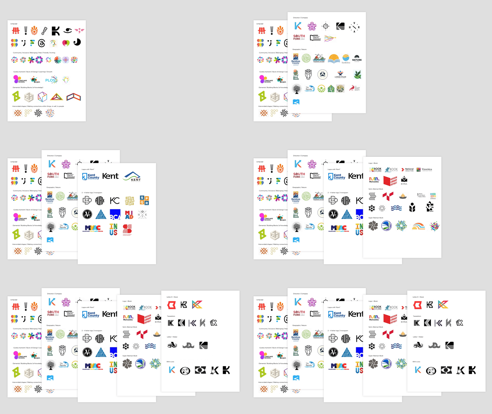
We started with a deep dive into the essence of a library challenging ourselves and the KCPL team to define what a library truly stands for. This introspection led us to define a spectrum of concepts, from the tangible aspects like language and community to the intangibles such as eureka moments of discovery.
Then, based on our identified concepts, we ventured out collecting existing logos for each concept creating a series of mood boards to find our sense of direction and set the stage for defining the look, feel and meaning of the brand.
Through the process of elimination, we found our sense of direction, and our design team pushed into workshopping lots of ideas.
Defining Core Brand Elements: Logo, Color, and Typography
Pushing into extensive workshopping and keeping inclusivity at the forefront of our minds led us full circle back to the traditional symbol of library: books. However, we recognized we needed to go beyond tradition.
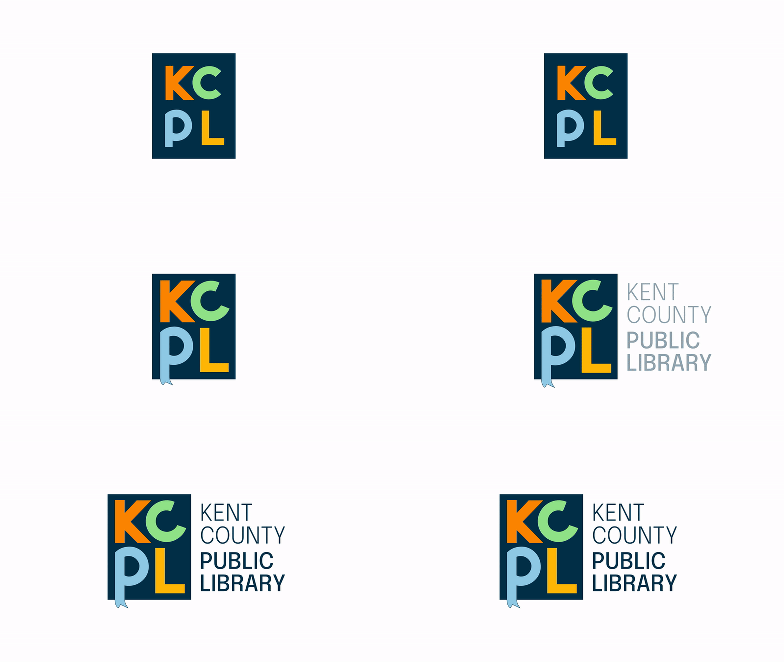
Through multiple iterations, we honed the design, infusing it with charm and distinctiveness. The final logo emerged with bold, blocky letters exuding strength and stability. We added a playful touch via a titled “C” and a “P” that breaks out of the box, transforming into a bookmark.
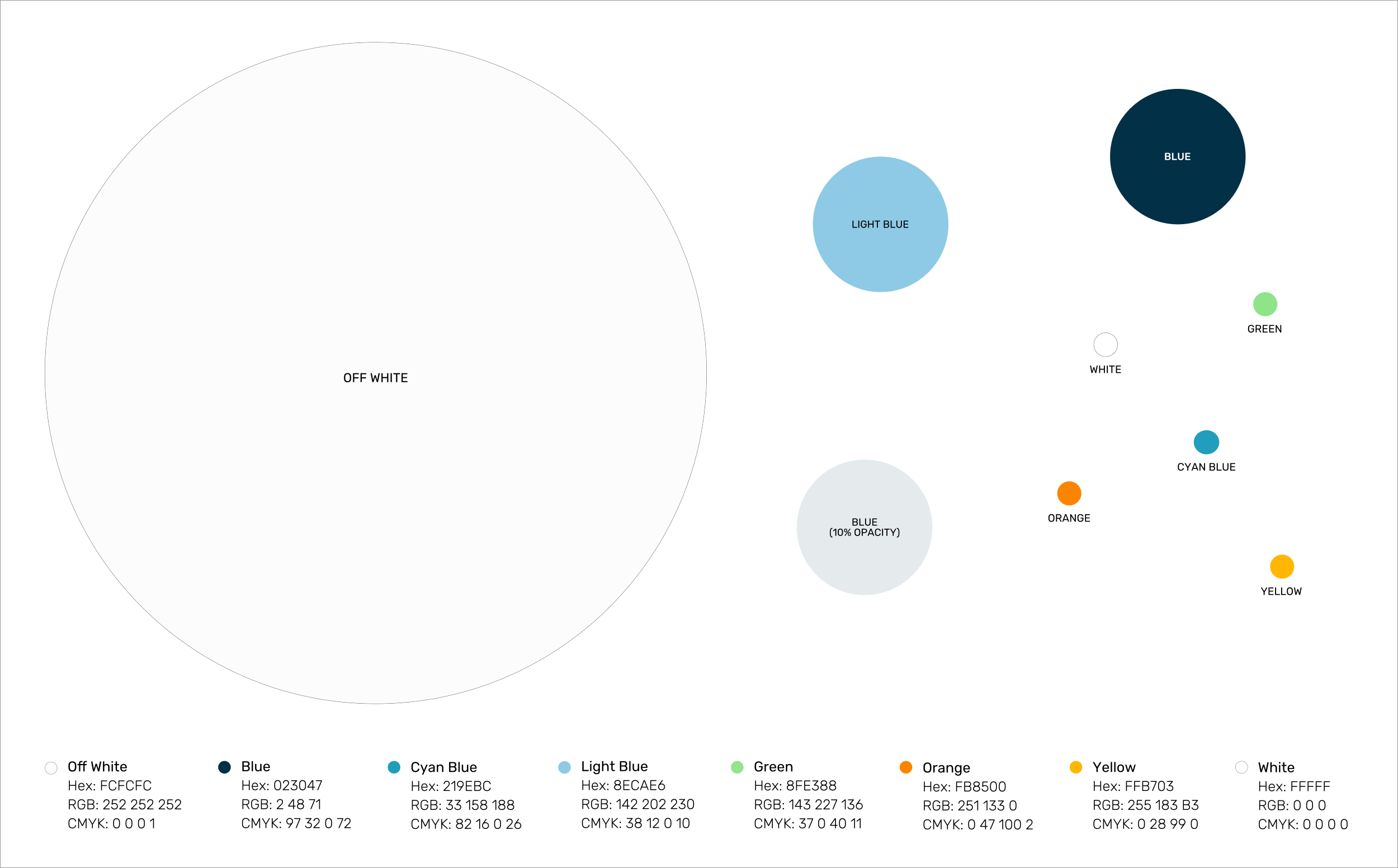
Extensive exploration yielded a color palette adding vibrancy and energy and font family selections that prioritizes usability and accessibilty.
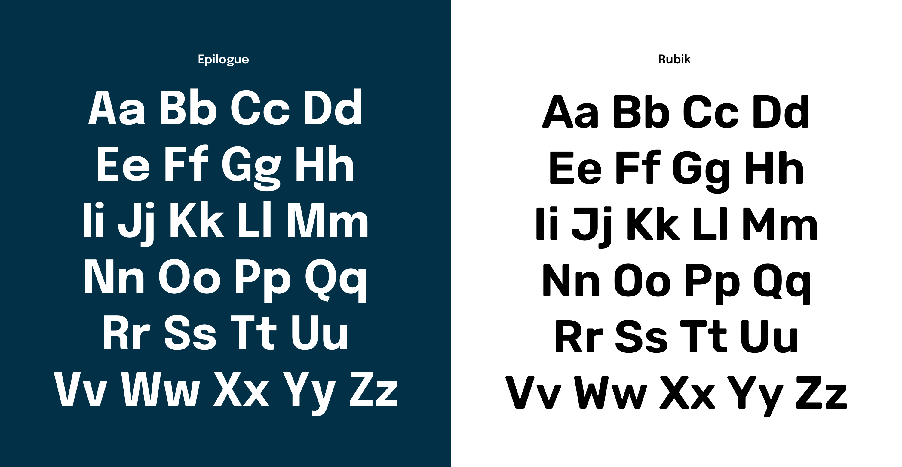
In the end, each element—the logo, color palette, and typography—was carefully crafted to work in harmony. Together, they create a cohesive brand identity that honors the library's traditional role while positioning it as a modern, inclusive institution ready to serve all of Kent County.
Extending the brand: website, business cards, checkout cards
Once the core brand elements were defined, we began expanding the brand through the process of designing various collateral – from the website, staff business cards, patron checkout cards to wristbands.
The easy path lay before us: simple, straightforward applications of the logo, color and fonts. But we wanted KCPL’s identity to be more than a static logo pasted onto everything – it needed to be a living entity with depth, capable of discovery, unexpectedness and emotion.
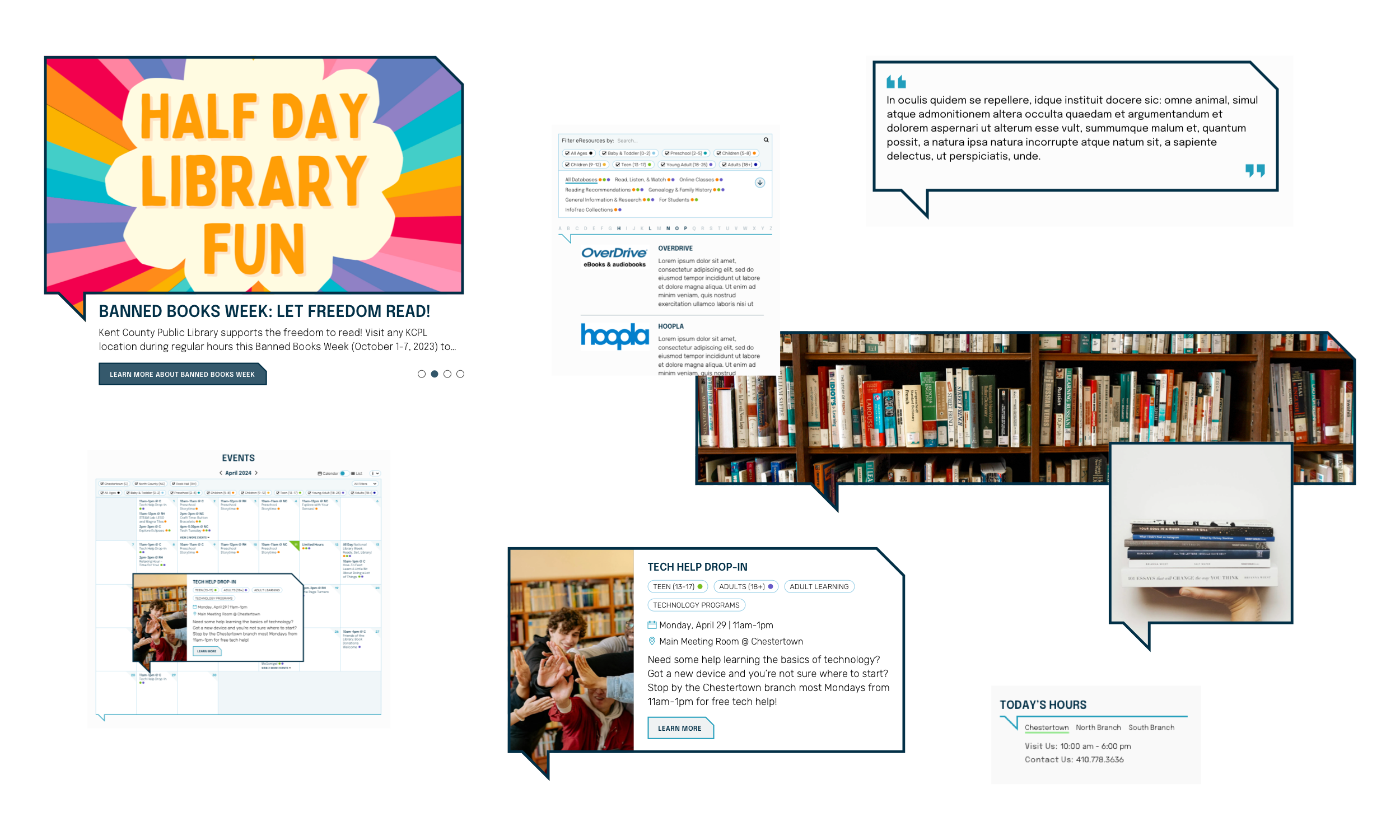
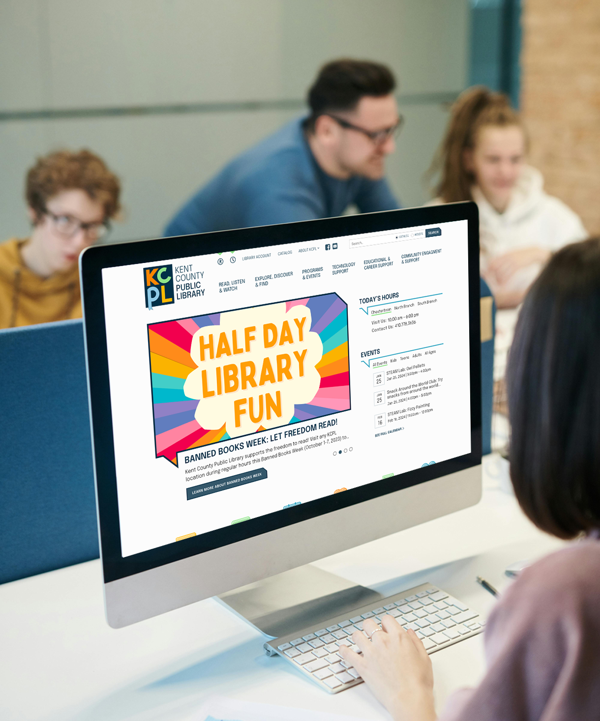
During the website design, a moment of serendipity struck. The bookmark-tailed ‘P’ in our logo, when breath with imagination harkened to a speech bubble. Suddenly, we had a powerful visual metaphor: “KCPL has something to say.” This new design element reinforced a message as the library’s role as a hub for dialogue.

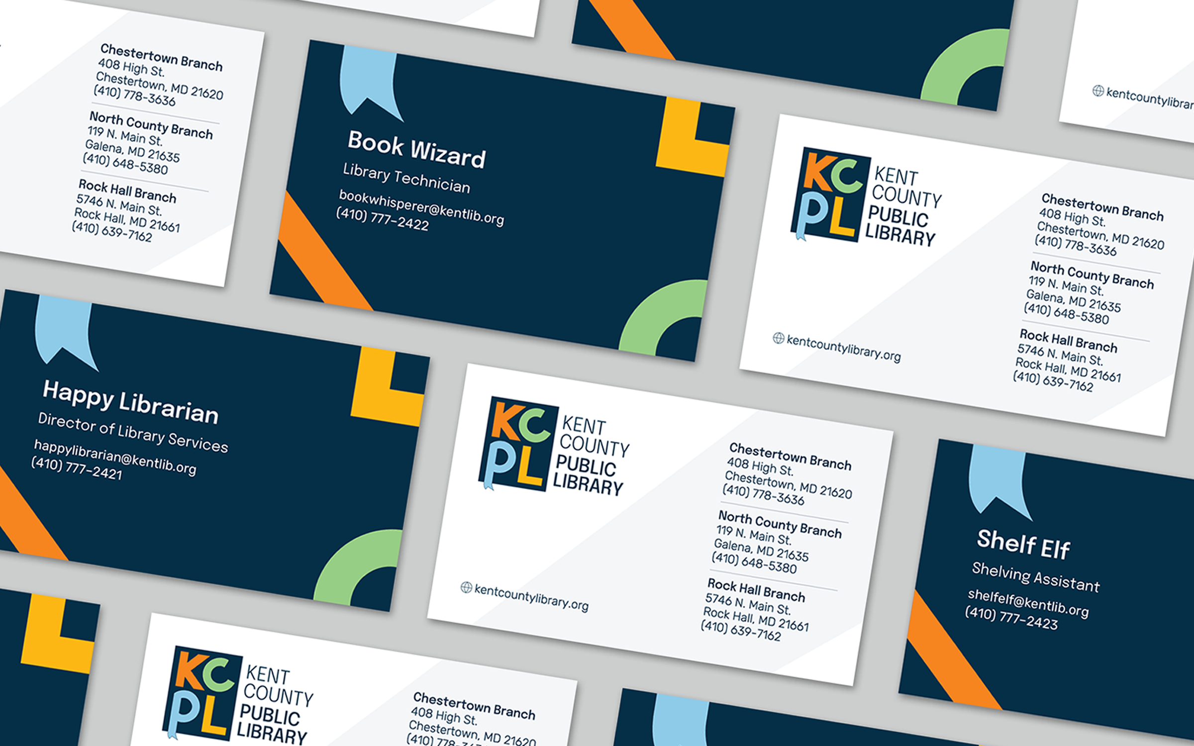
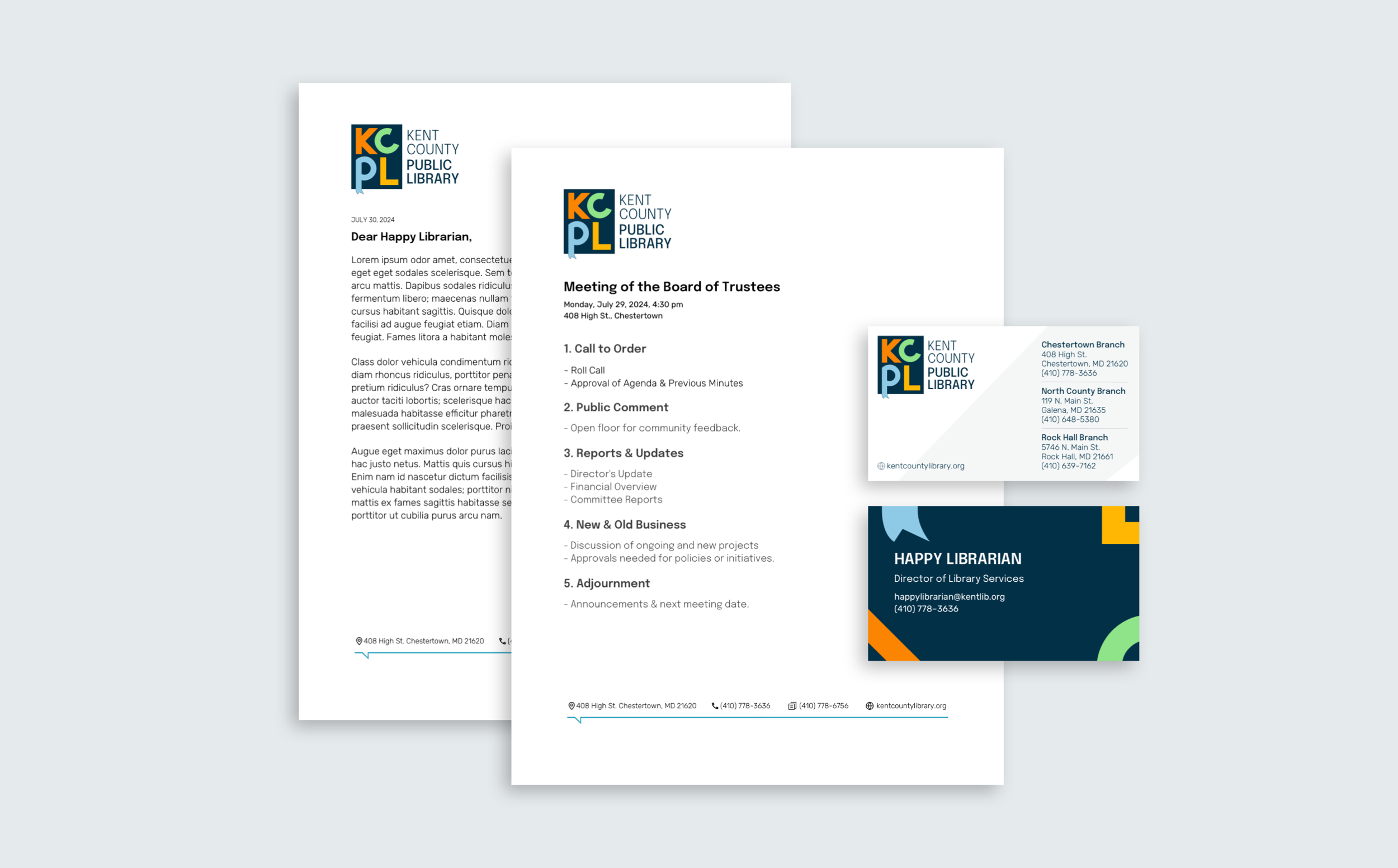
For the business cards, we elevated the playfulness by abstracting the letters into whimsical shapes, creating a unique and engaging visual identity.
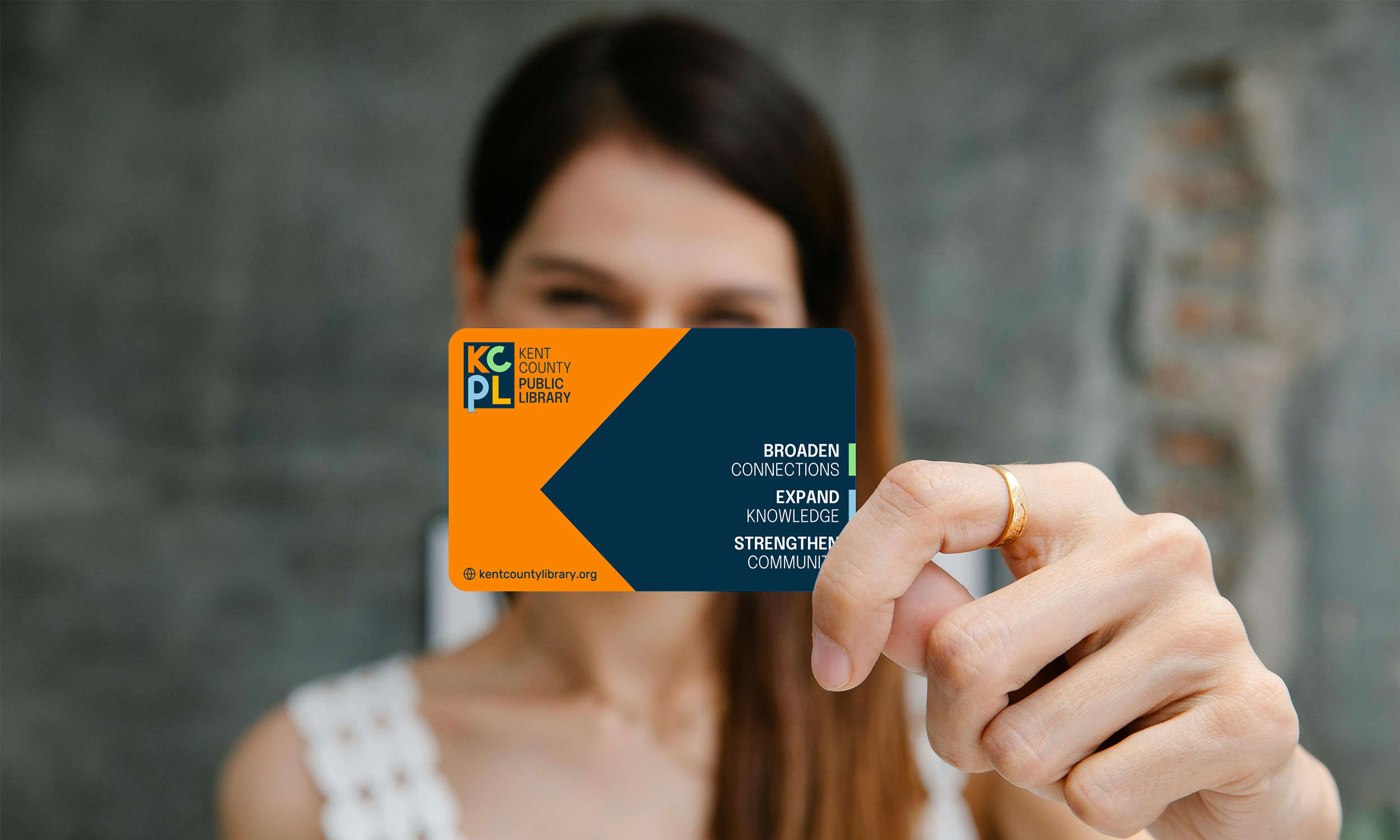
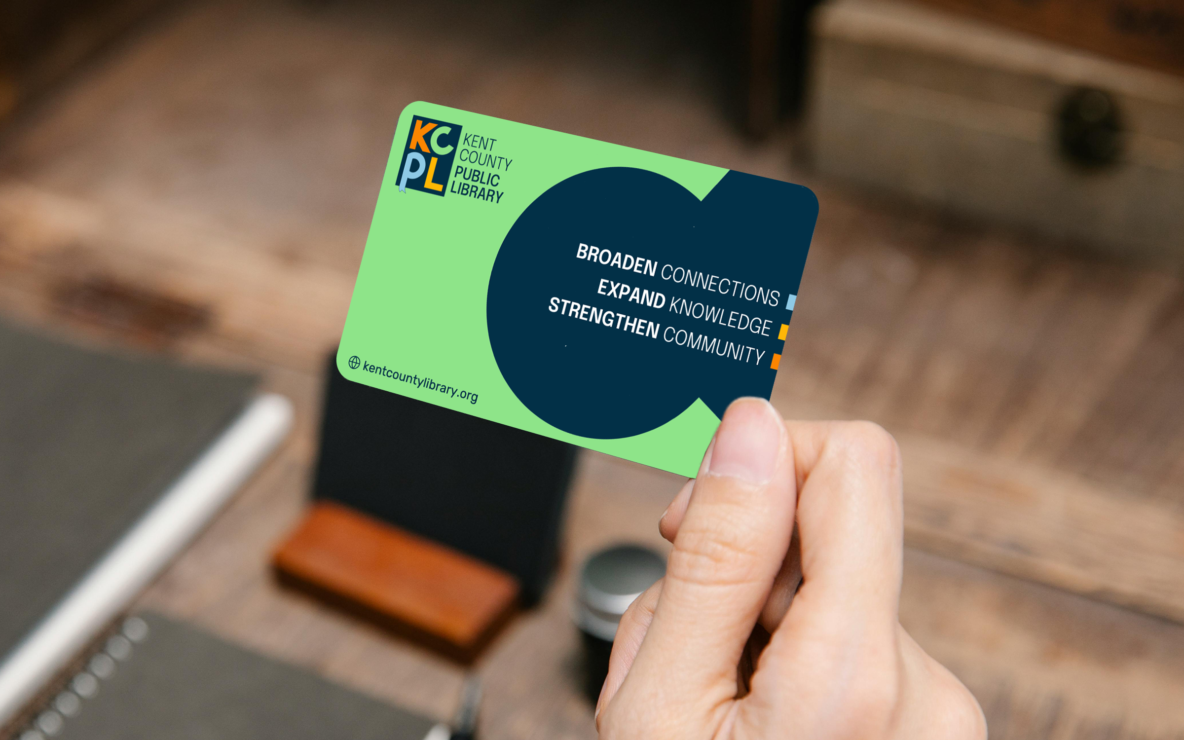
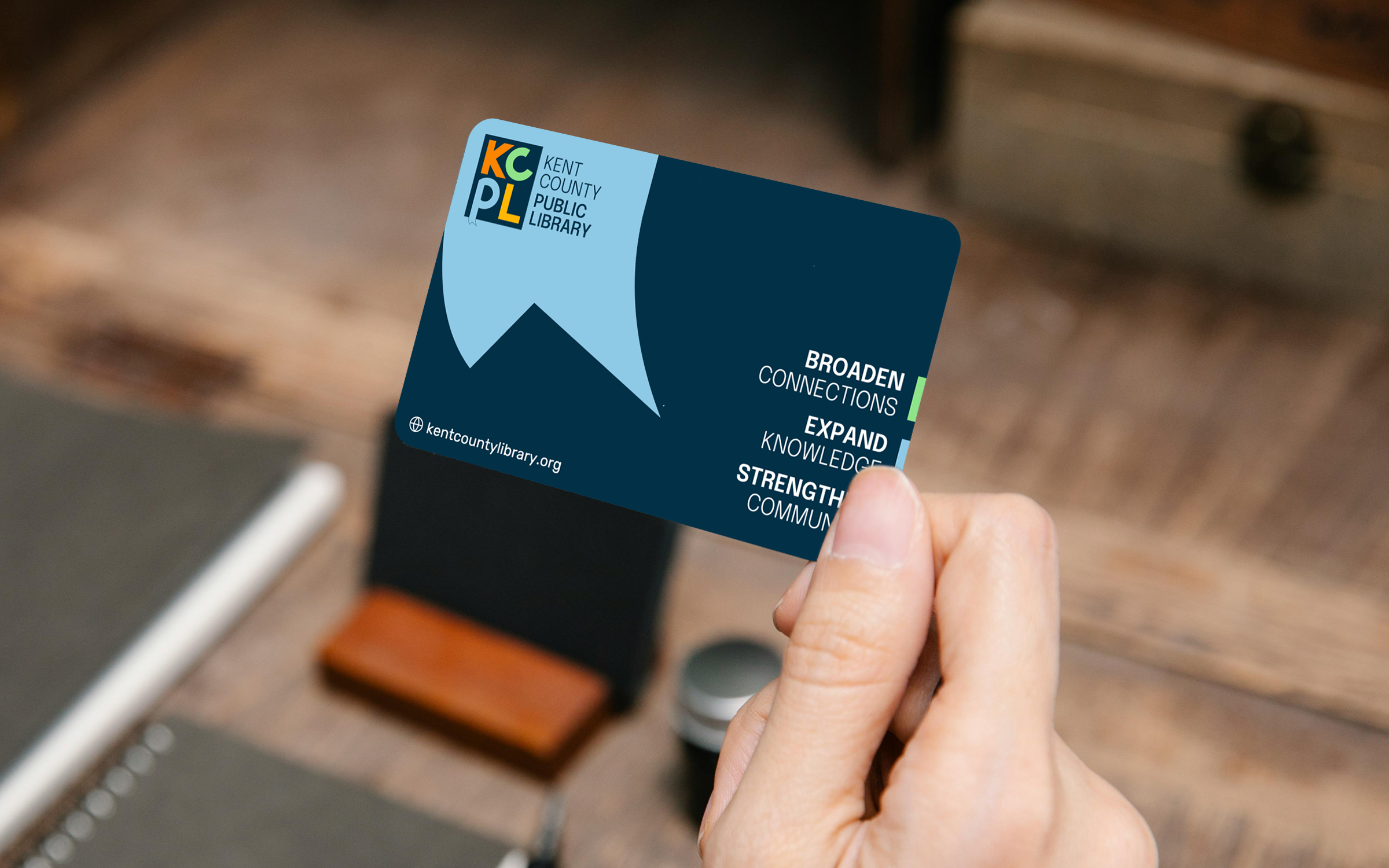
For the library checkout cards, we considered the interaction patrons would have with them and saw an opportunity to enhance this experience. We developed a system of designs that allows patrons to choose from a variety of options. Each card with the vision statement as the focal point framed by shapes derived from the logo.
 Throughout this process of brand extension, we pushed KCPL's identity past a static logo into a dynamic, living entity that continually surprised and delighted us. From the speech bubble to whimsical shapes, each application of the brand revealed new facets of the brand’s personality.
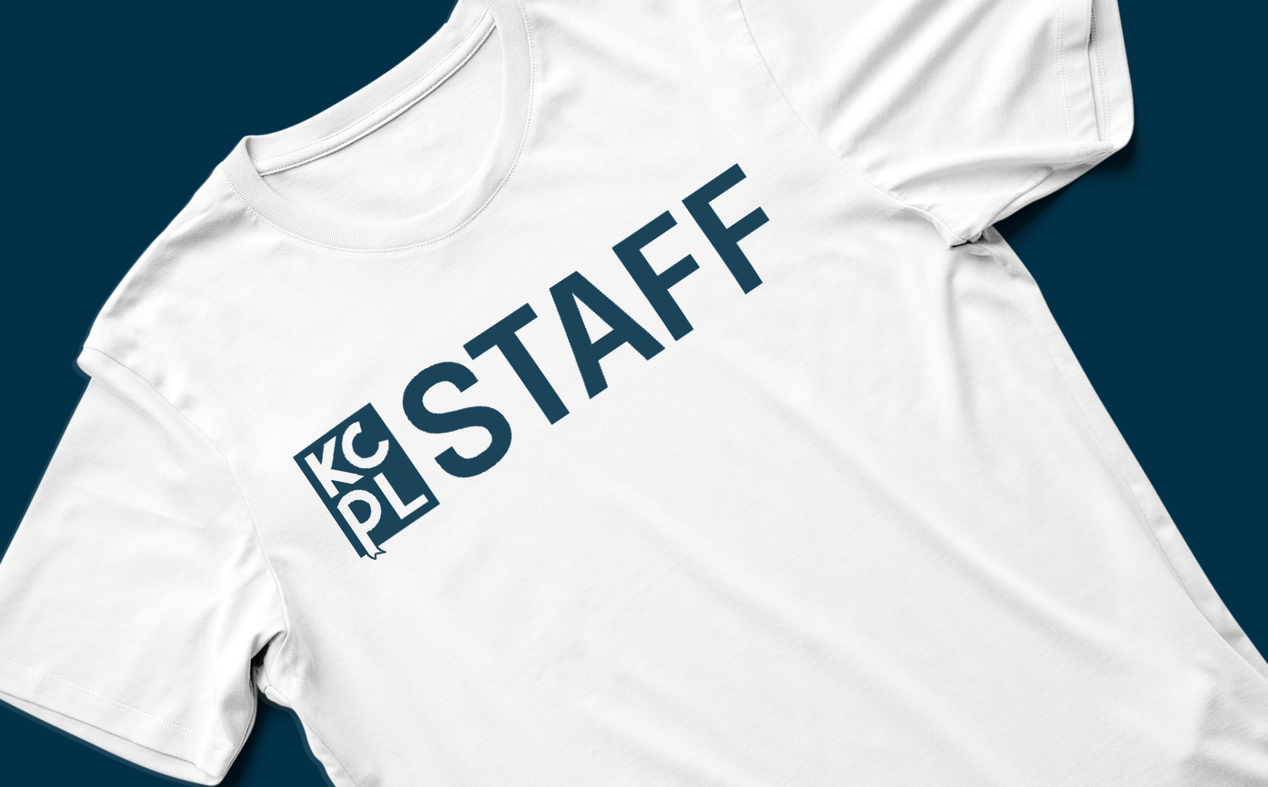
By pushing beyond the obvious and embracing creativity at every turn, we created a brand that not only positions KCPL as a relevant institution but also invites patrons to interact and discover the library in new, exciting ways.
Features & Functions Phase
To address the negative cycle of engagement, we upgraded the features and functionality of the website by aiding KCPL with tools to exercise and develop their library voice as well as a CMS that is easy to manage.
Their updated site and CMS includes booklists, an integrated calendar system, an e-library of electronic databases, and universal search.
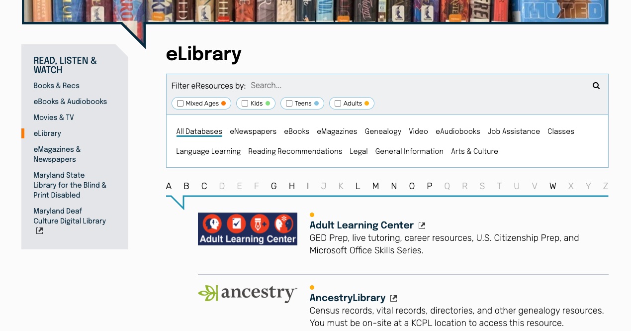
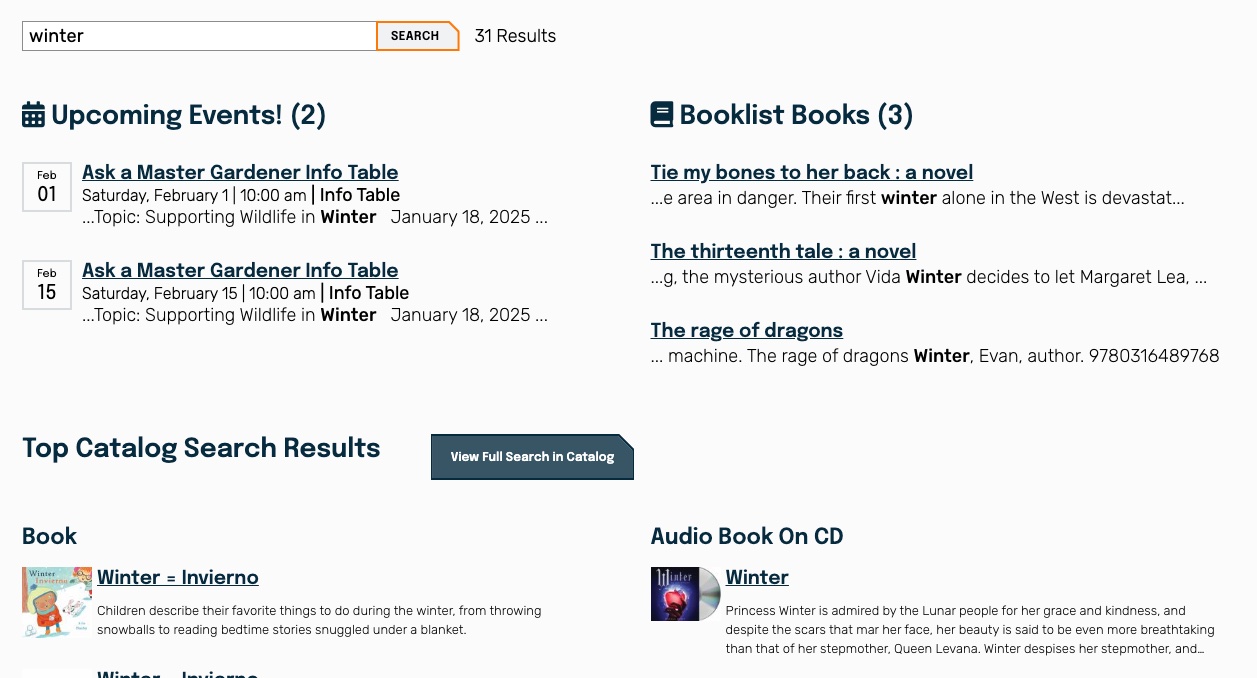
Every library we build for has a unique vision for how their content and data will work, and we love customizing sites to reflect the library's need. For us the level of care we take in building the tools show the level of care the library provides each patron.
Conclusion
This comprehensive brand initiative coupled with functional updates not only addresses KCPL's challenges but also positions the library as a dynamic, inclusive, and indispensable community resource, ready to serve Kent County's diverse population in the digital age.
As the project manager for our site, I was incredibly grateful for how organized and responsive Byte was throughout the whole project. Not only did they address our concerns, but they gave us great structure to prepare our site to house all the different elements we wanted. Our branding was incorporated throughout the design of each page and Byte encouraged us to think about what kind of model for our website we wanted to focus on: service, community, etc. By the time it was time to actually build the site and put in our content, 80% of the site was already complete from all of the prep work that Byte guided us through including site maps, page naming and clear mapping from our previous site to the new one.
Kent County Public Library
